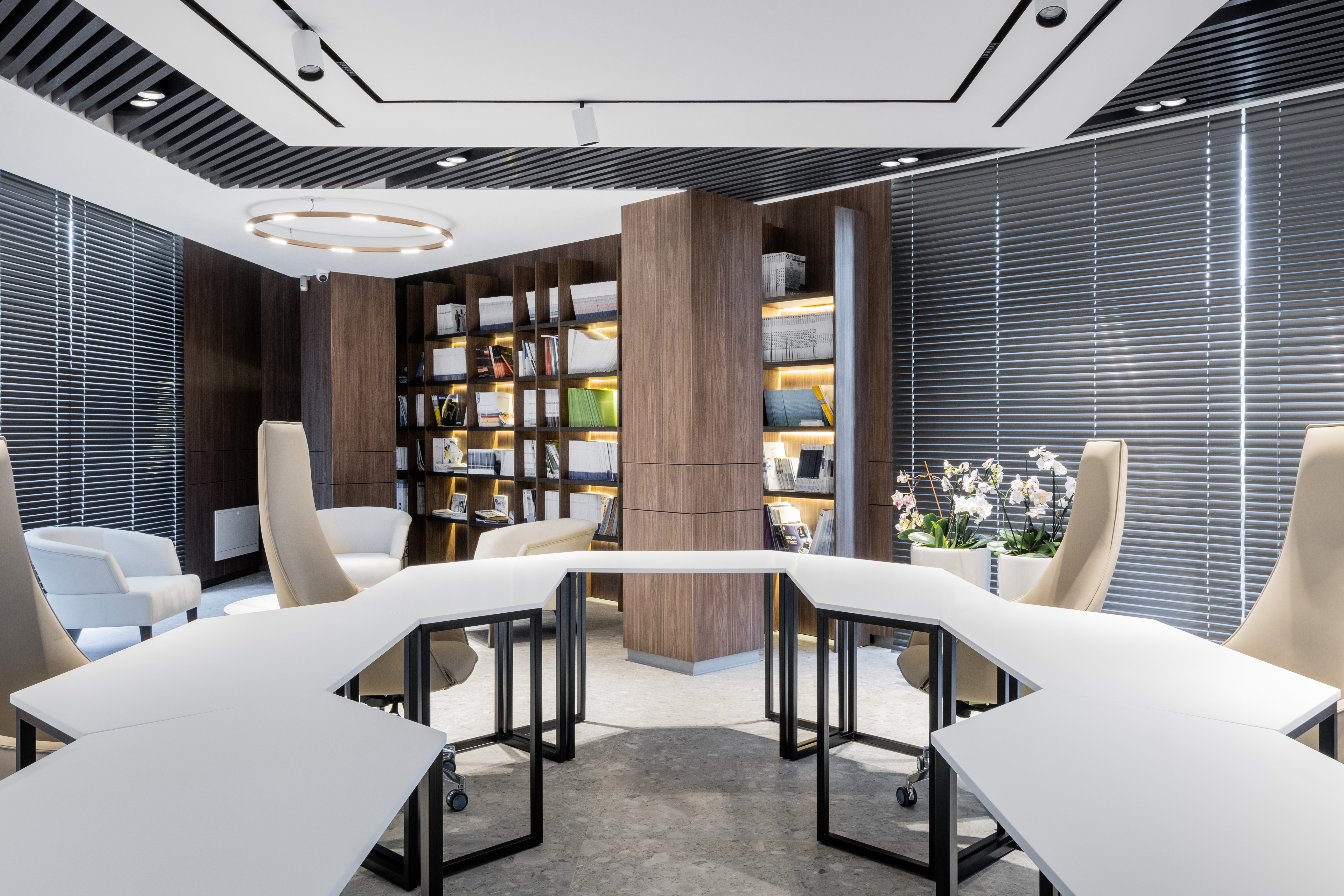
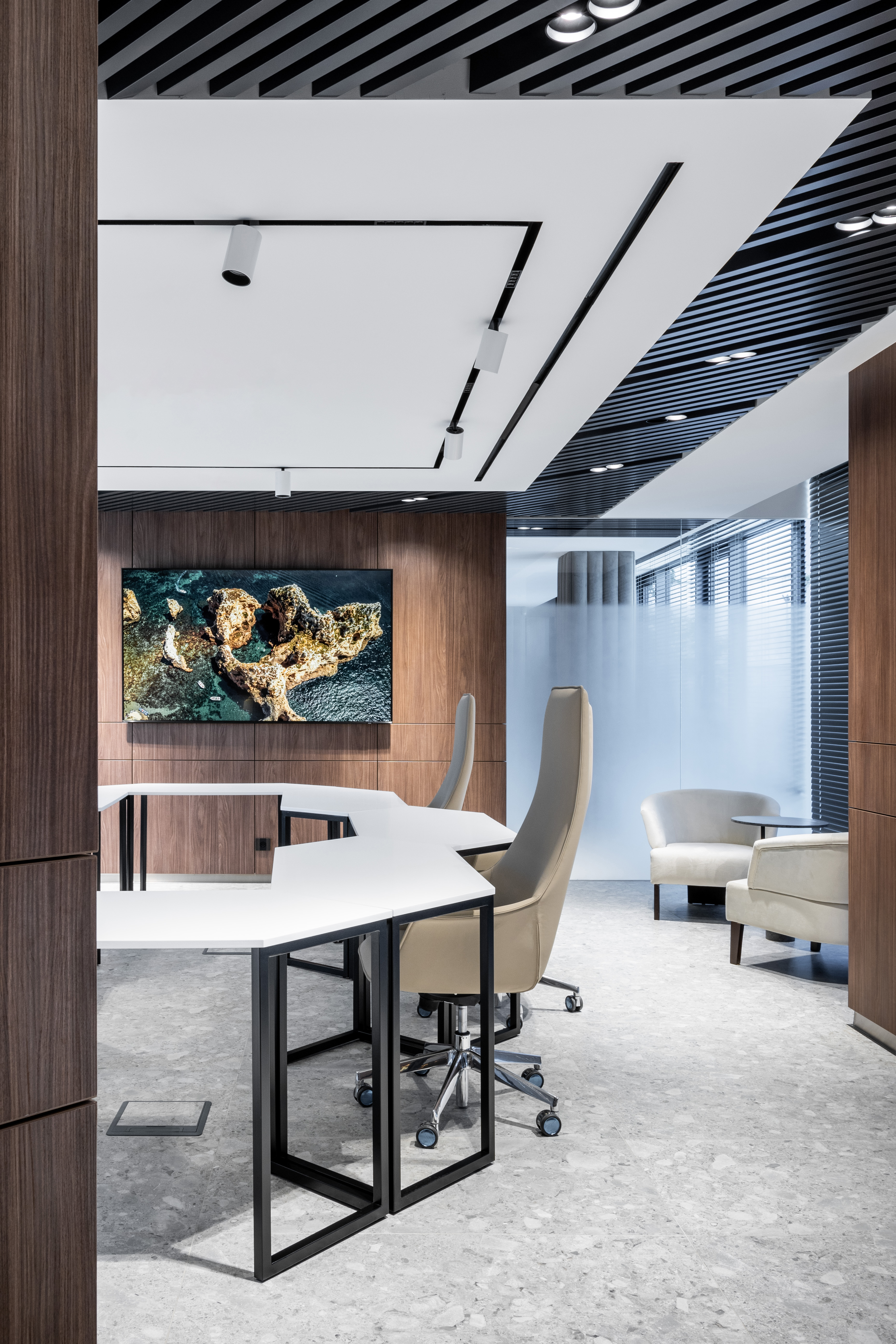
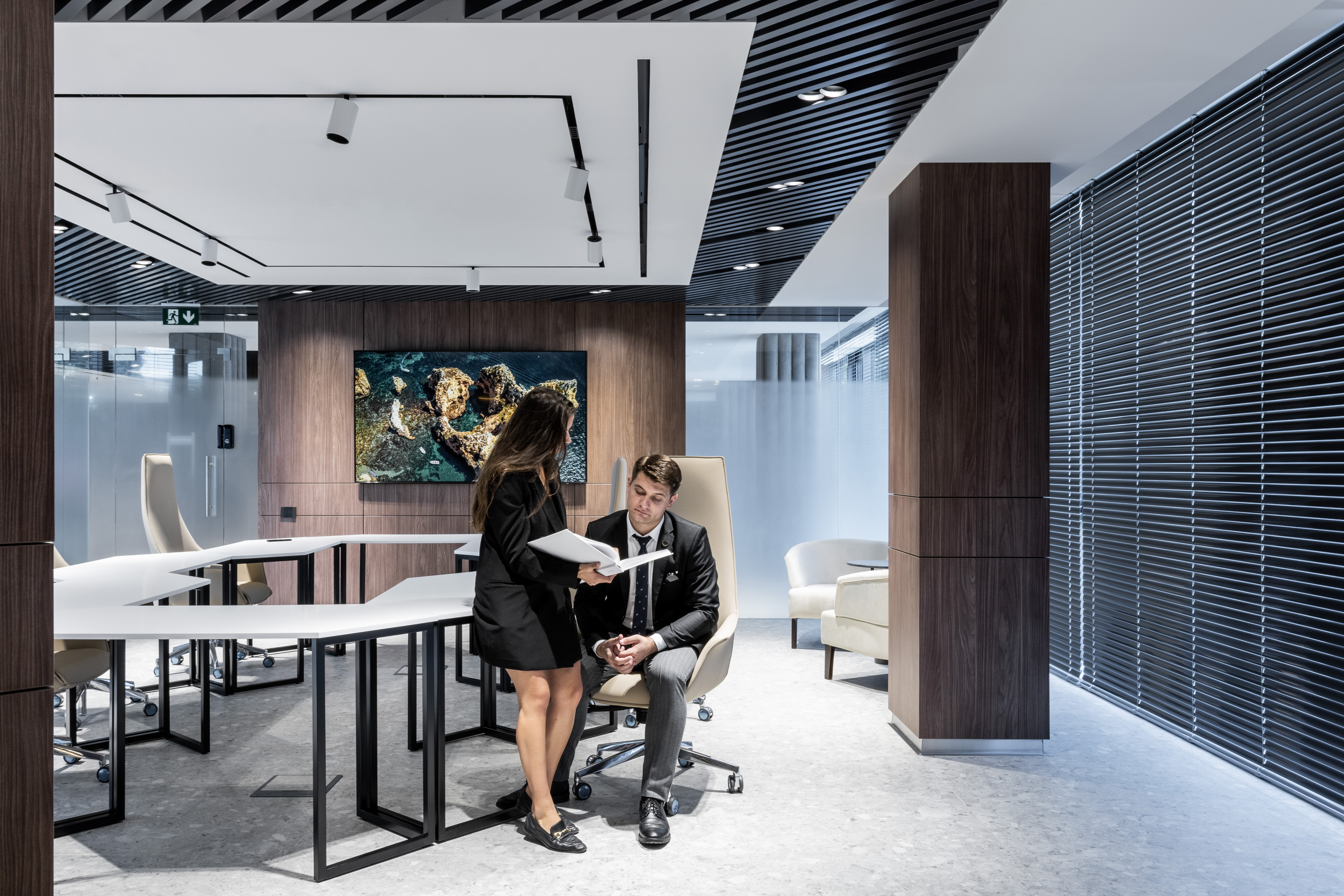
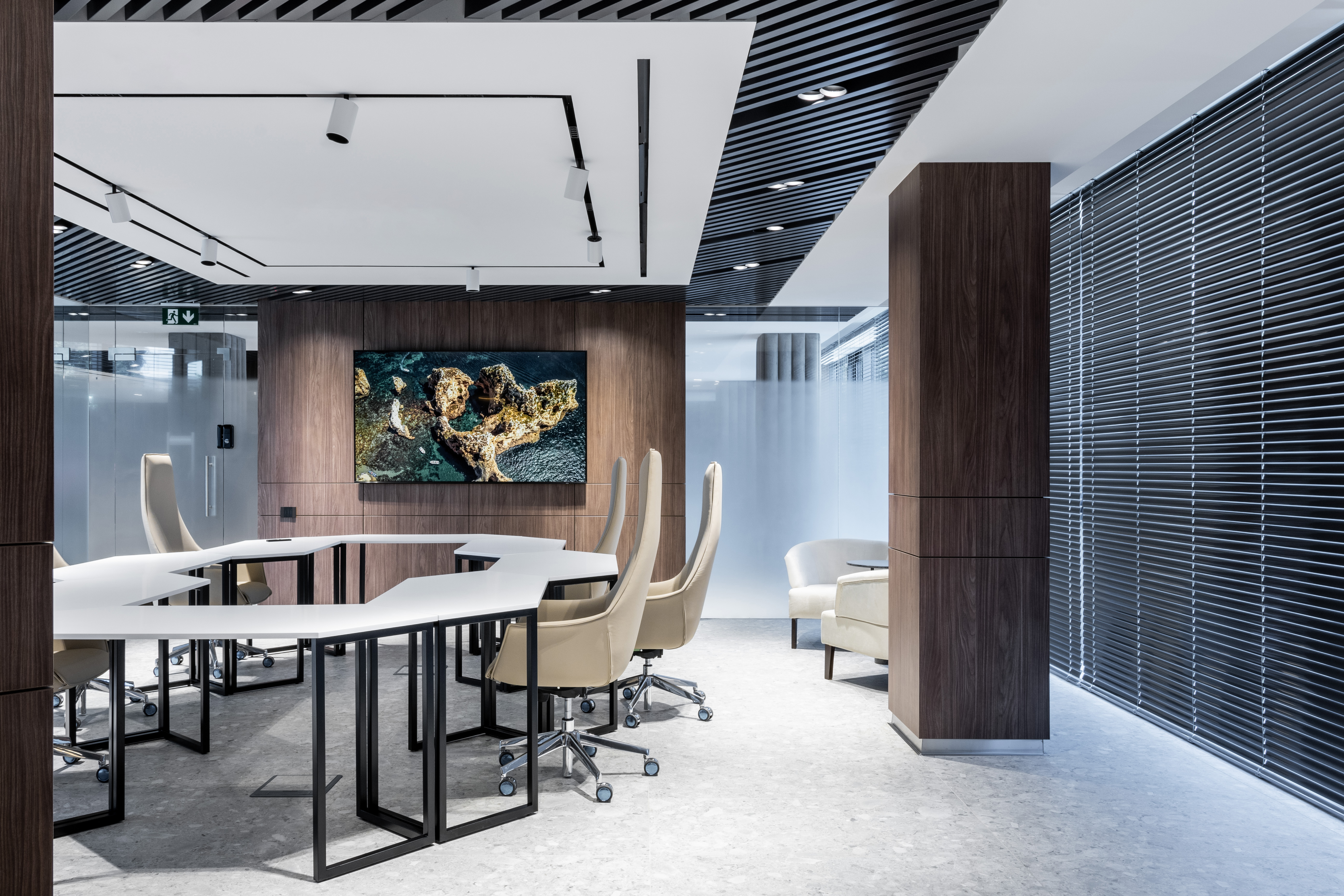
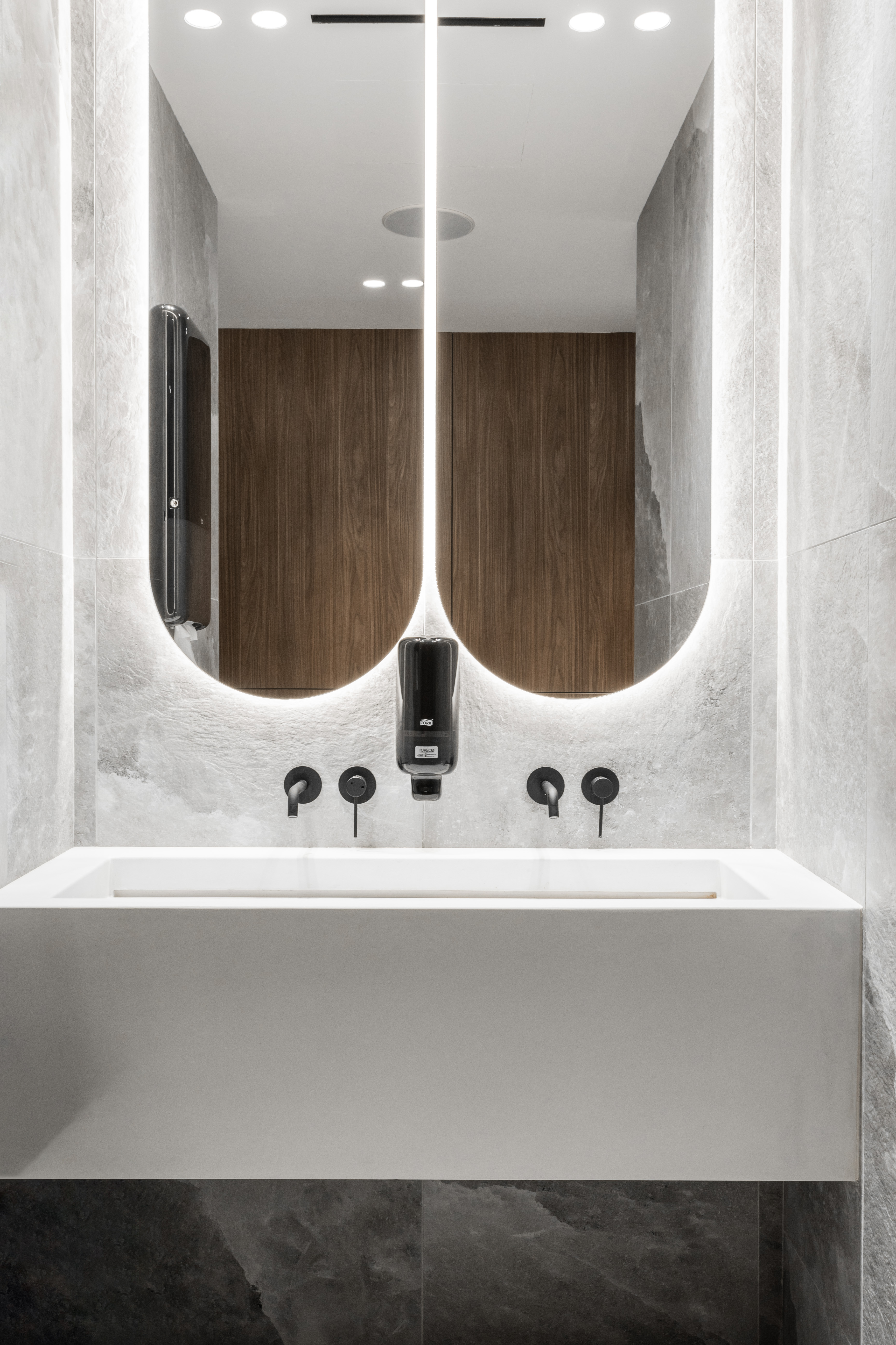
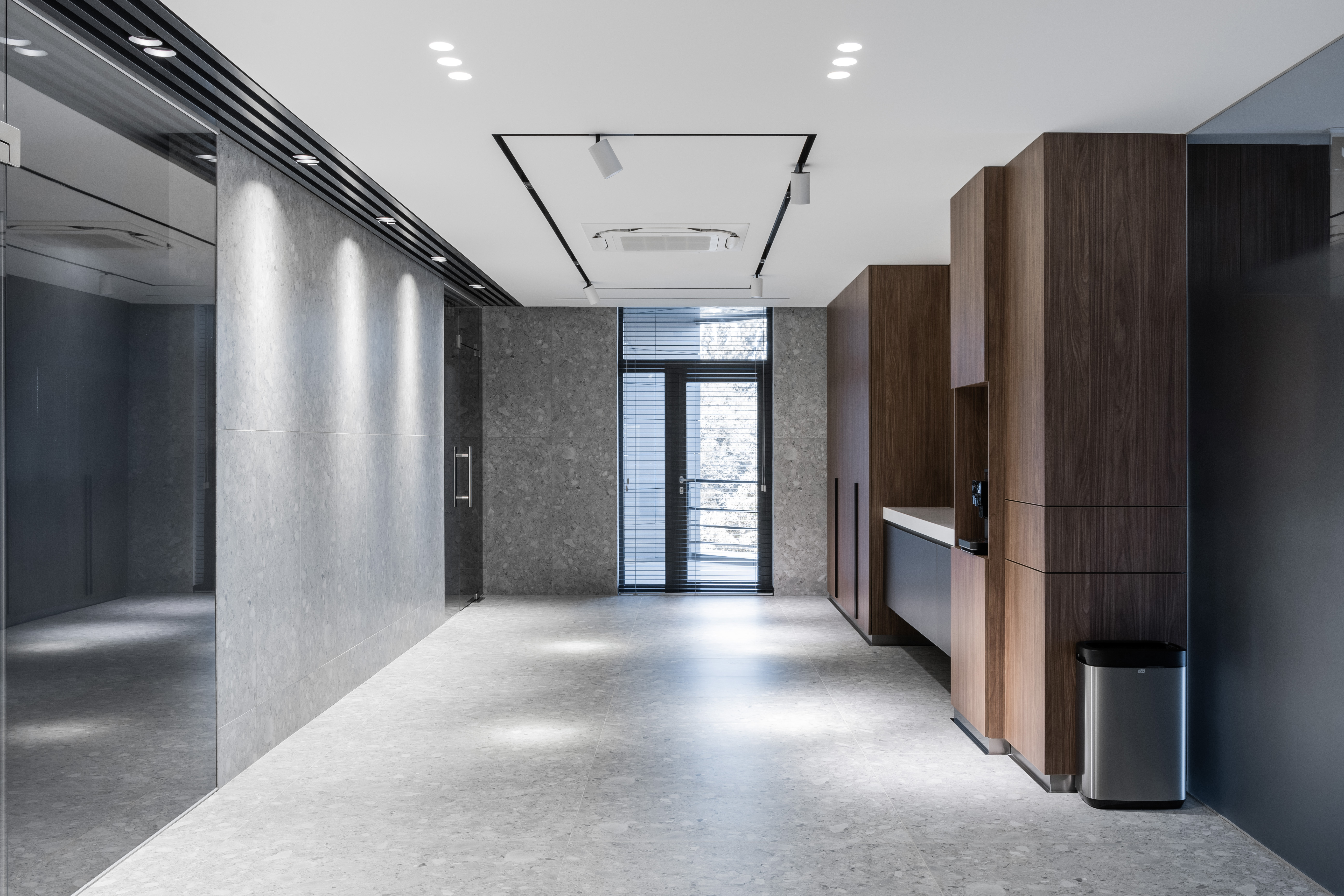
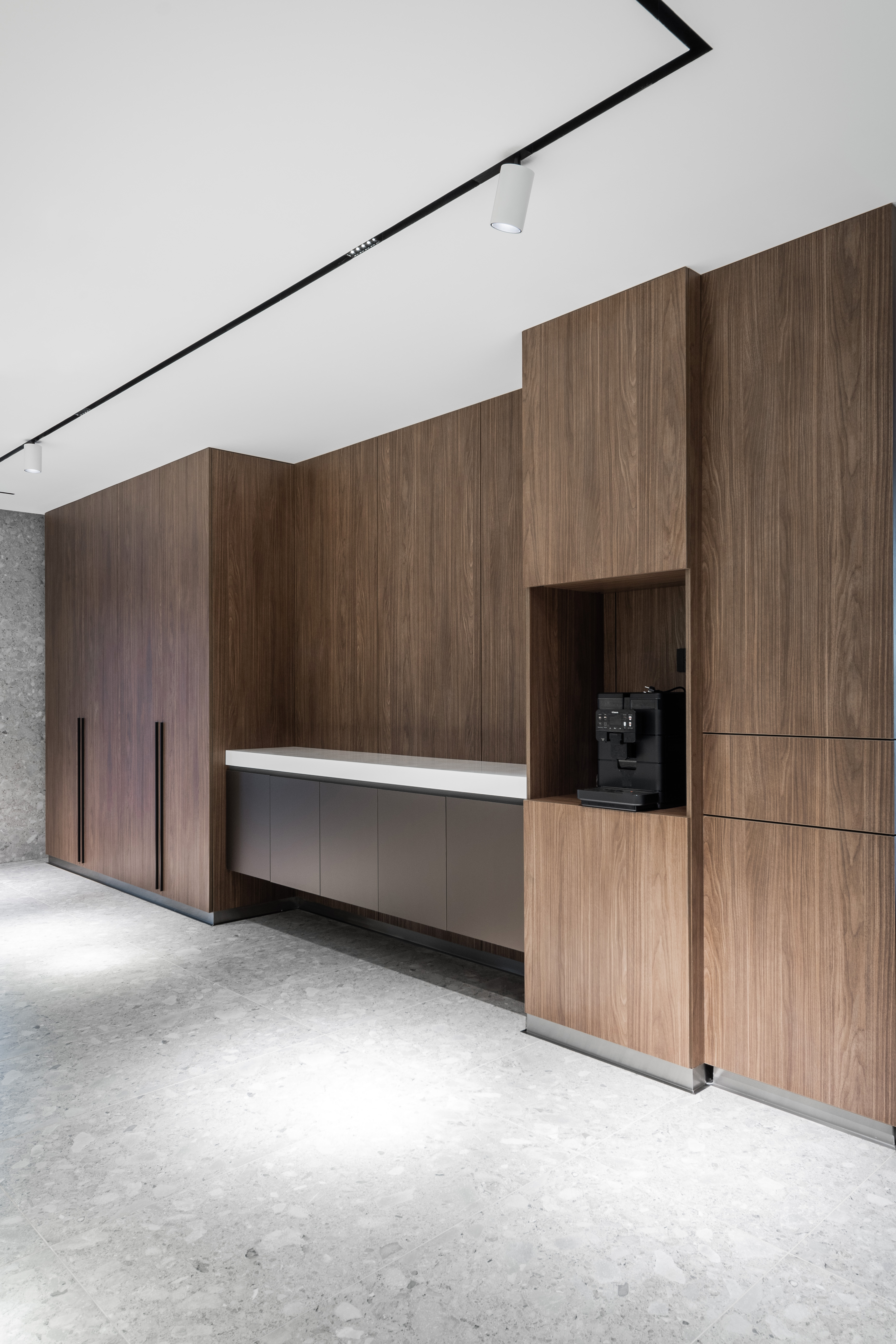
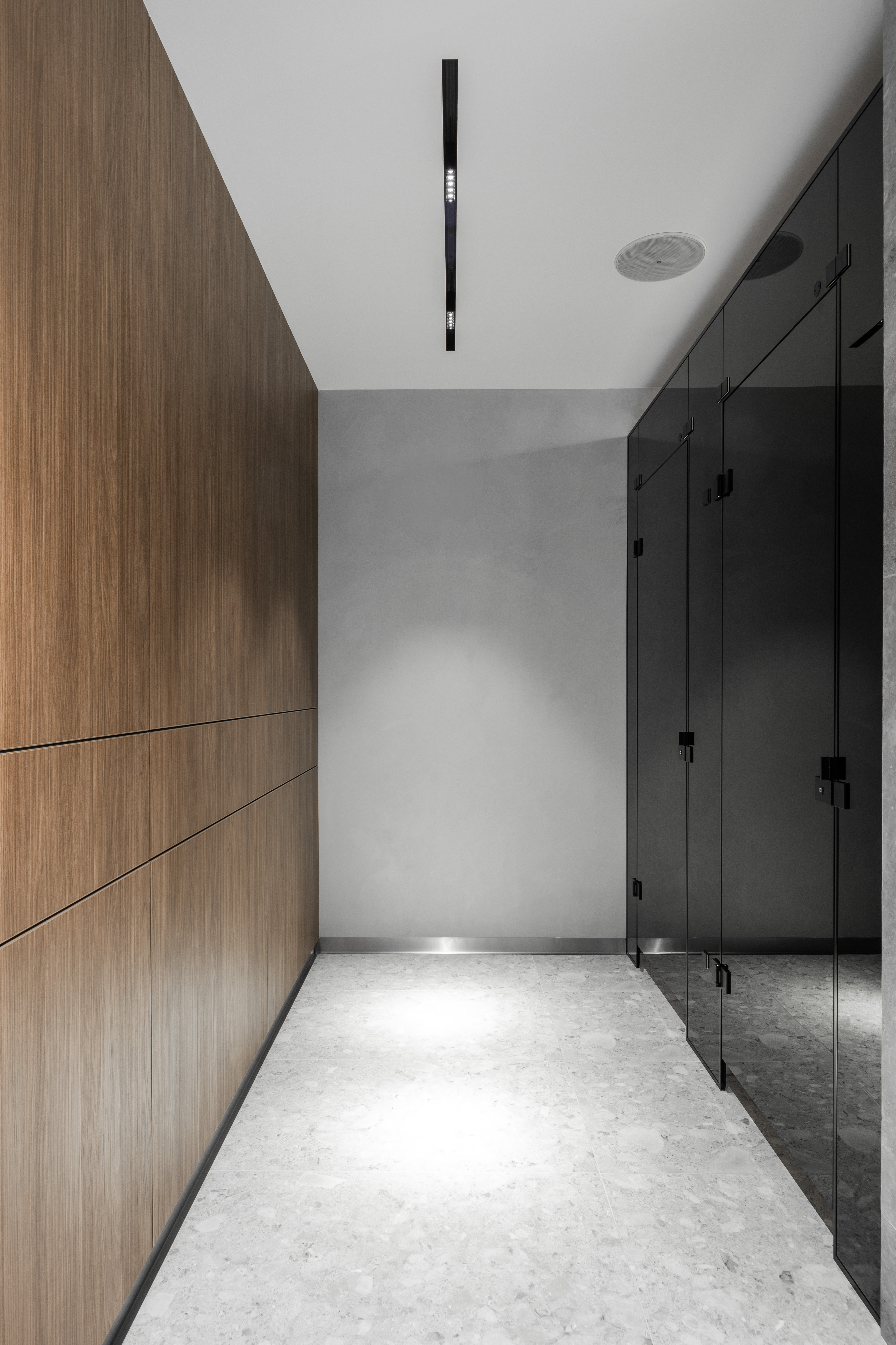
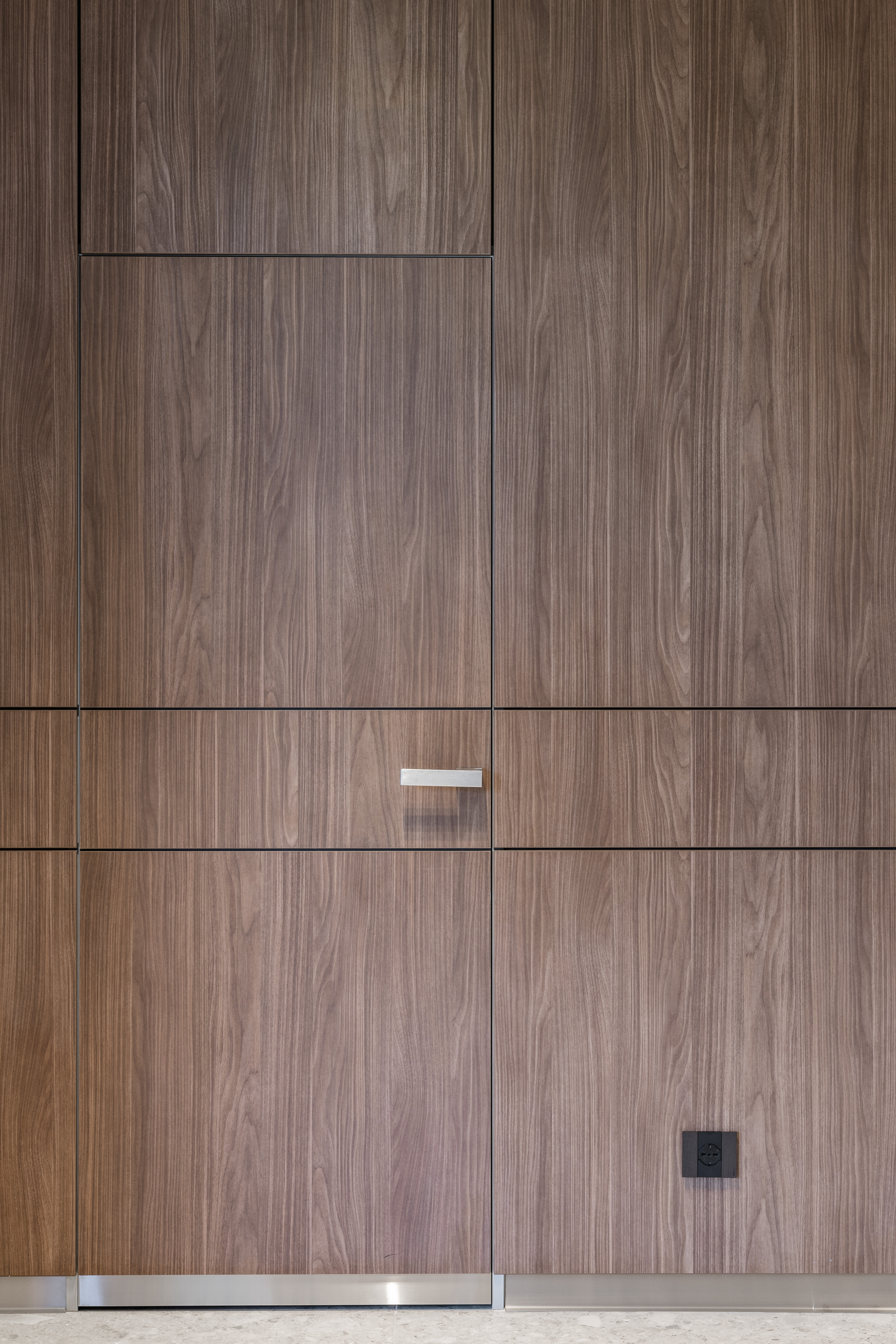
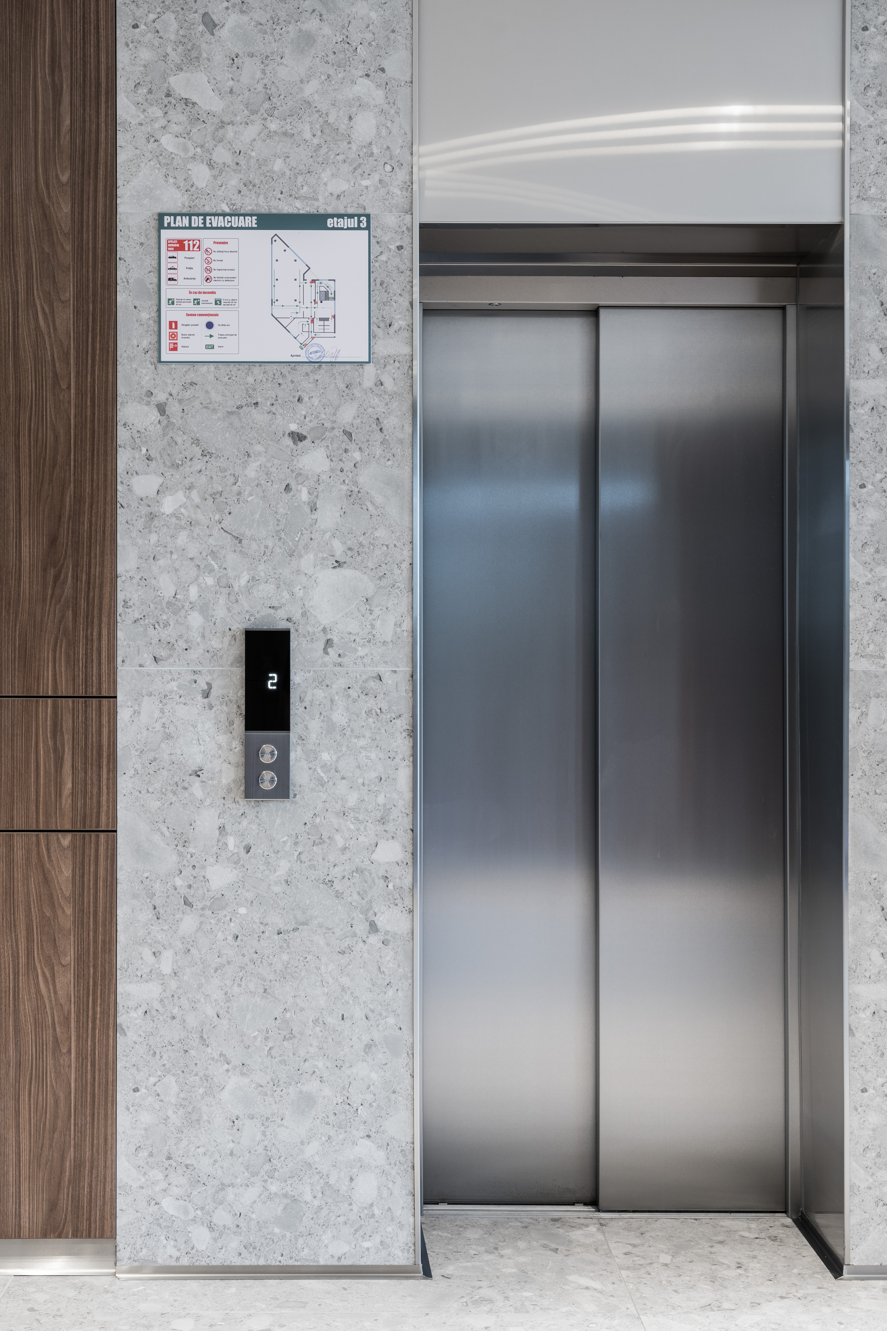
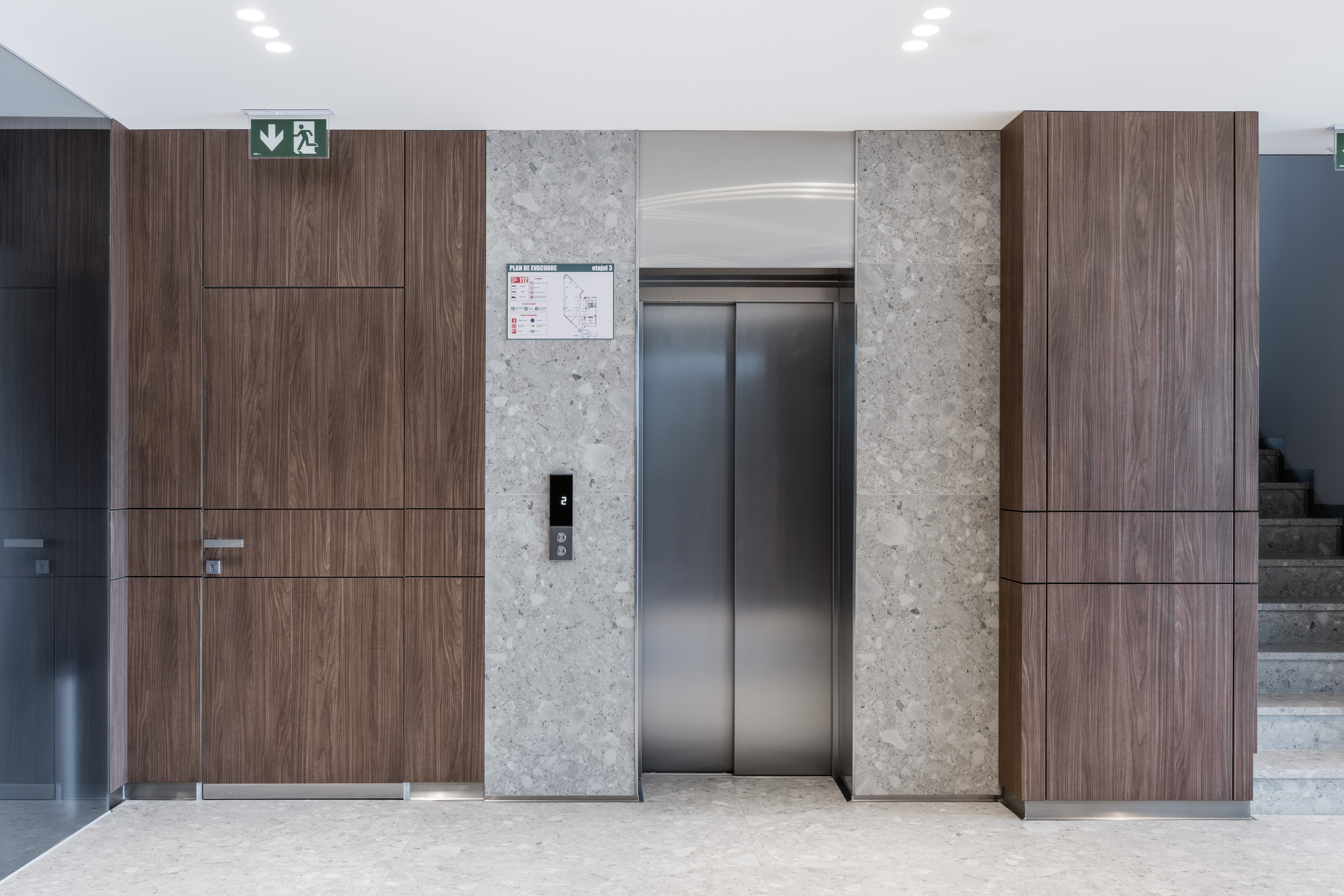
If in the case of residential projects the main stake is the comfort of the customer, in the case of office space design, the goal is to obtain an image that would convey the company’s message to the clients alongside with the comfort for employees. To achieve this, we followed the idea of using concise lines, which do not distract attention, creating calm and large spaces whose simplicity denotes professionalism.
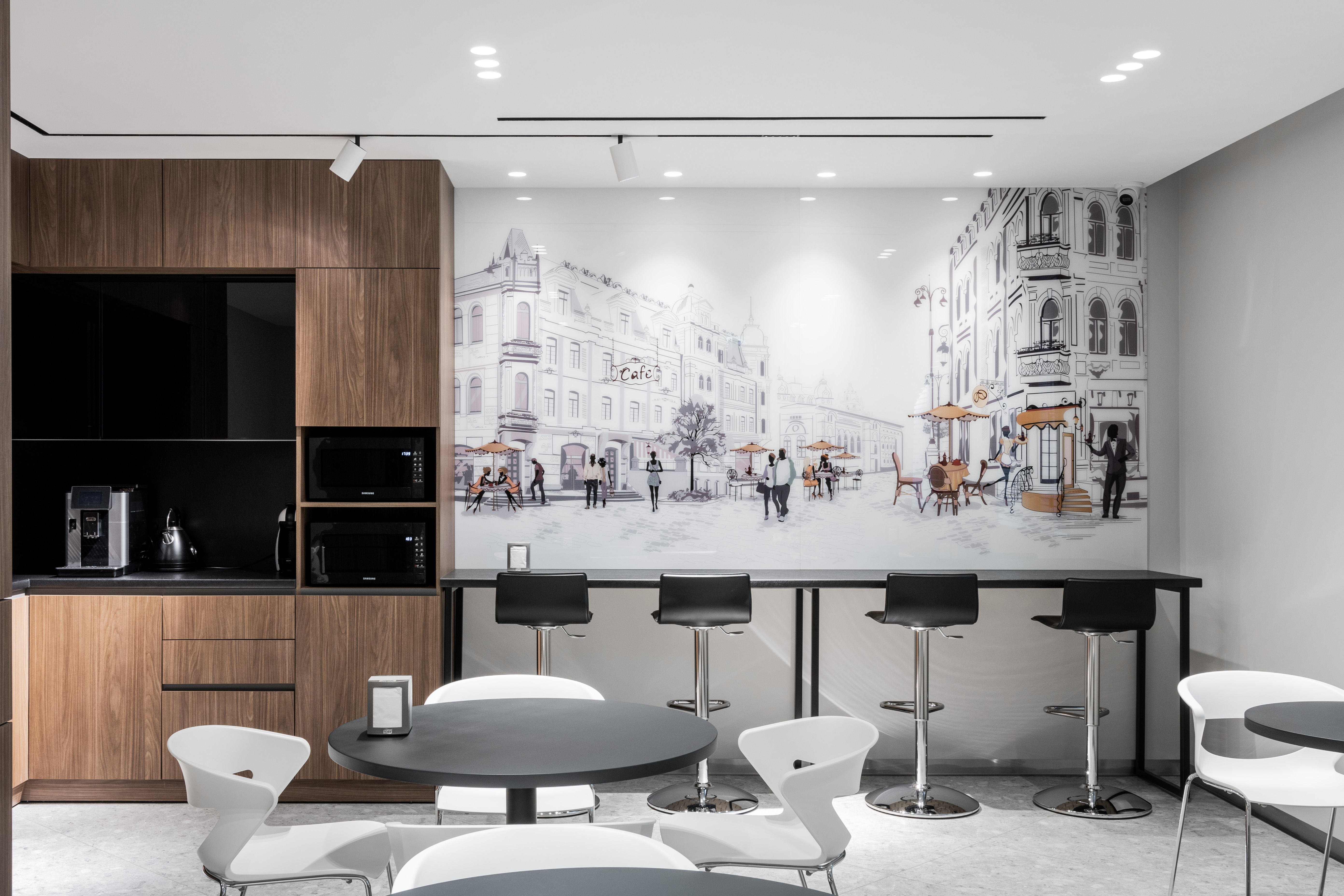
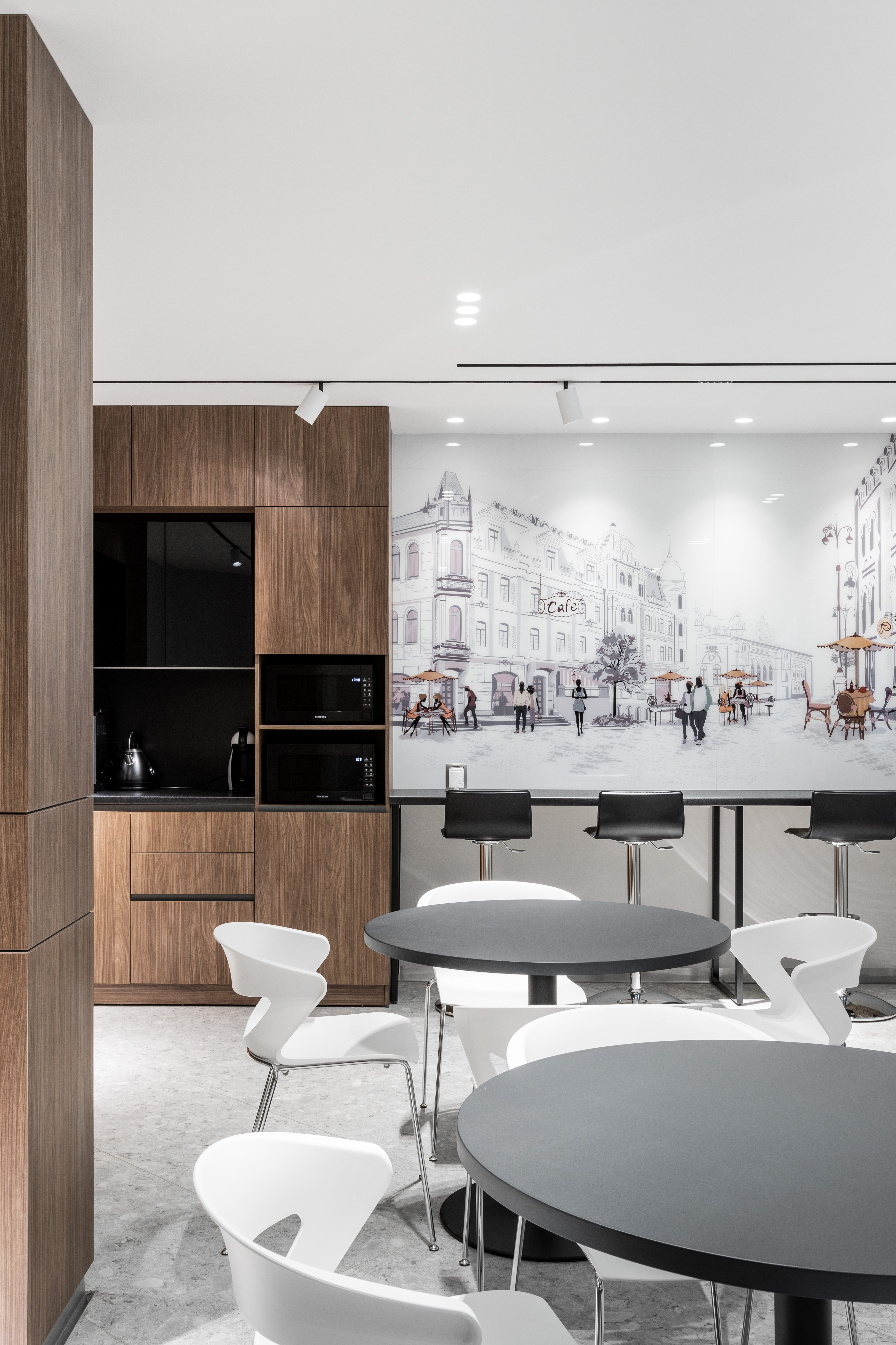
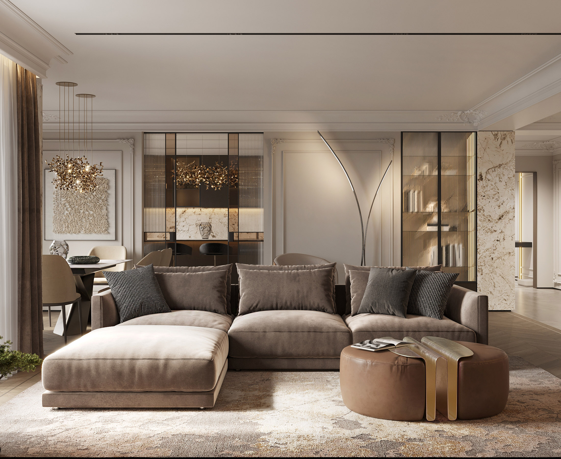
The diversity of the premises we had to arrange, allowed us to use a complex approach to them. The general concept of the project provides for a neutral colour range and a set of textures, individually combined according to the destination of the room.
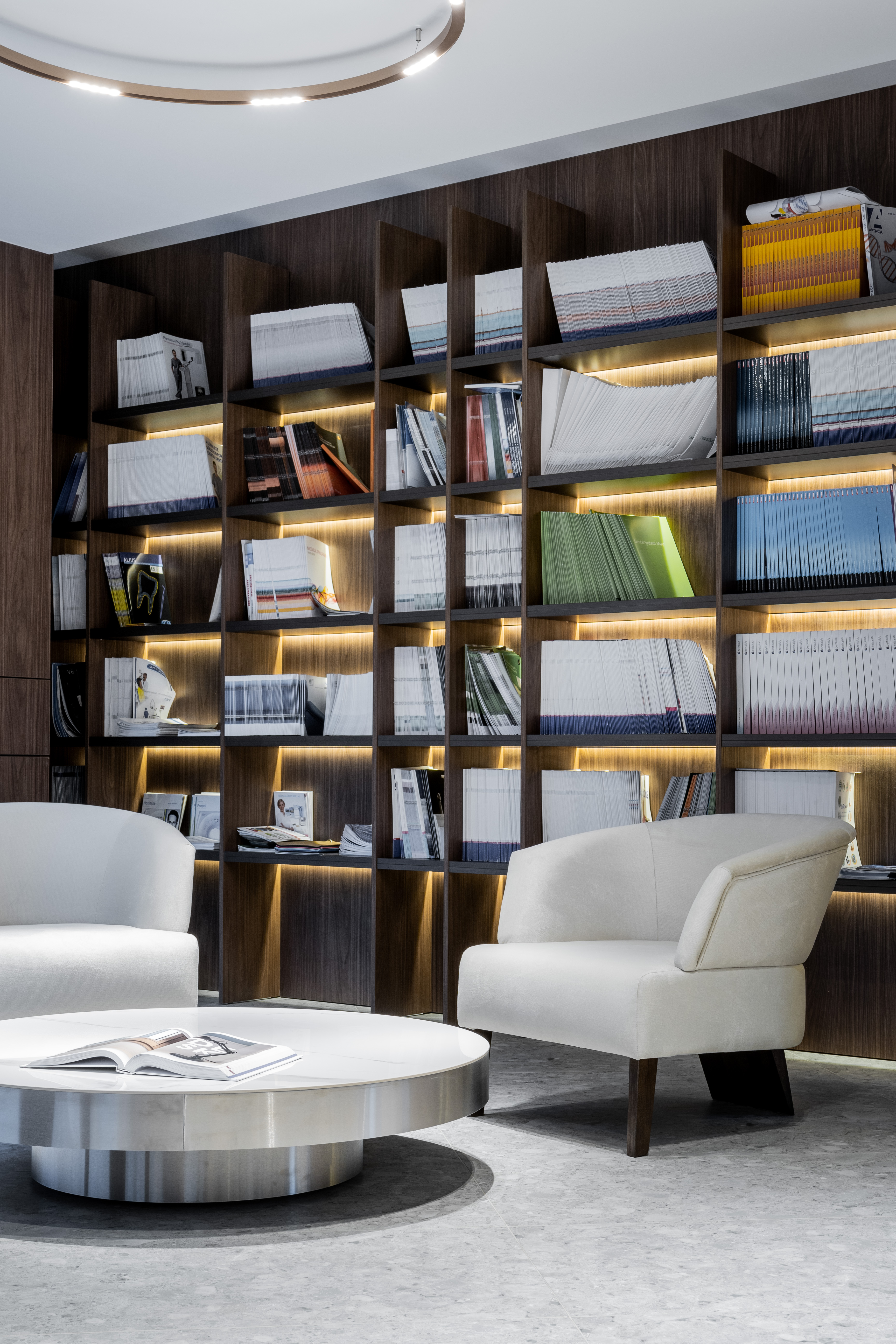
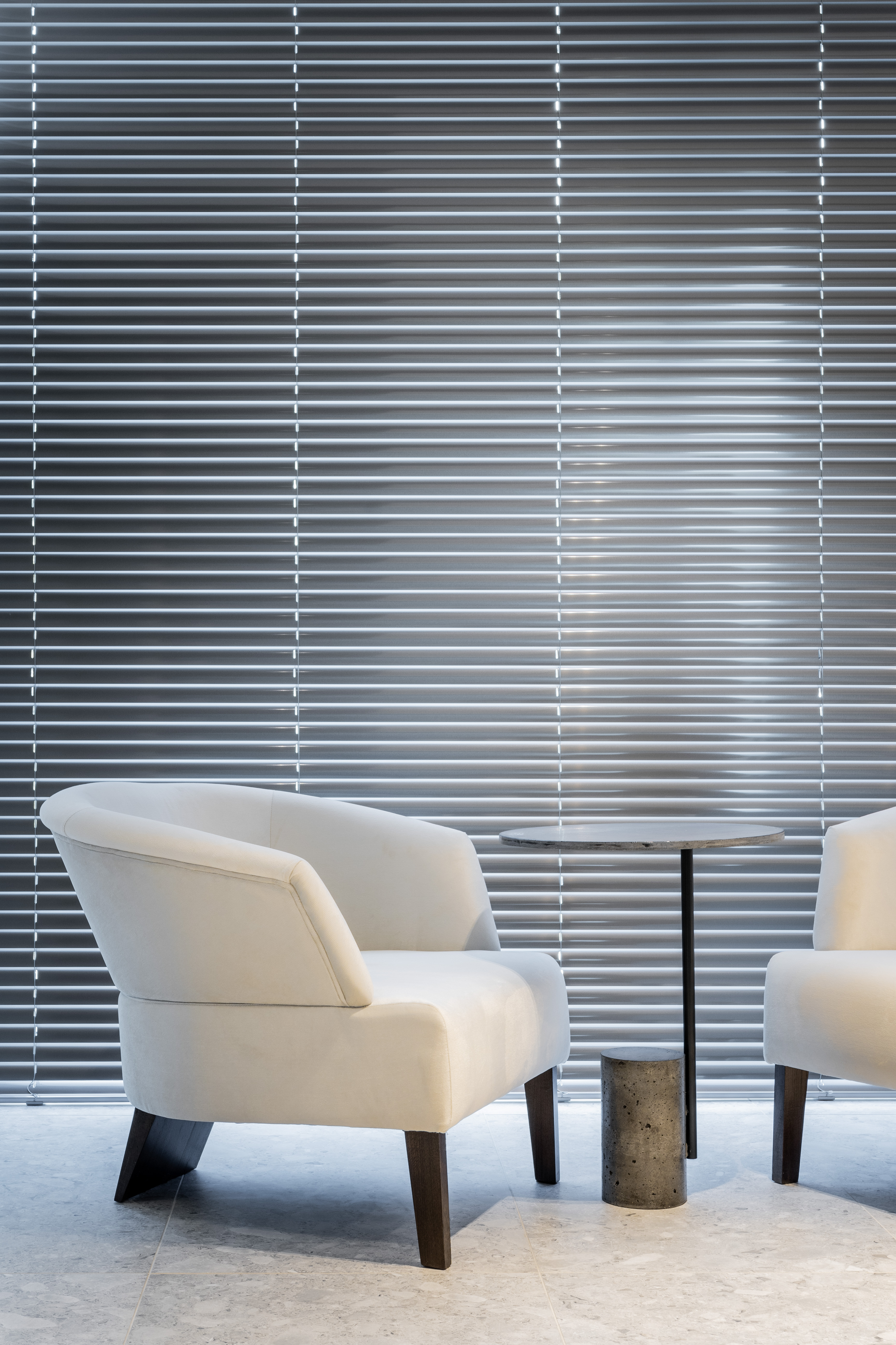
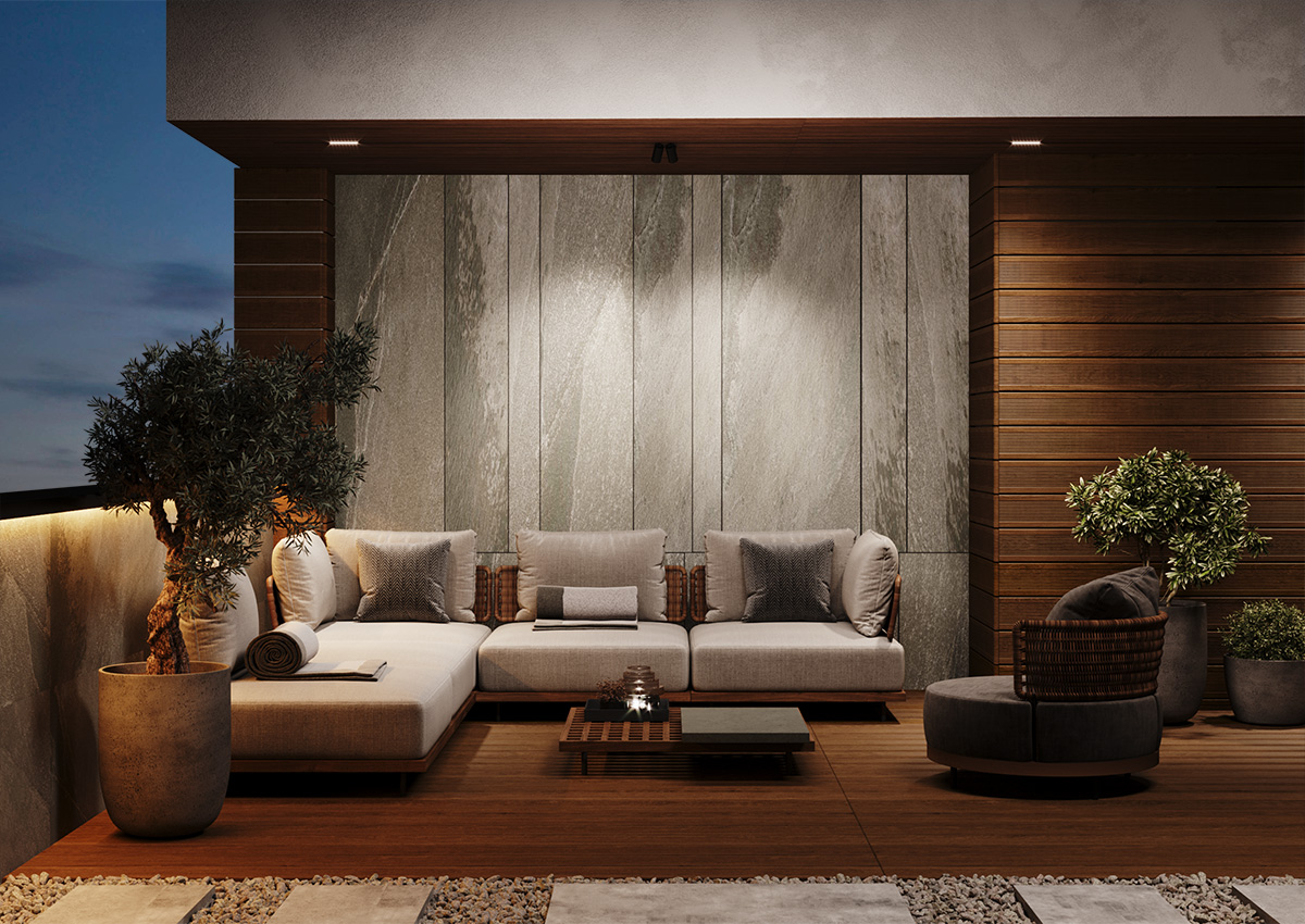
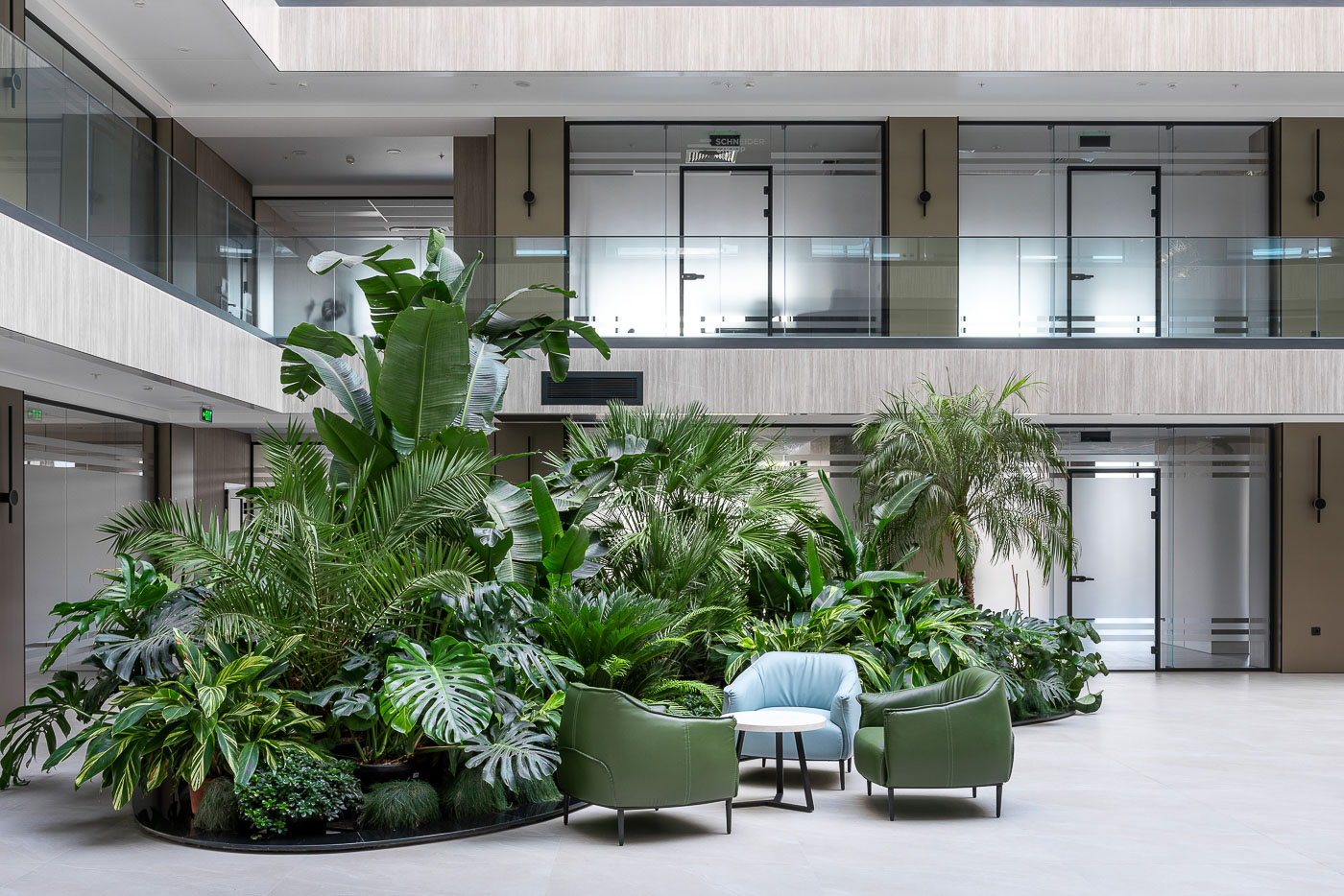
We have reserved space for waiting area in the open space offices. In addition to the functionality they offer, they have become small islands that diminish from the strictly business style, so the style on the 2nd floor has become an authentic central stylistic accent.
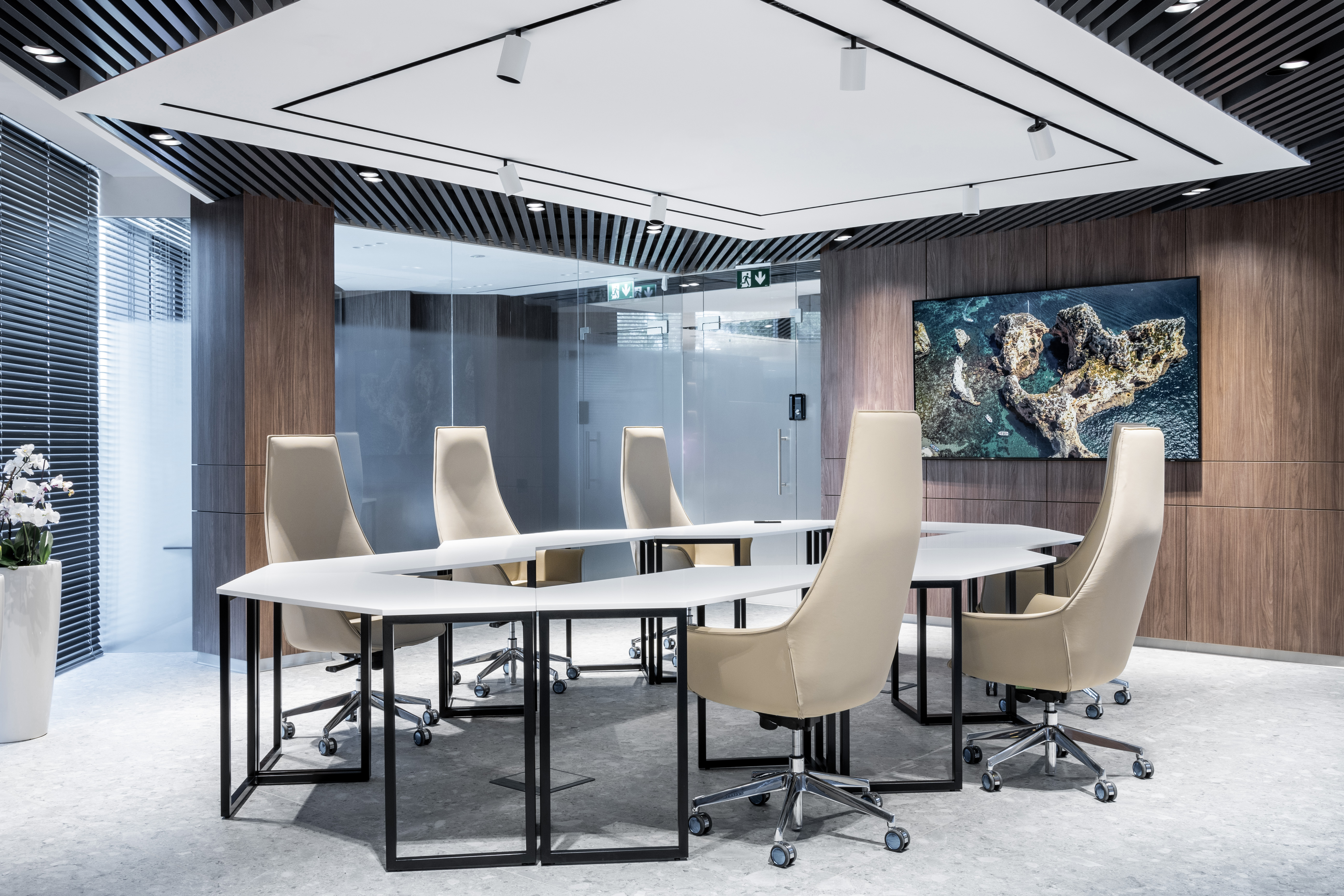
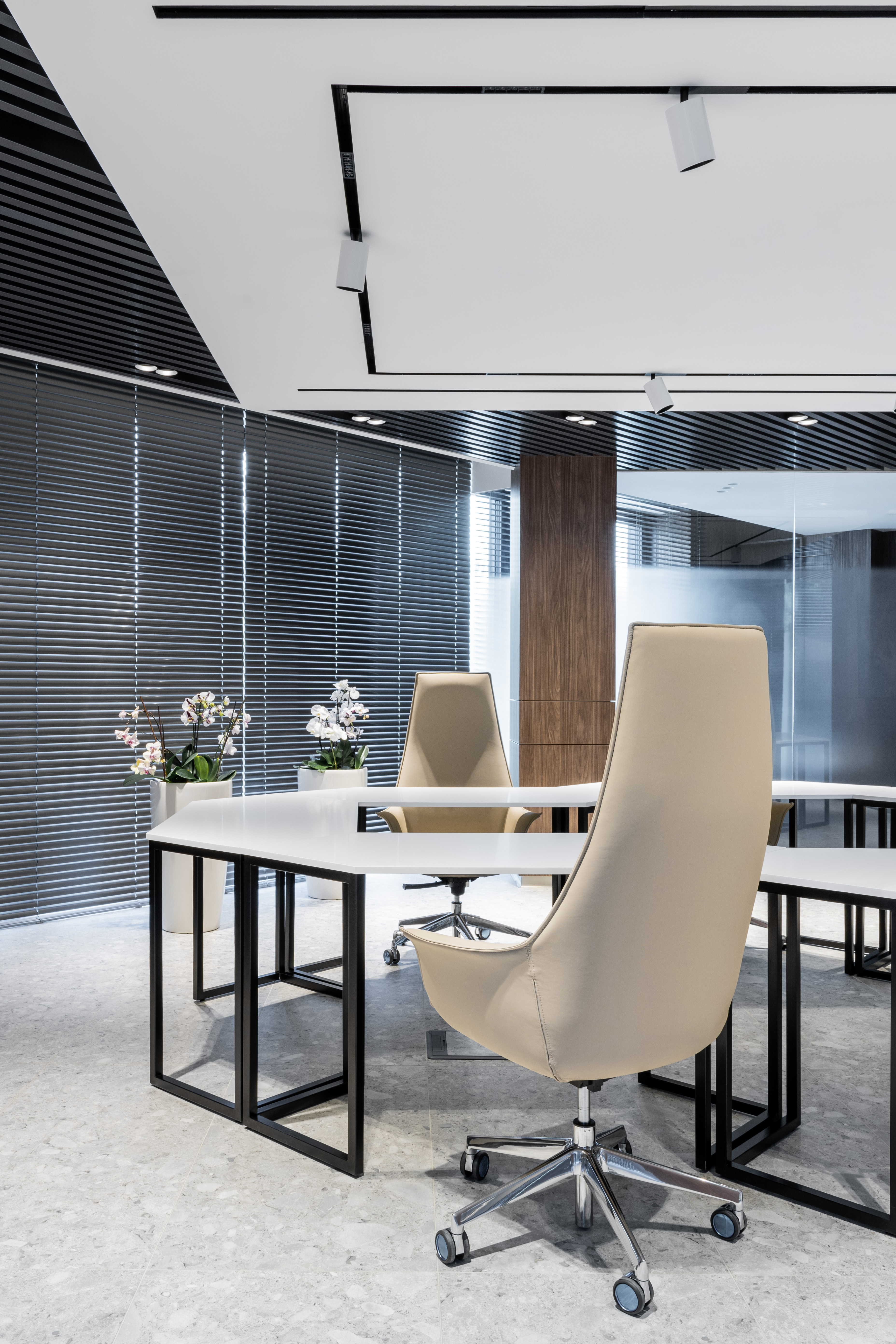
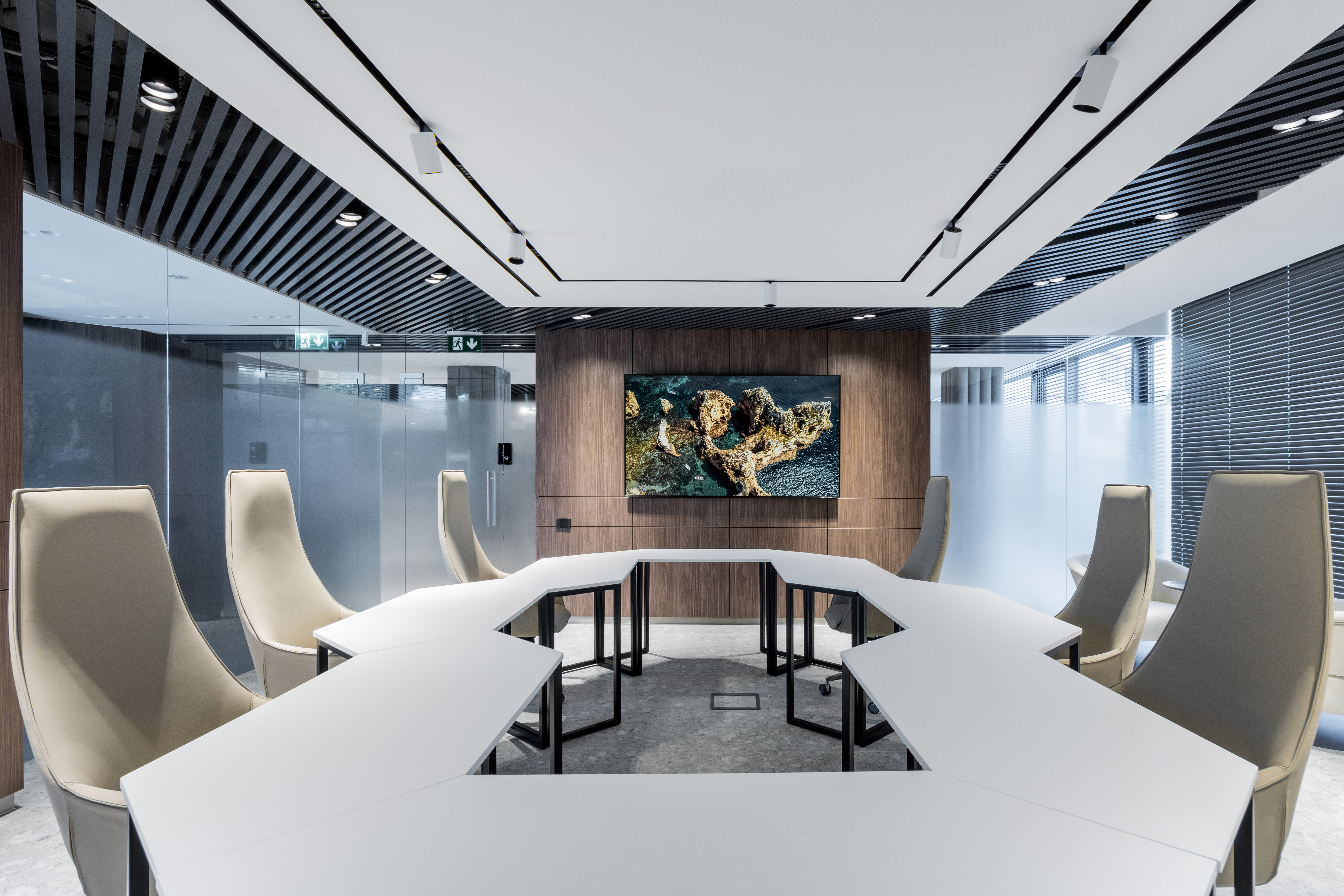
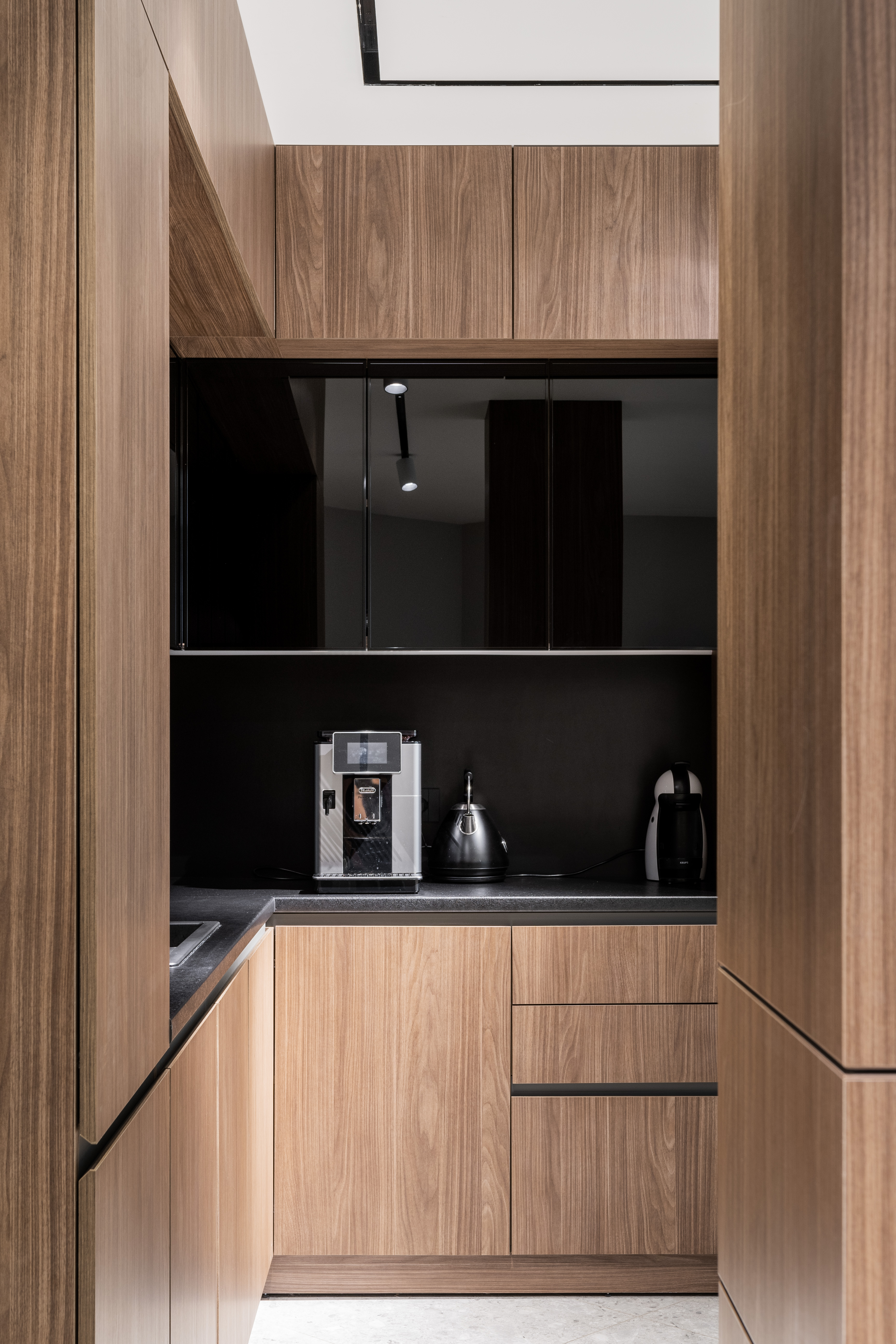
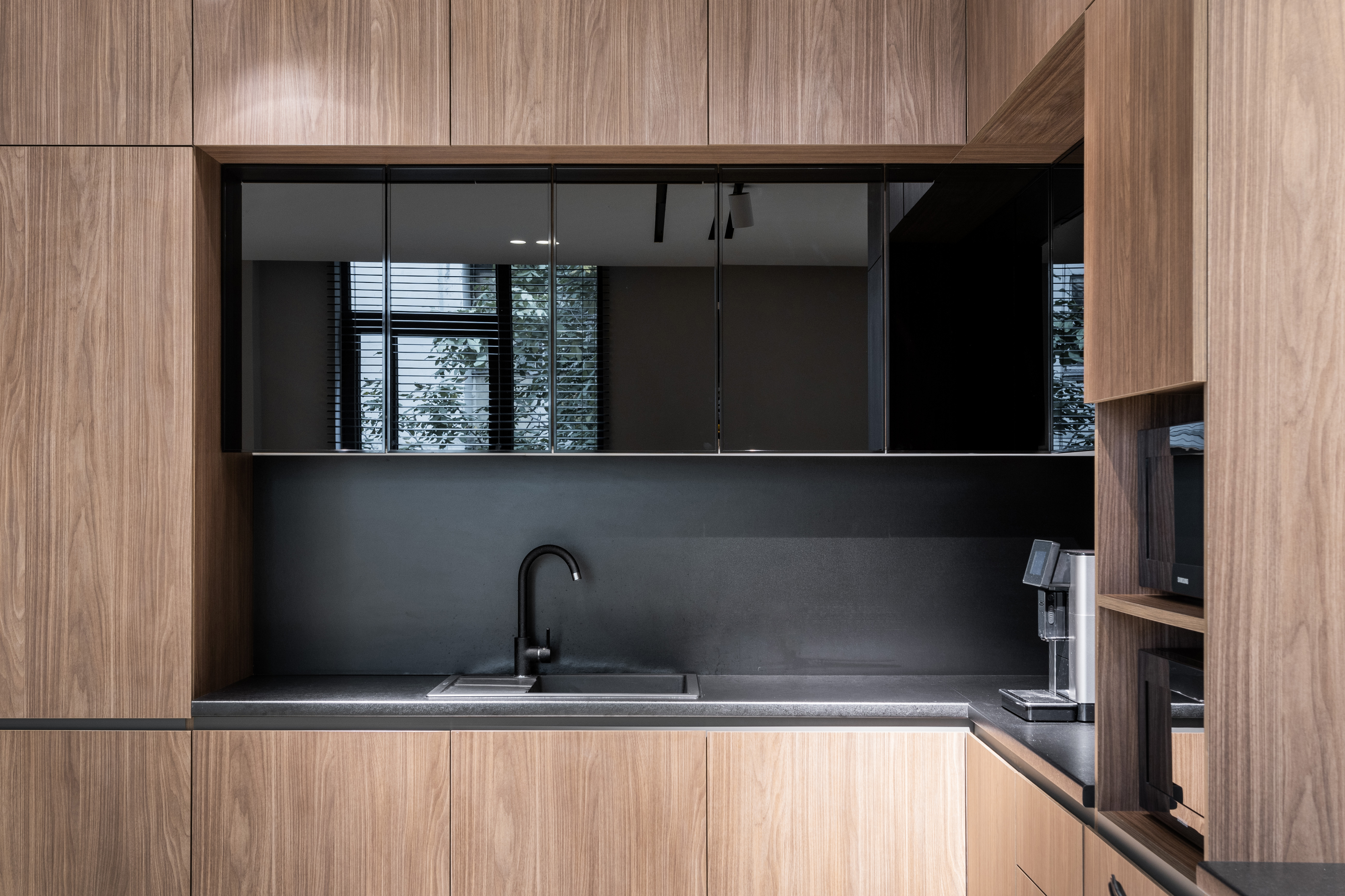
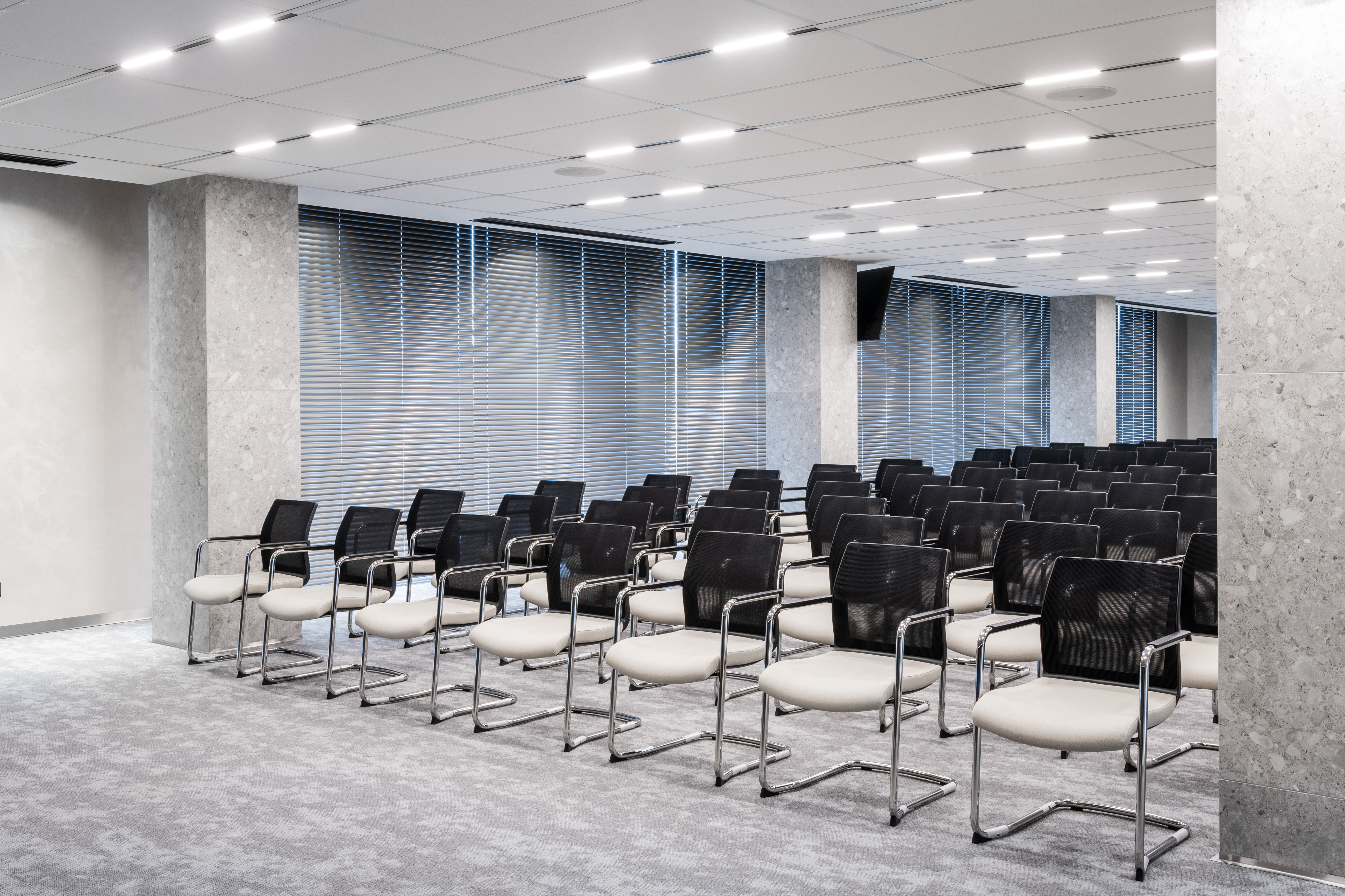
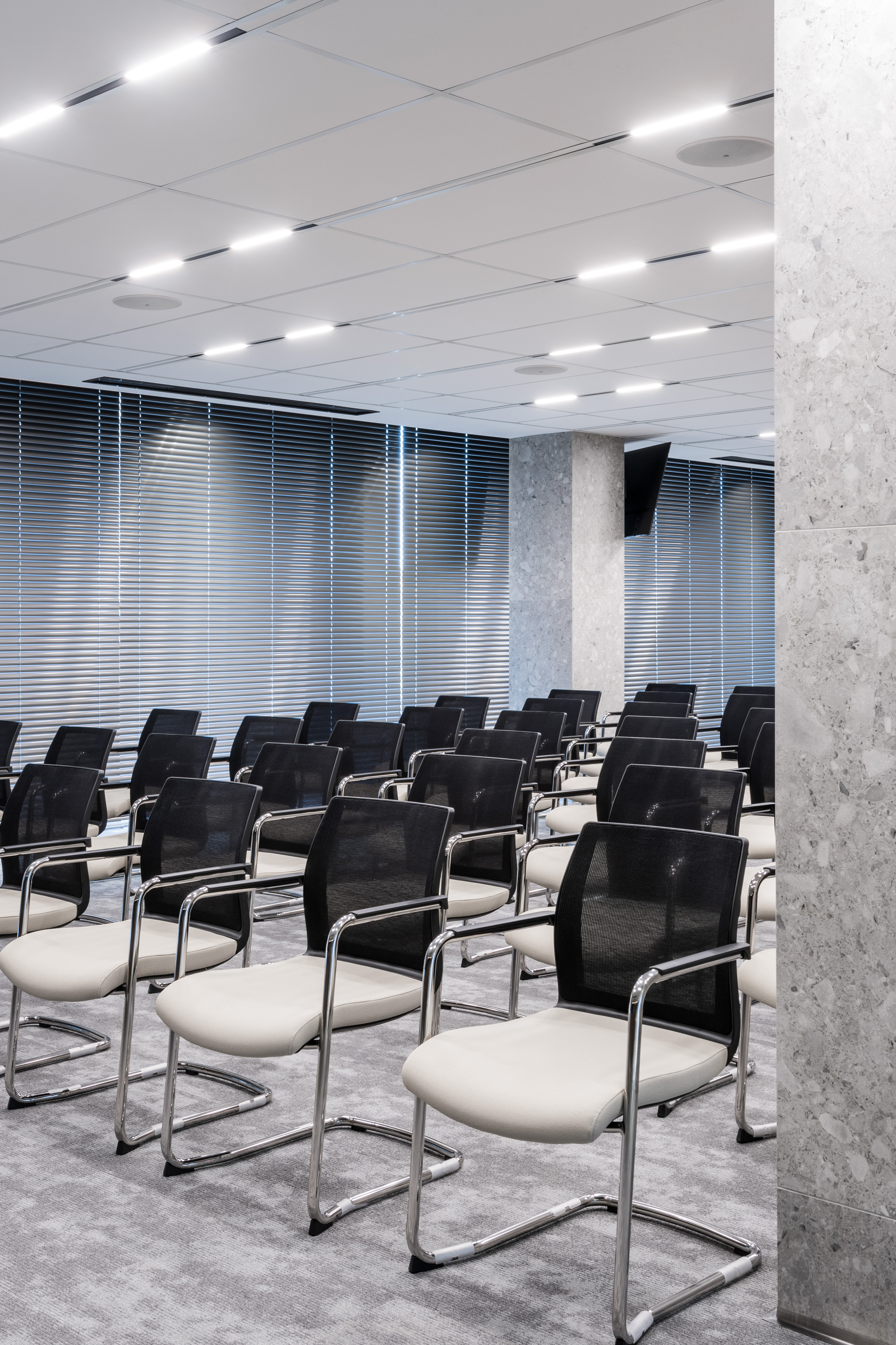
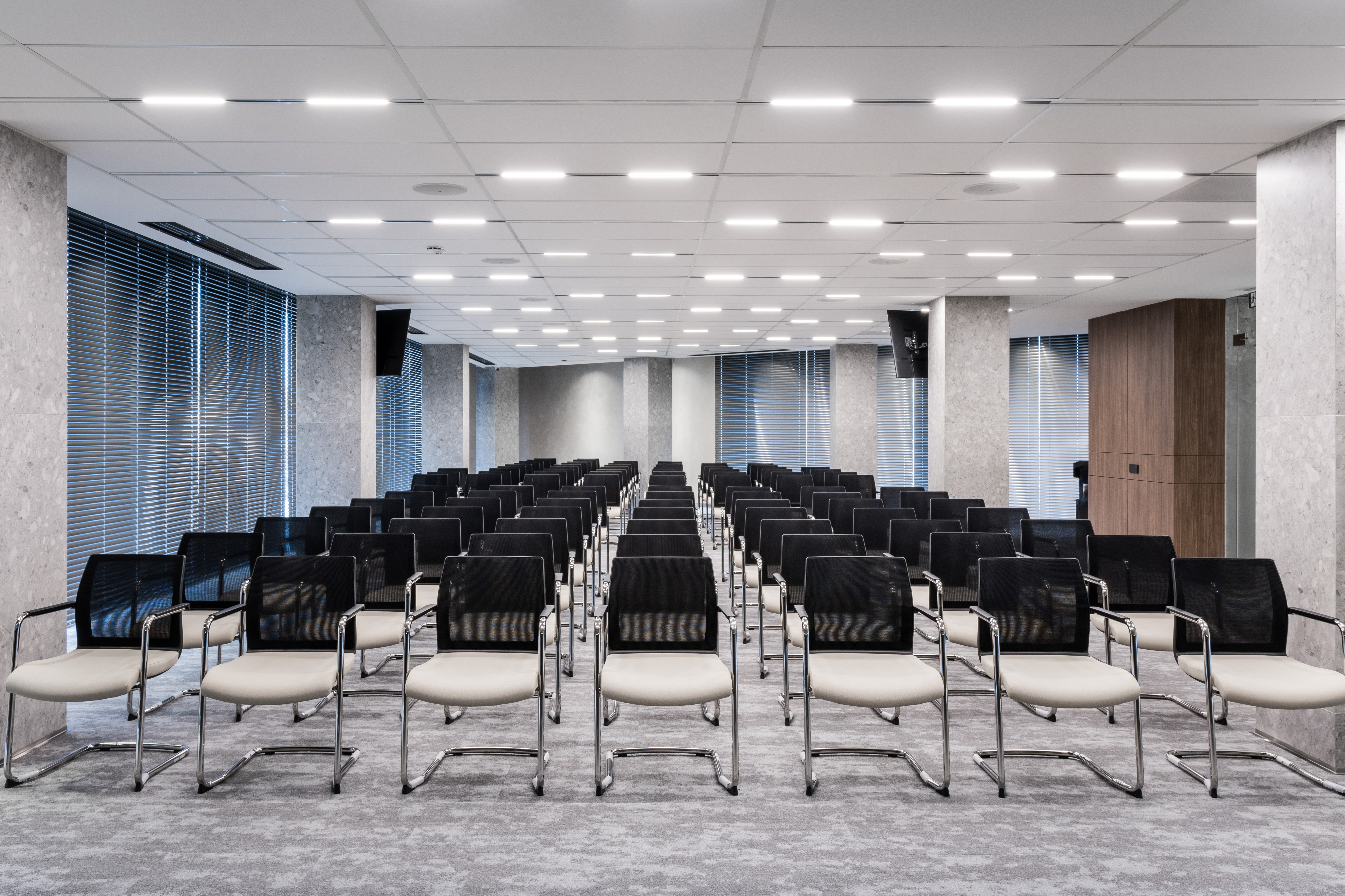
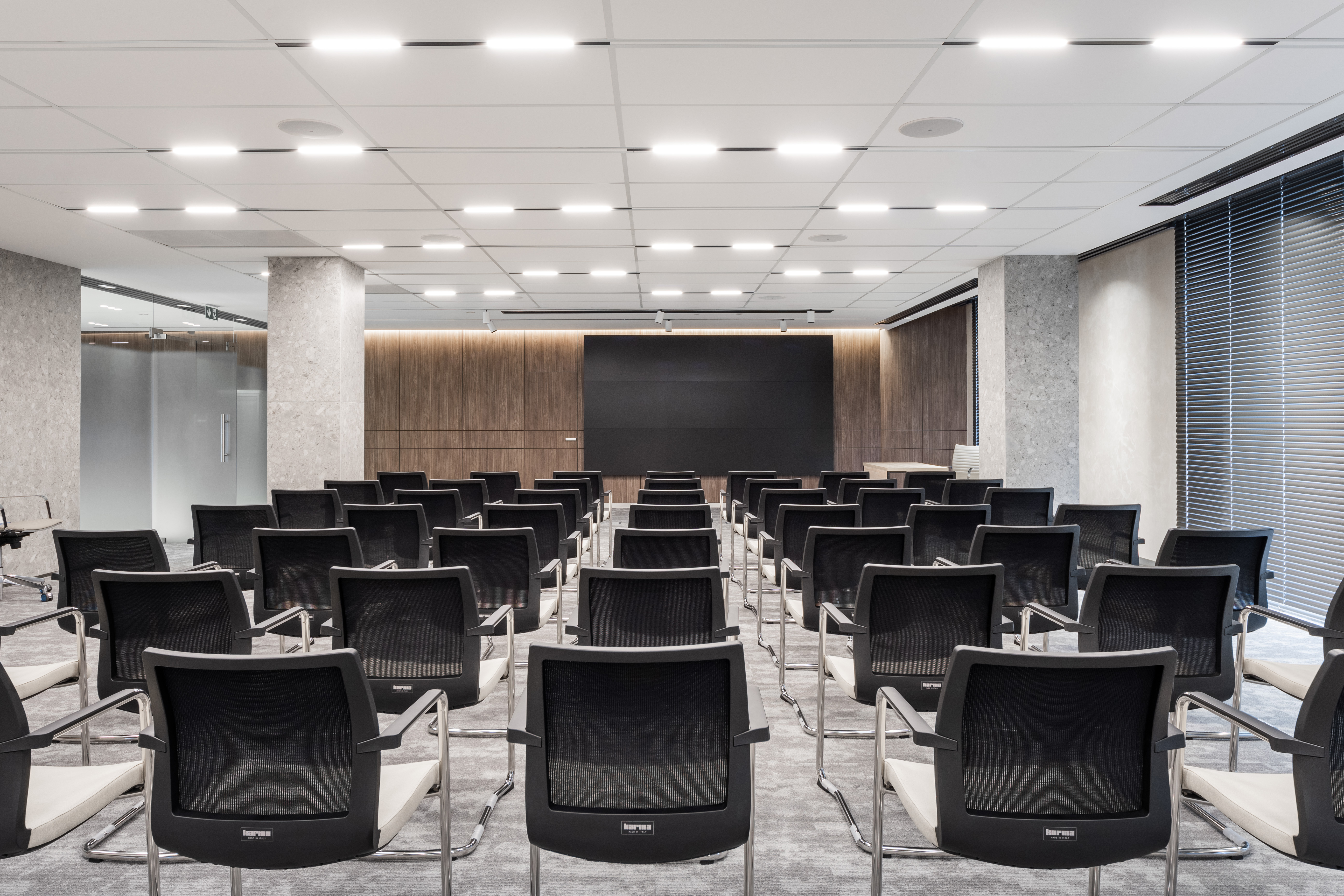
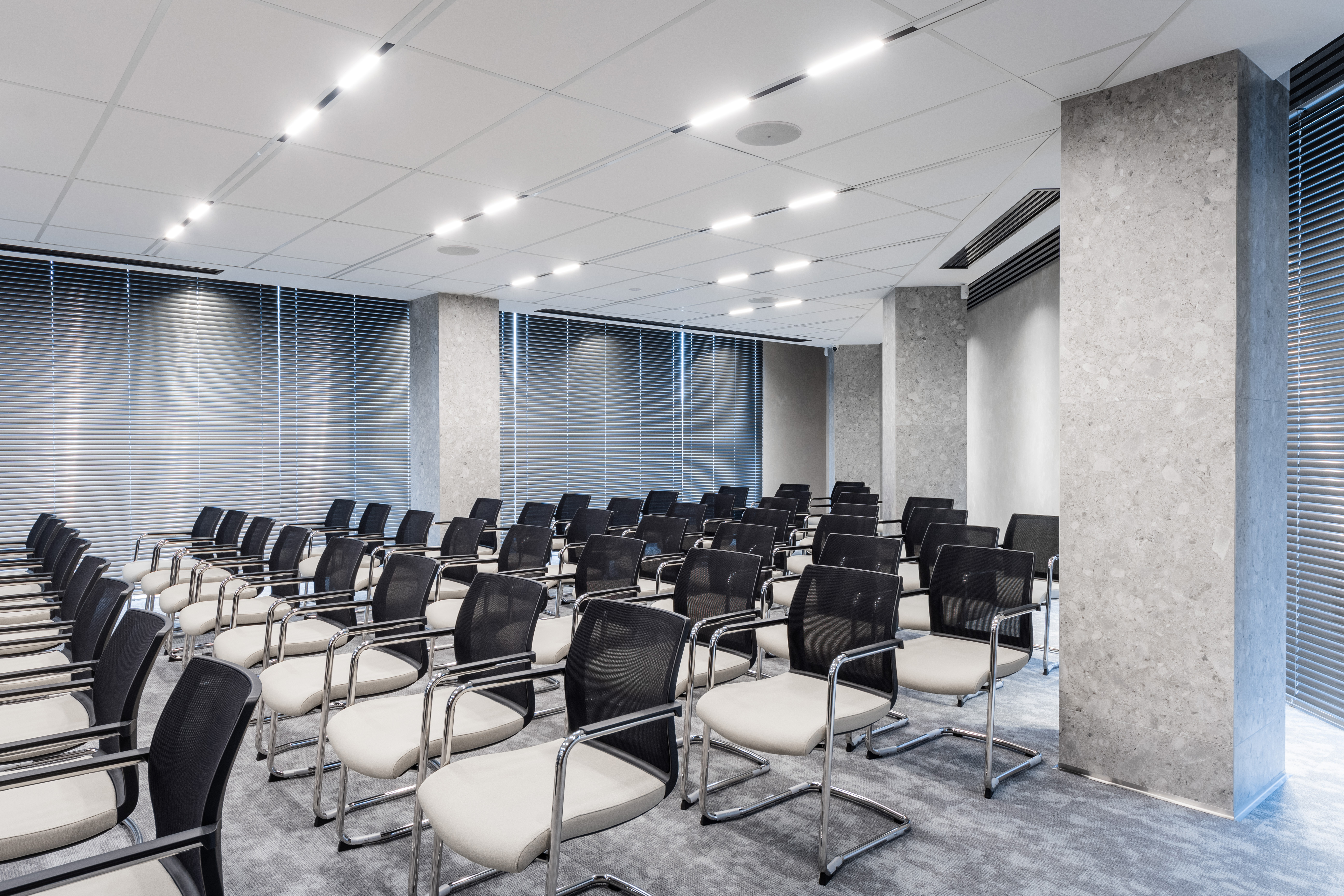
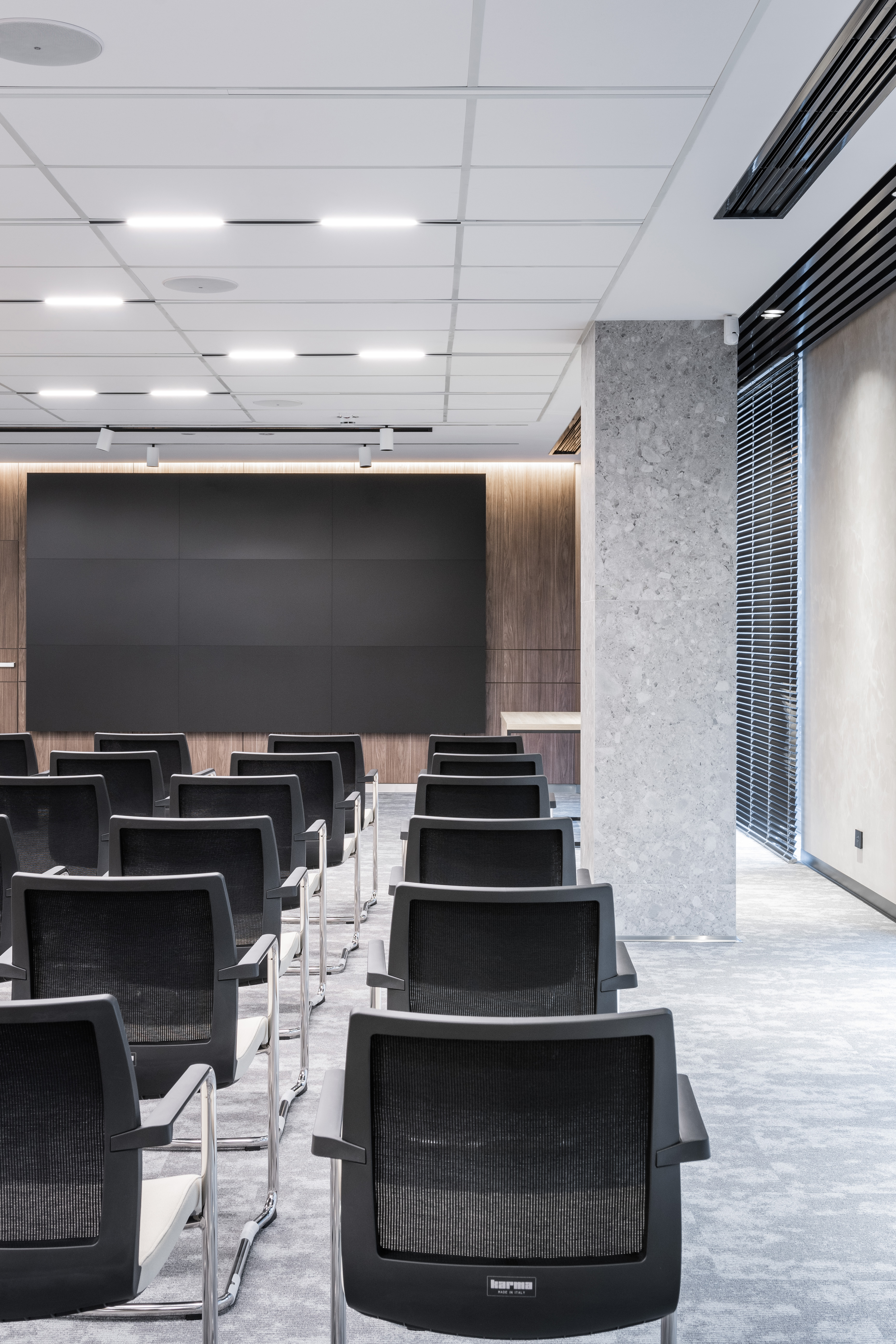
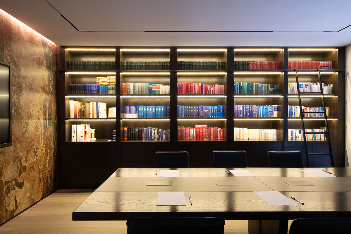
Having generous spaces, the 3 levels of common offices allowed us to arrange a conference room. The laconic lines were combined with warm materials, so we offered comfort to the rooms. We paid special attention to the furniture. In addition to the classic desk tables, we carefully selected the chairs and armchairs. In addition to the ergonomic aspect, which will guarantee the productivity of the employees, we also followed their aesthetic side. We deviated from the preconception that they must have dark shades to be practical and we opted for greige. Combined with elements of dark chromatic, the color gave a note of nobility to the space. The texture and warm shade of the wood enhances the feeling of comfort. Thus, we transformed the work space into an attractive one, perceived as an intimate and family one.
