Calmness, privacy and aesthetics are those three ingredients that complete the recipe for a harmonious interior of a restaurant. An interior design project with such a destination must combine comfortable atmosphere and the freedom of common premises. Beyond providing delicious dishes, the restaurants are meant to offer their visitors noble experiences, and the interior arrangement is essential to guarantee them.
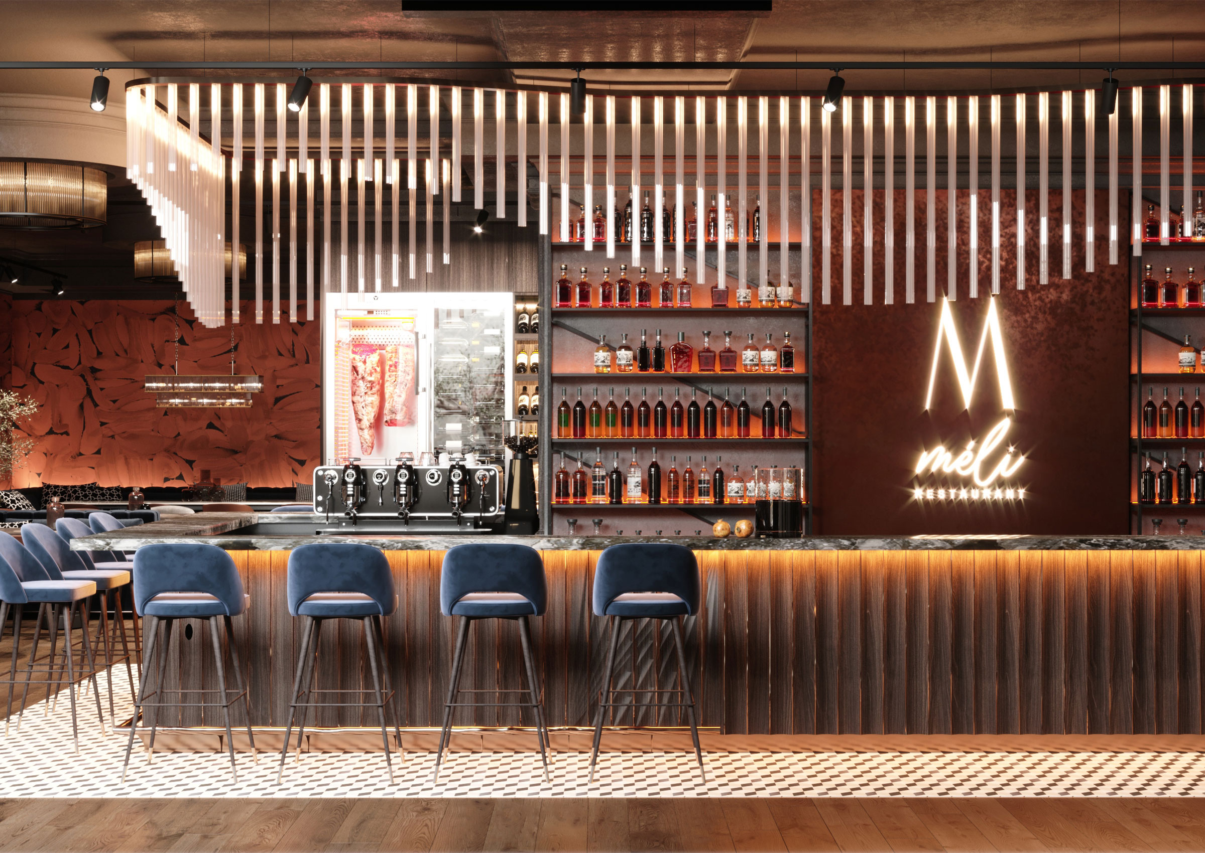
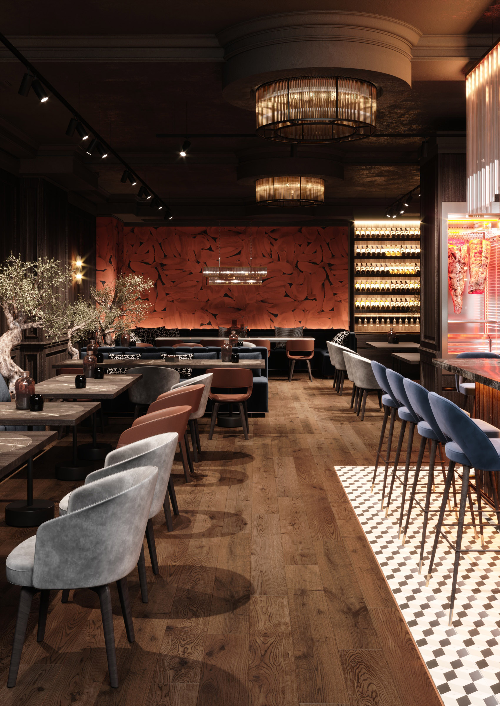
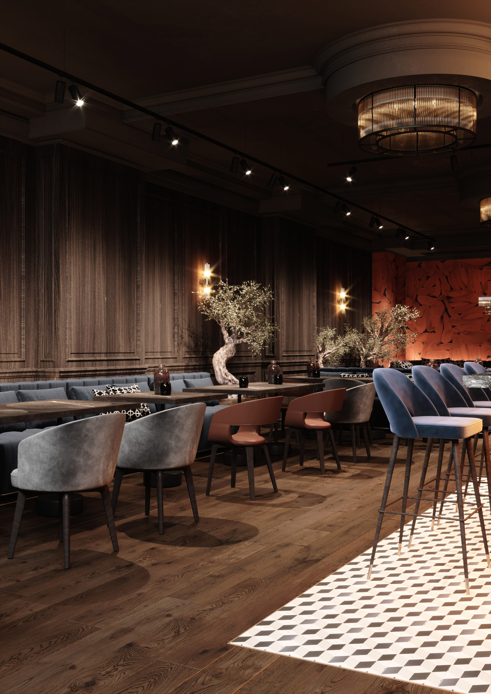
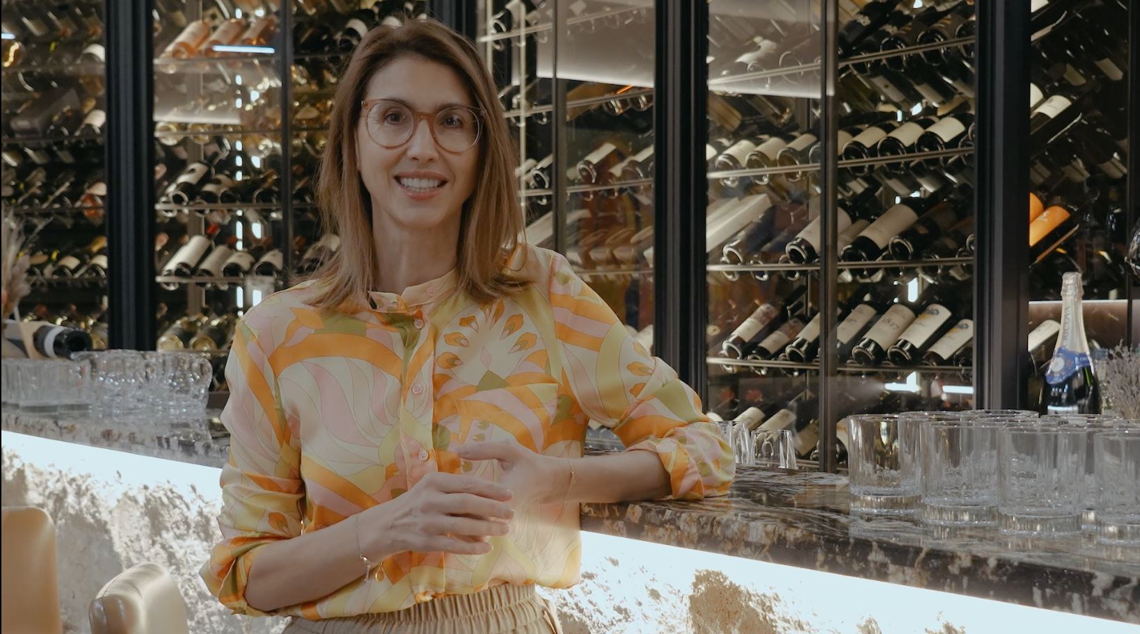
Everything matters: from the logic of creating the flux of visitors to the tiny accents. In the case of the project presented below the zoning offers ephemerality to the space. We have created a generous bar area that allows visitors to approach from three sides. At the same time, due to it, we avoided the impression of overcrowding and also provided ease of movement, that is, the functionality of the premise. At the aesthetic level, we relied on a balance between warm atmosphere and the play of colours. We have used a lot of wood inside, both as a finishing material on the floor and as plywood on the walls. We avoided the chromatic monotony and the uniformity of colours of furniture items. Although we kept the intensity of colours and the hues, we have created a combination of brown, grey and blue. The lighting also brought its contribution to the creation of a special atmosphere. We have created such a scheme of lighting arrangement that helped to provide illumination of the surrounding space, making it functional, but at the same time with certain accents.
Last but not least, the premise should impress. In order to achieve this goal, we relied on details. The lighting fixtures provide a linear geometric play of light and become not only functional elements of the interior, but also a real embellishment of it.
