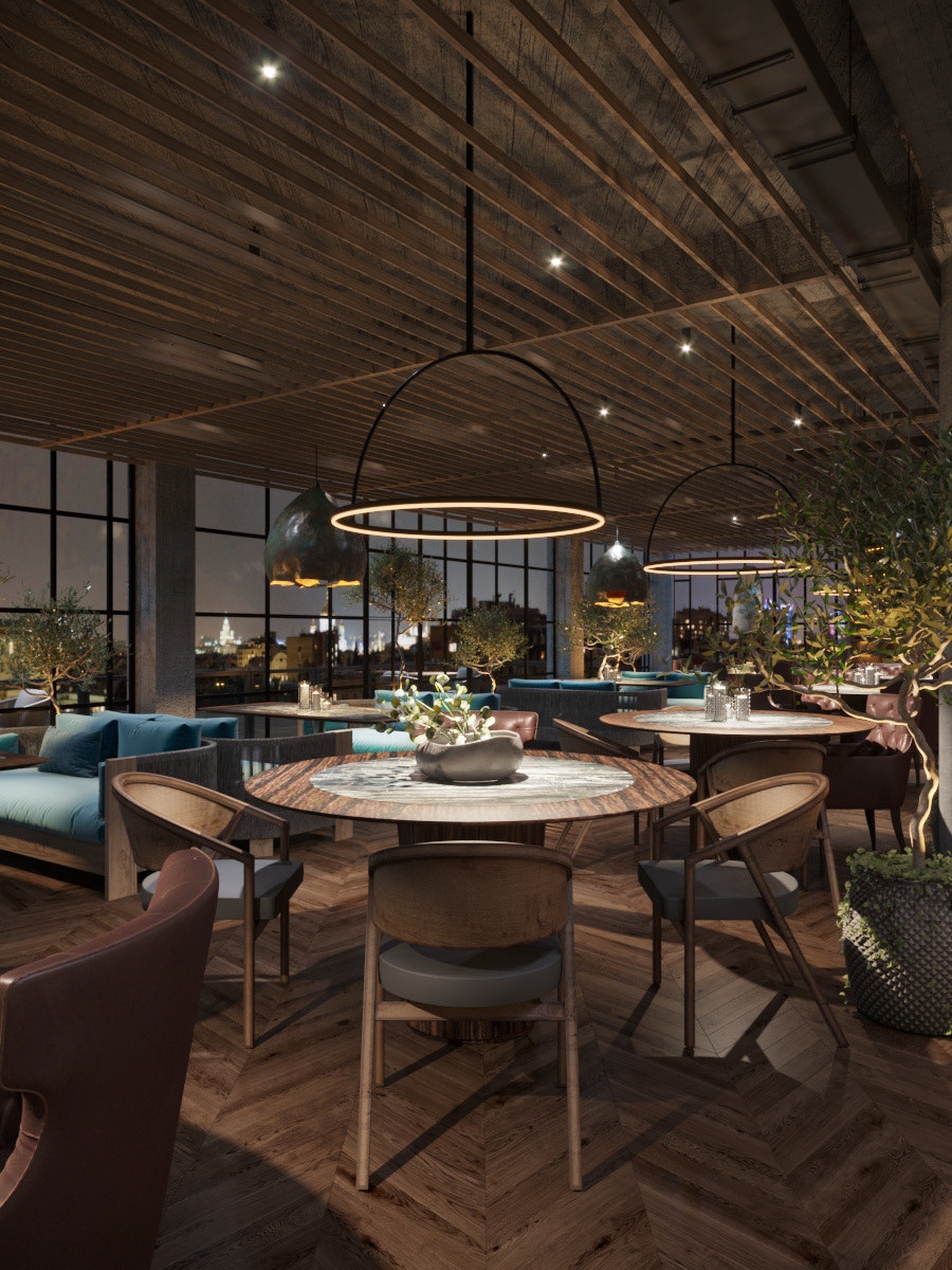
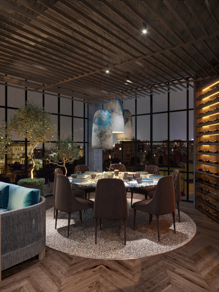
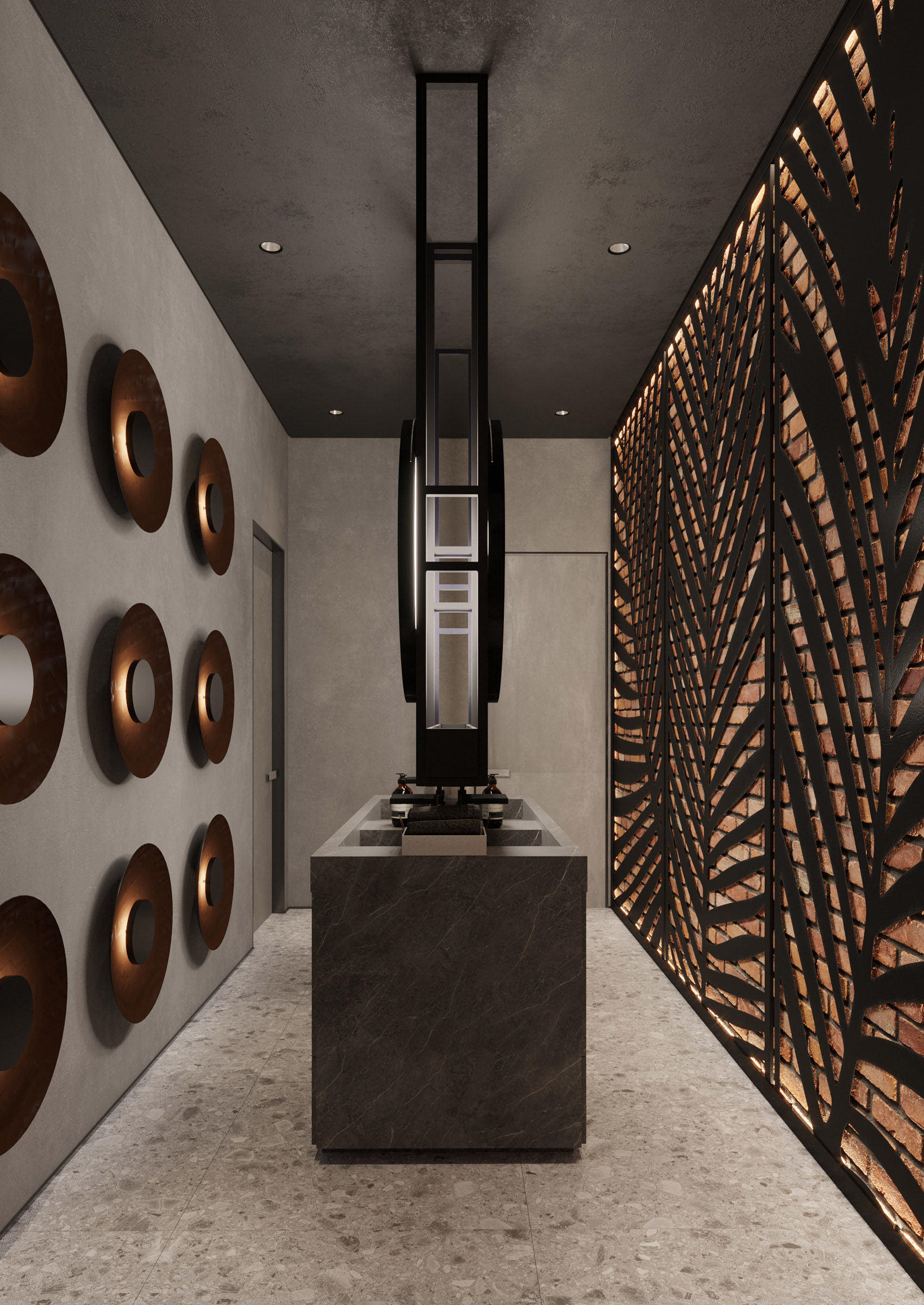
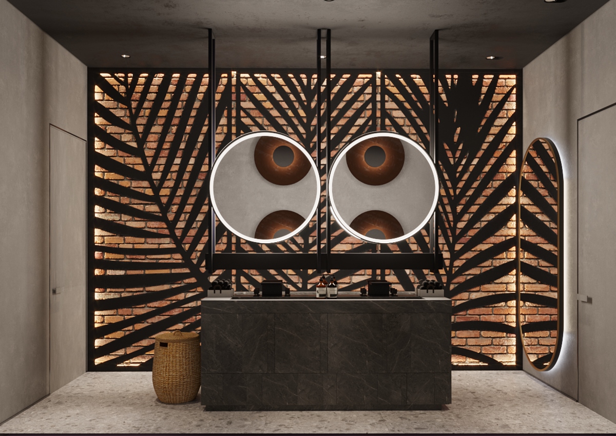
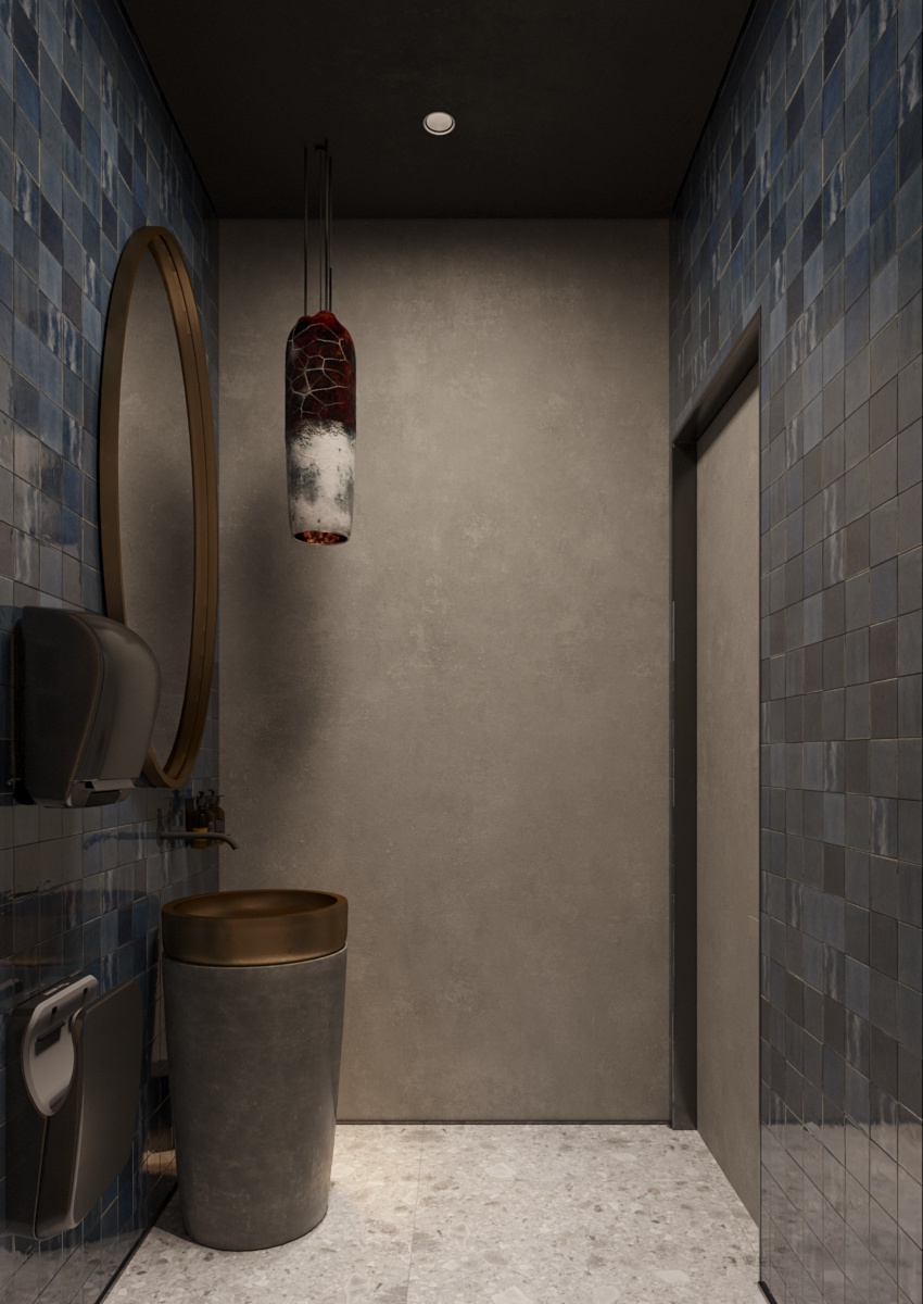
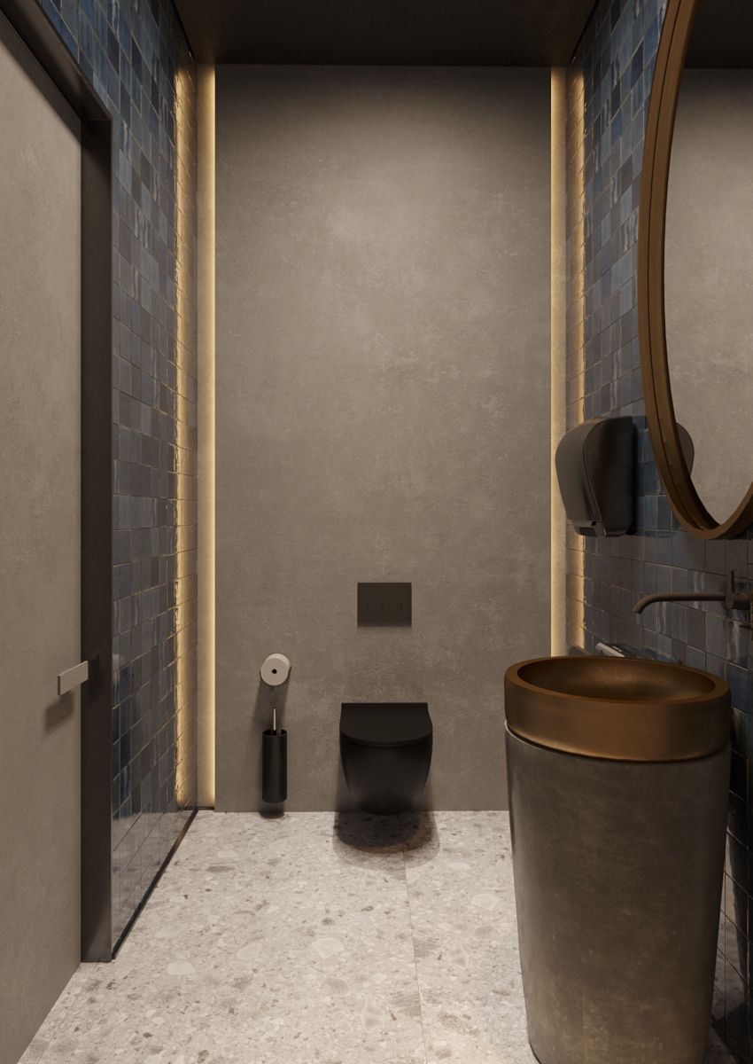
It is one of the cases in which we have given up minimalism in favour of creativity that is emphasized at all levels. We opted for furniture that creates a feeling of antagonism, where simplicity gives nobility to the interior.
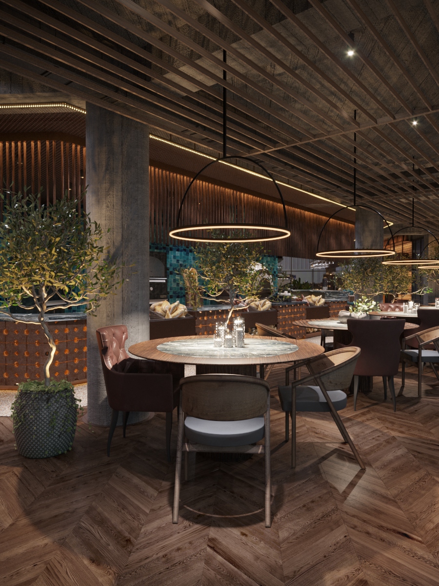
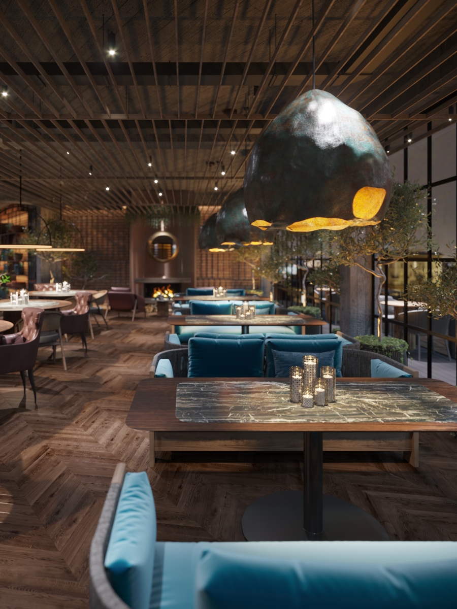
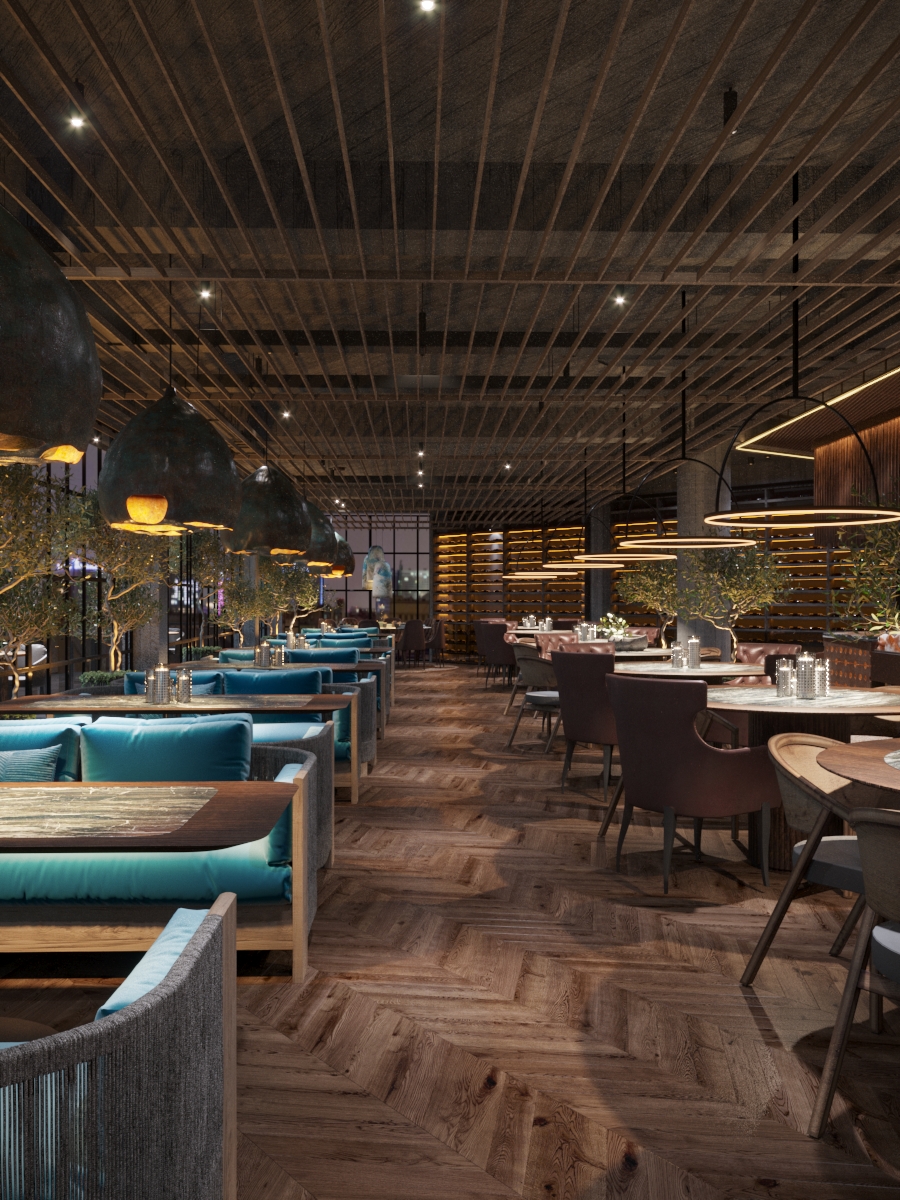
It’s no secret that zoning plays a crucial role in an interior design project of a restaurant. In our case, we opted for zoning using the furniture. Thus, on the one hand we have circular tables with chairs upholstered in the hues of brown, on the other – rectangular tables accompanied by chairs upholstered in turquoise colour, which follows the leitmotif of the colour accent of the restaurant.
We paid special attention to the lighting. Here we relied on diversity to ensure balance, but also on a special aesthetics. Some areas have been embellished with massive chandeliers, which become accents worthy admiring, others – with laconic lighting fixtures, which come as a contrast to the former ones.
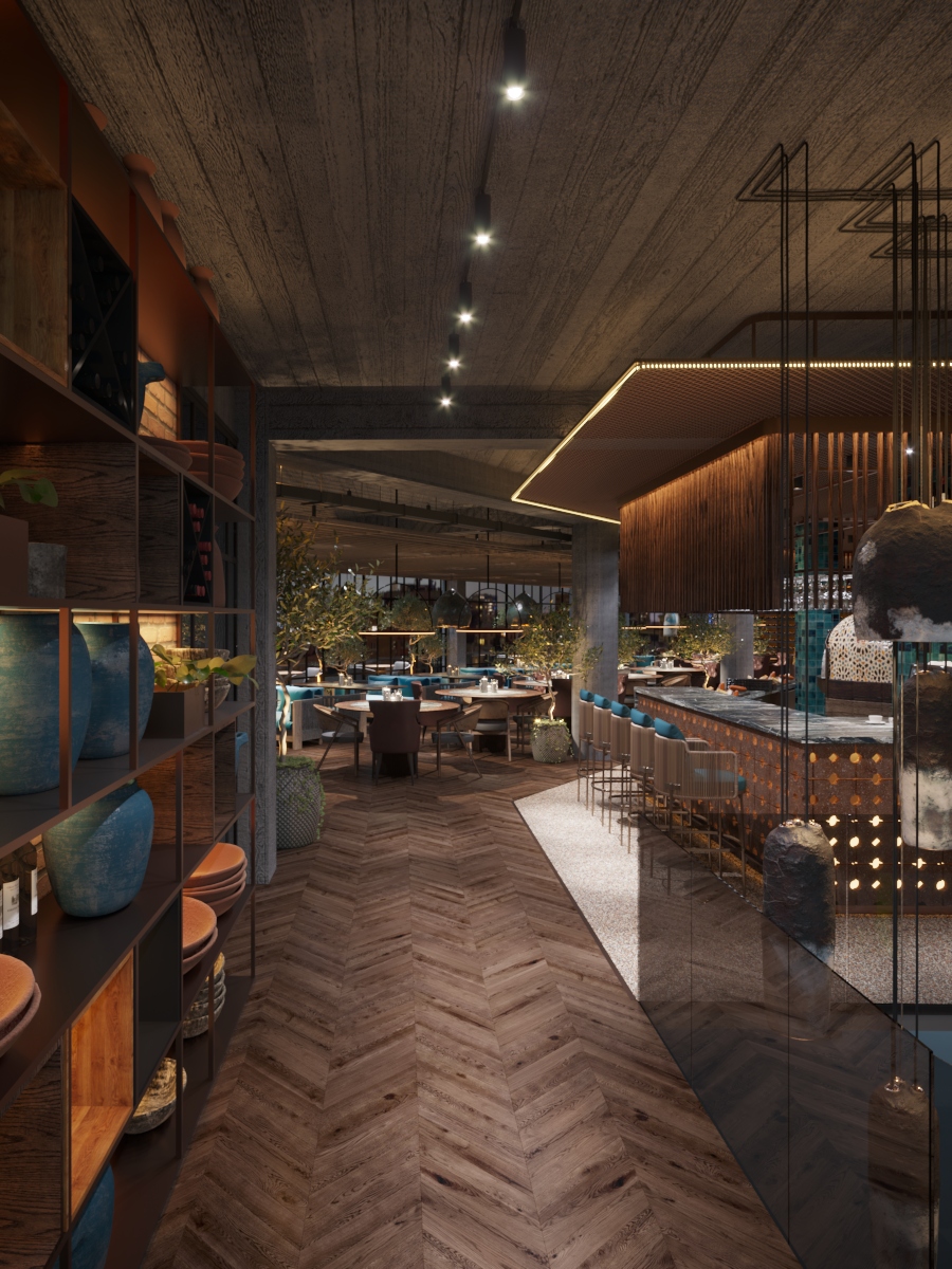
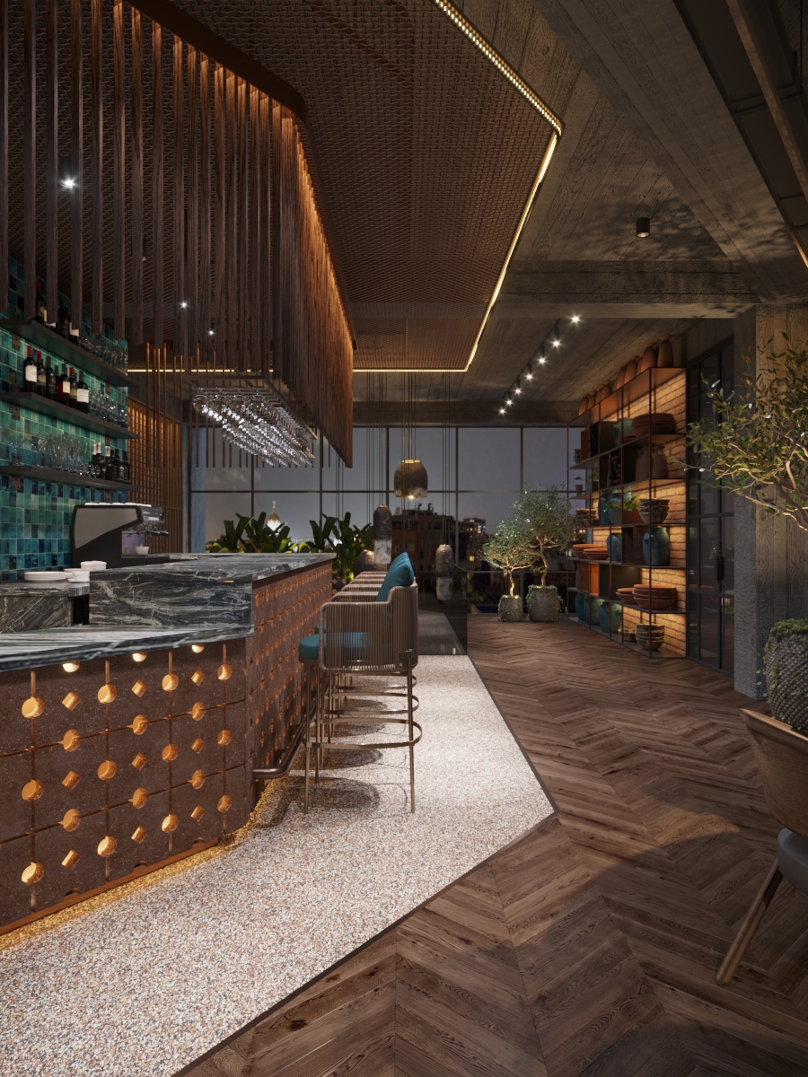
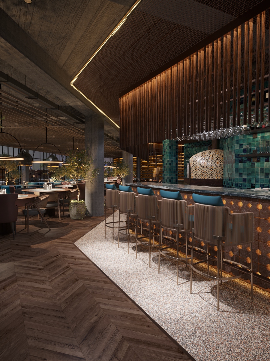
The open type kitchen not only reveals the process of preparing the dishes, but also the colour nuances meant to liven up the bar area. The mosaic on the walls offers a chromatic play of turquoise, being perfectly completed by the oven also covered with small ceramic elements, but in lighter colours.
As finishing materials, we relied on the brutality of the concrete, which we combined with a lot of wood. The interior was completed with living plants diminishing the sobriety of the finishing. Large windows let the light flood the interior giving it ephemerality and transparency.
