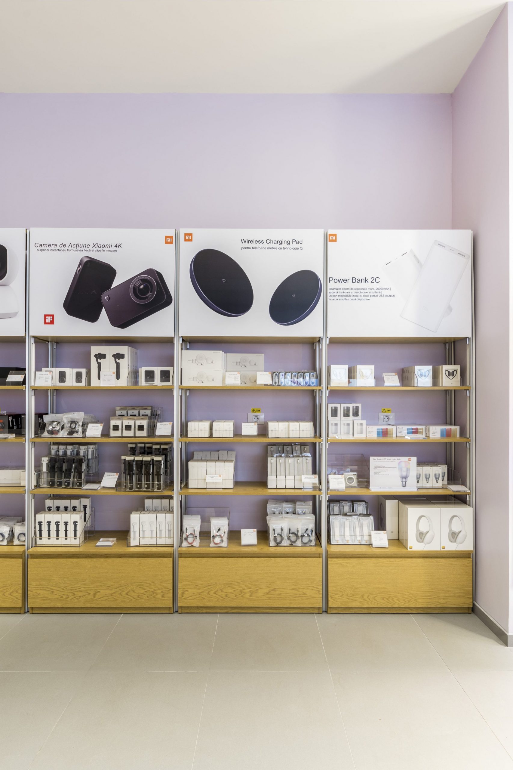
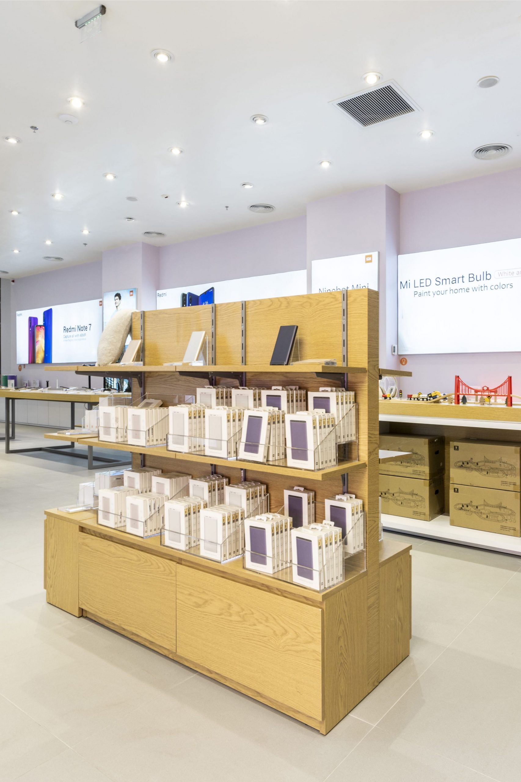
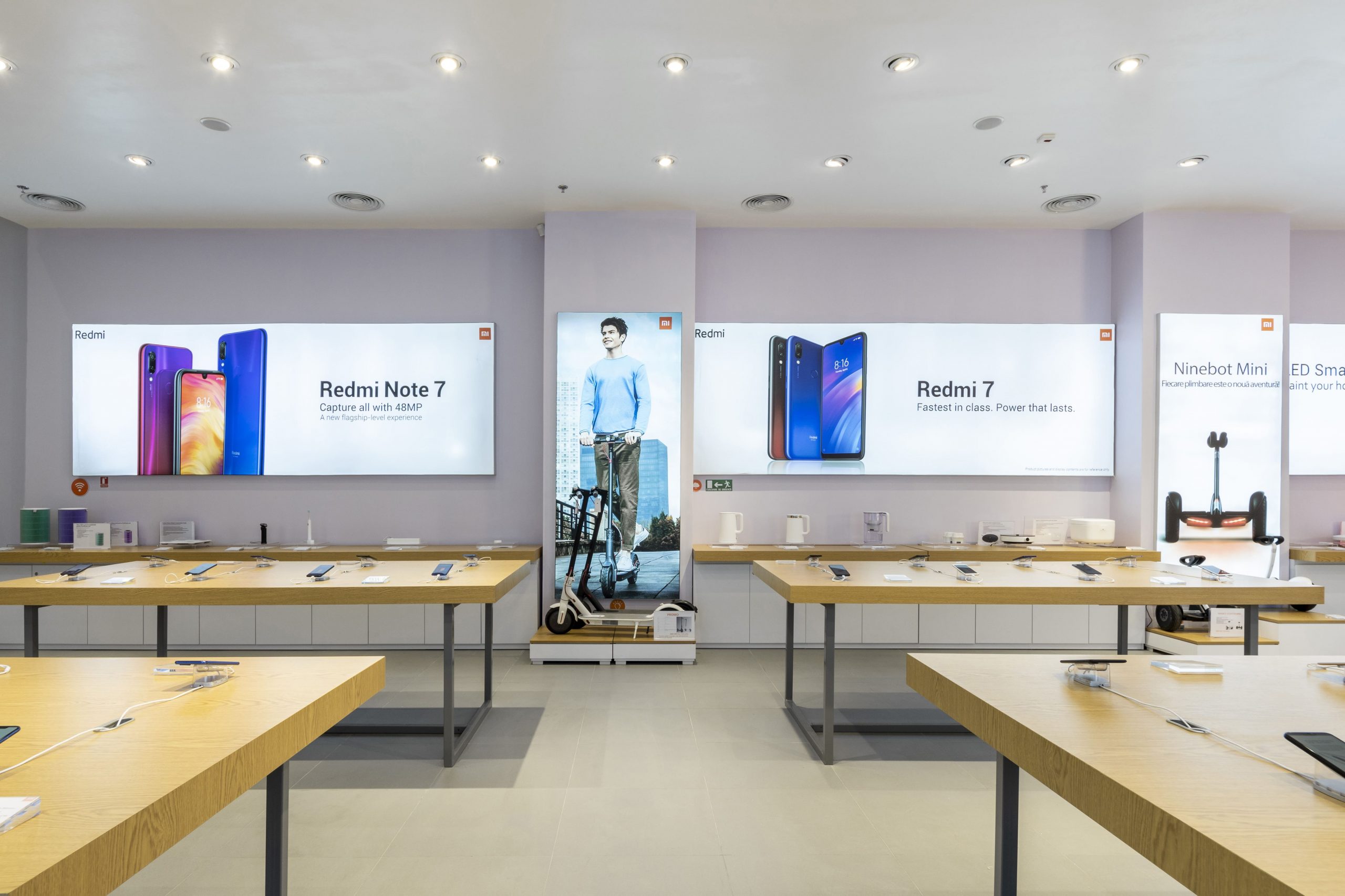
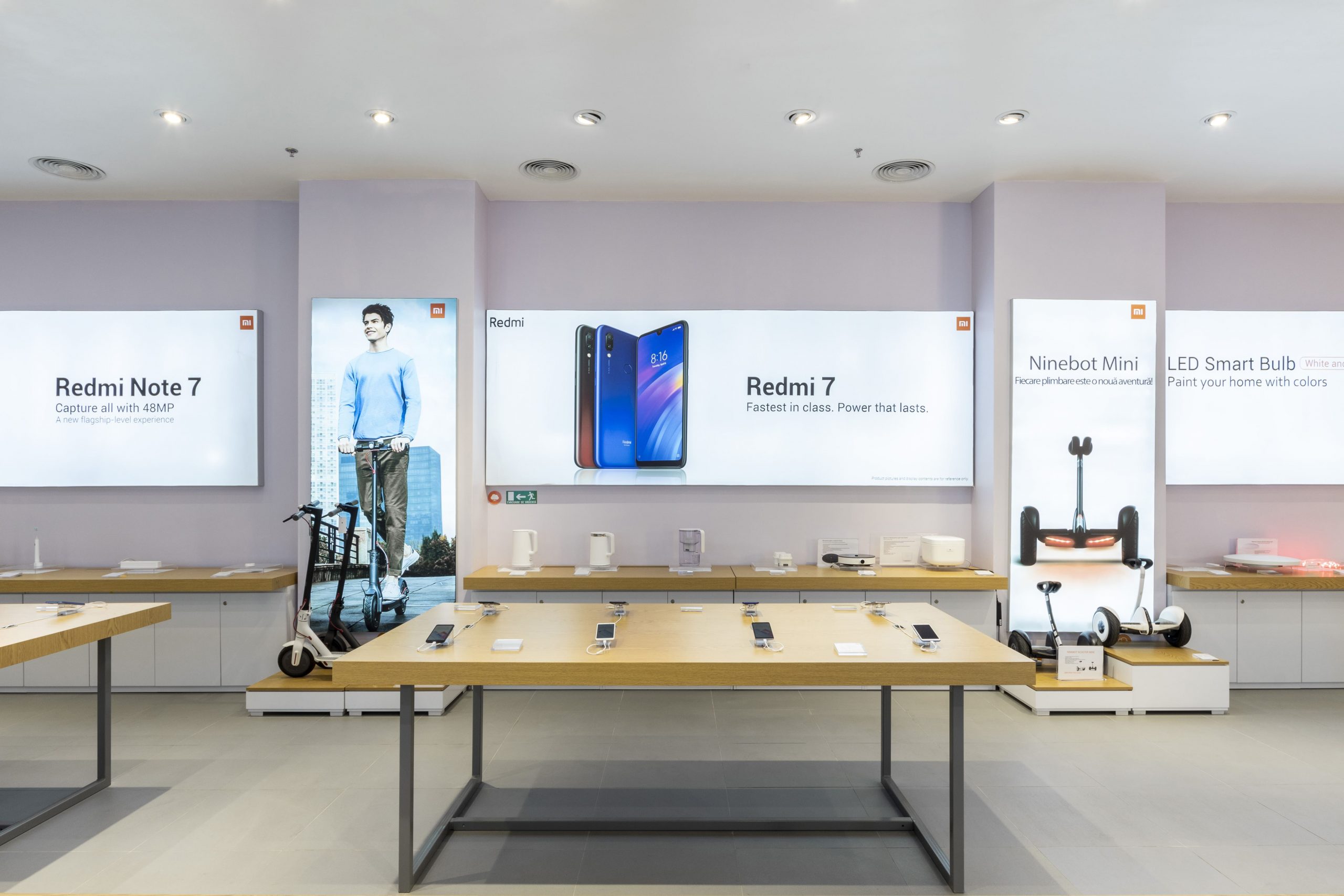
To create an interior taking into account clear rigours seems to be a piece of cake, but there is a great challenge in this process: the originality should fall within the constrains. This was the case of Xiaomi store, the arrangement of which had to correspond to the minimalist style imposed by the brand and present throughout the entire network.
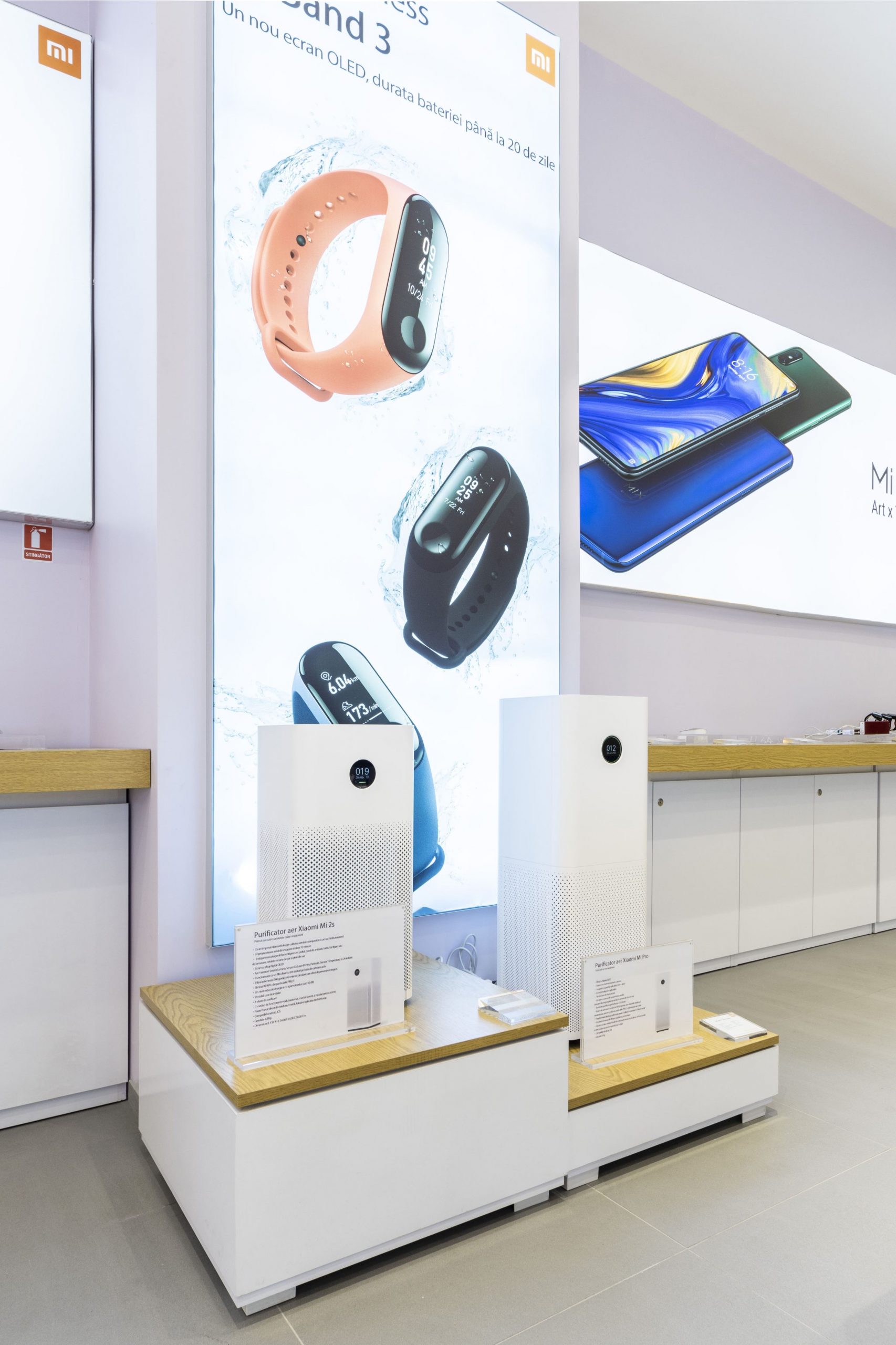
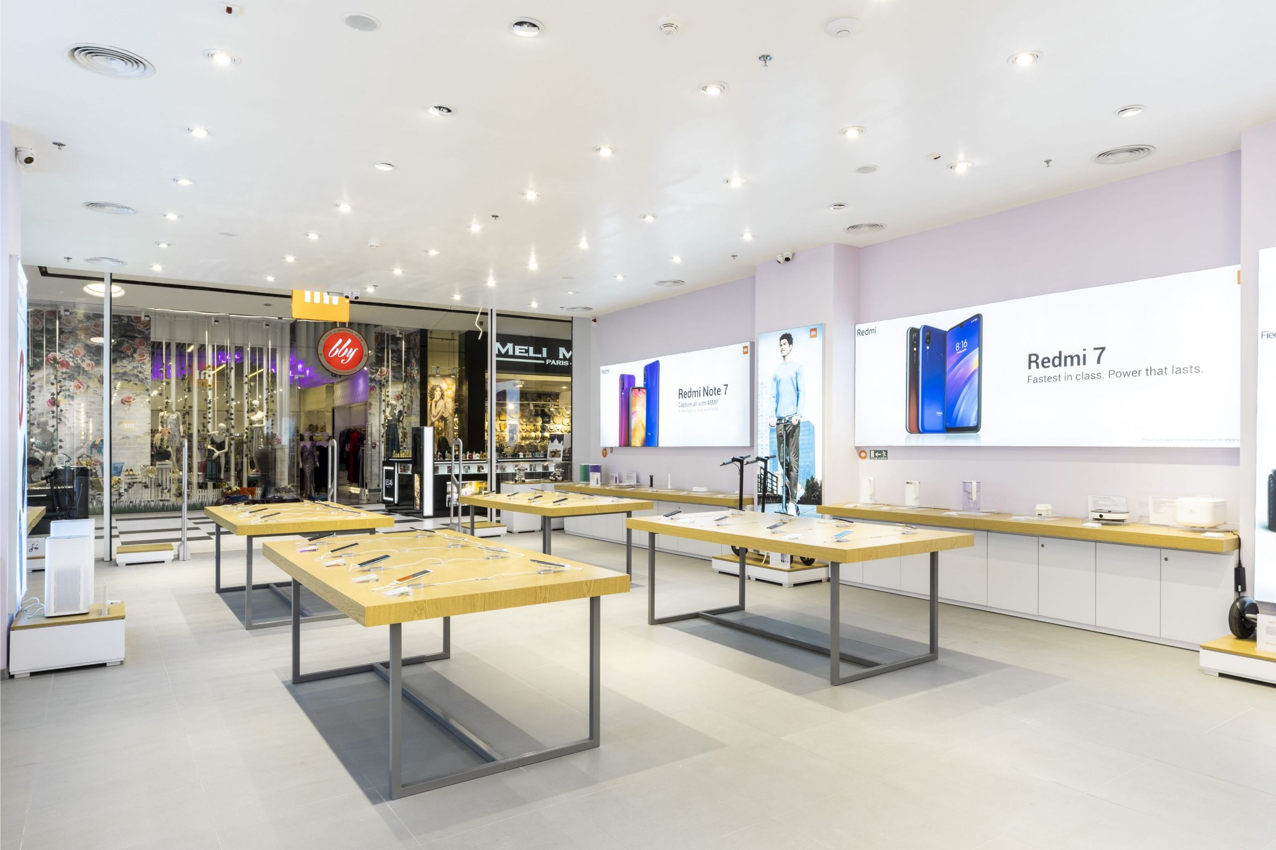
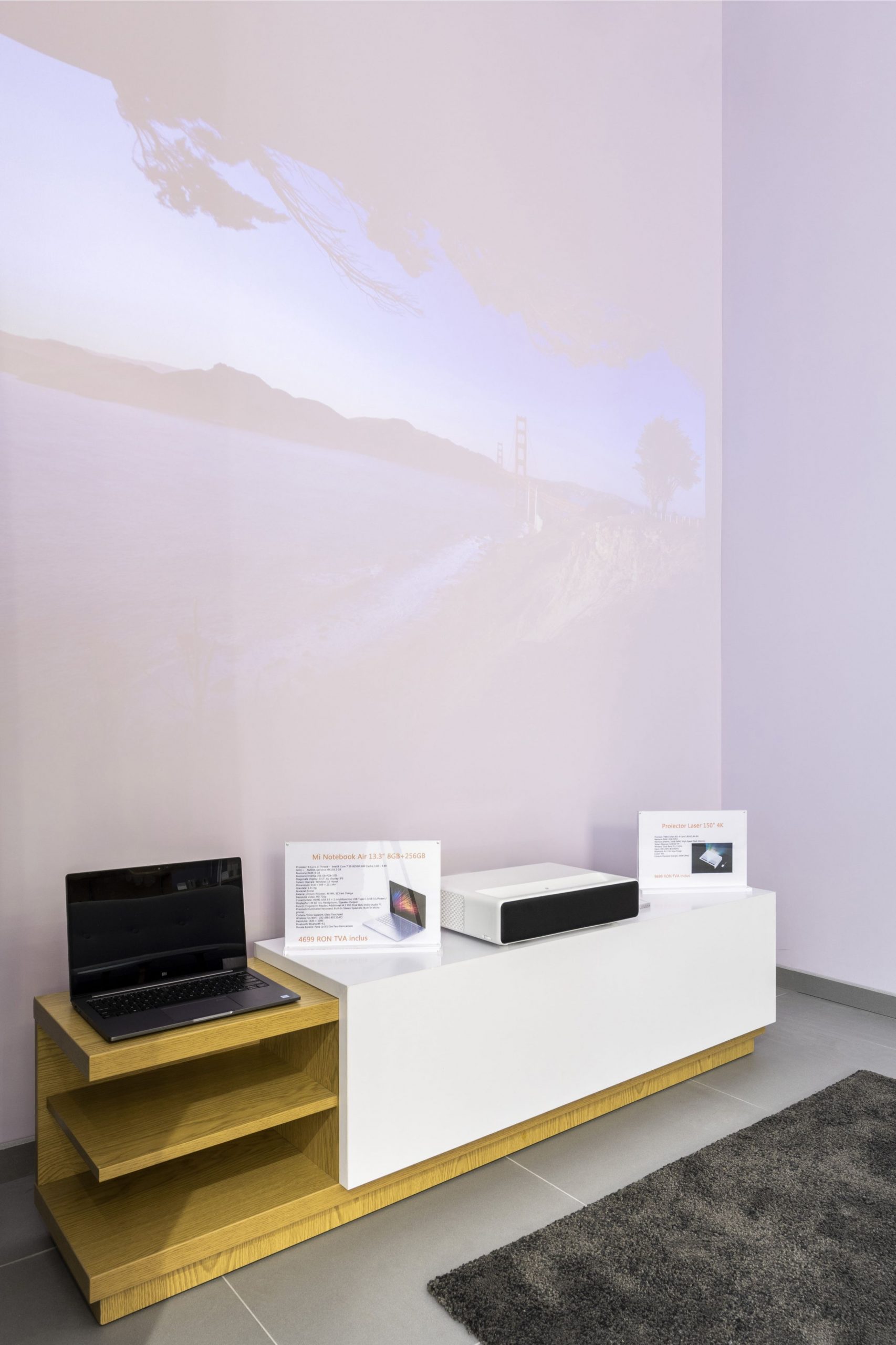
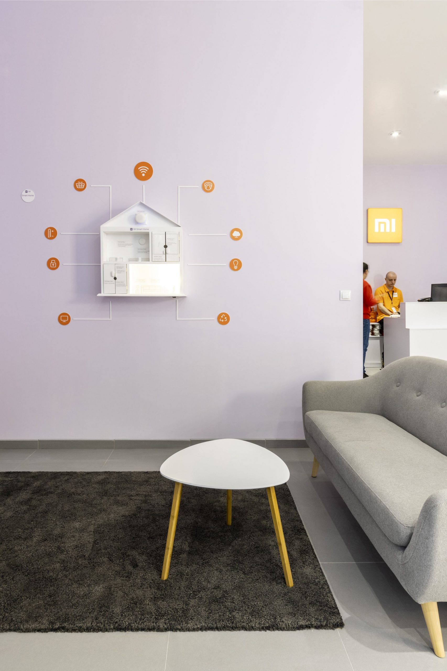
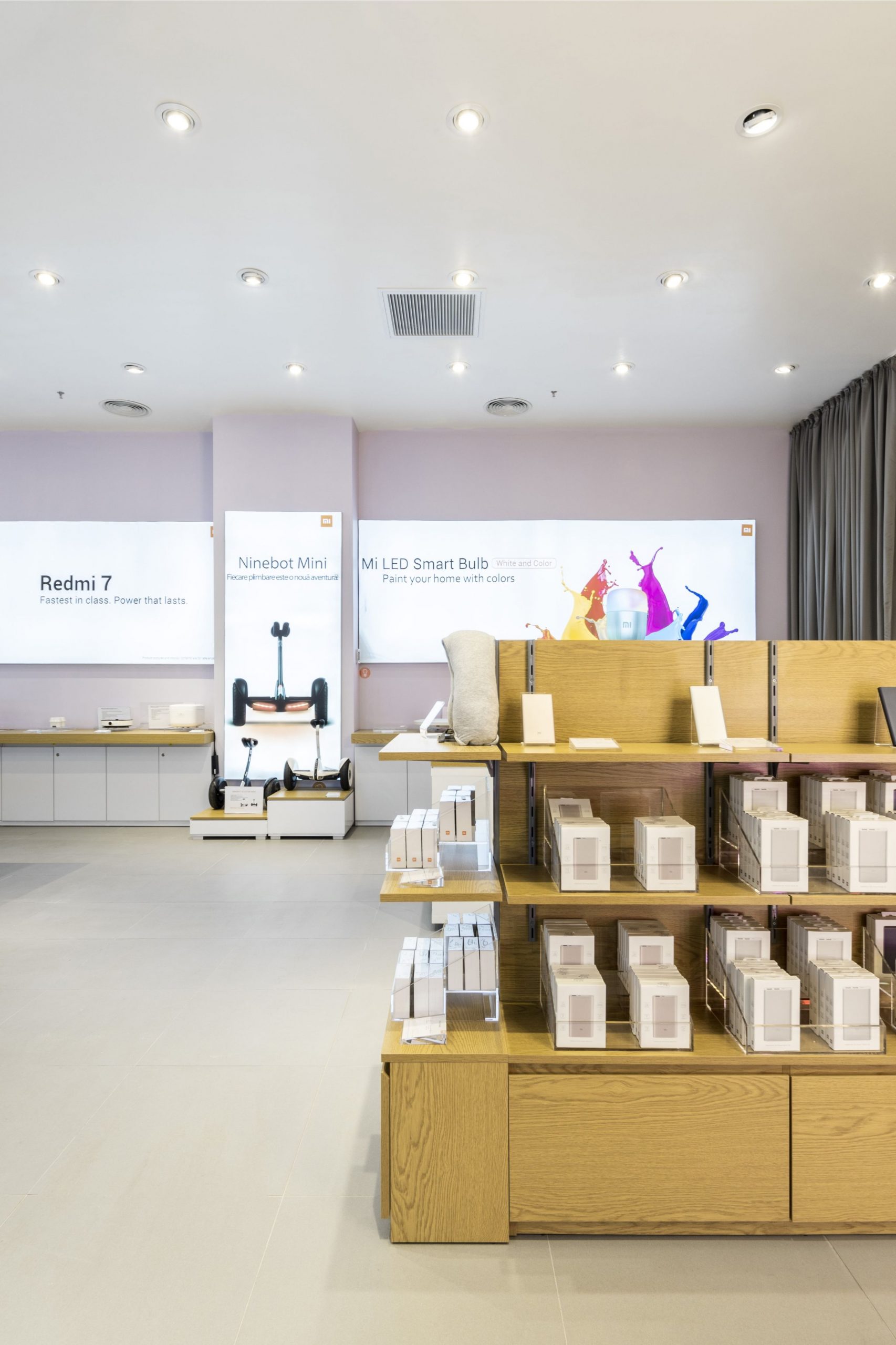
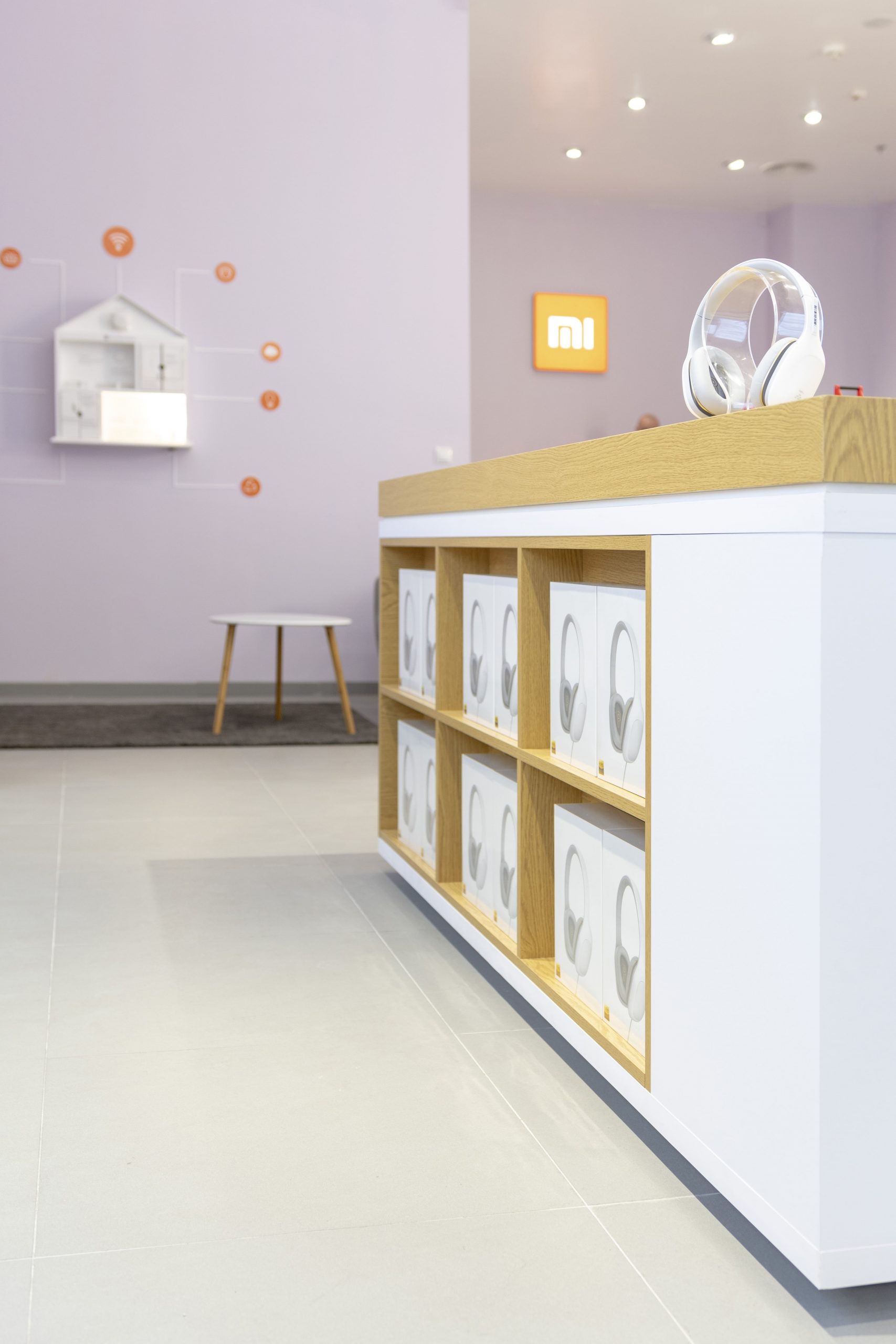
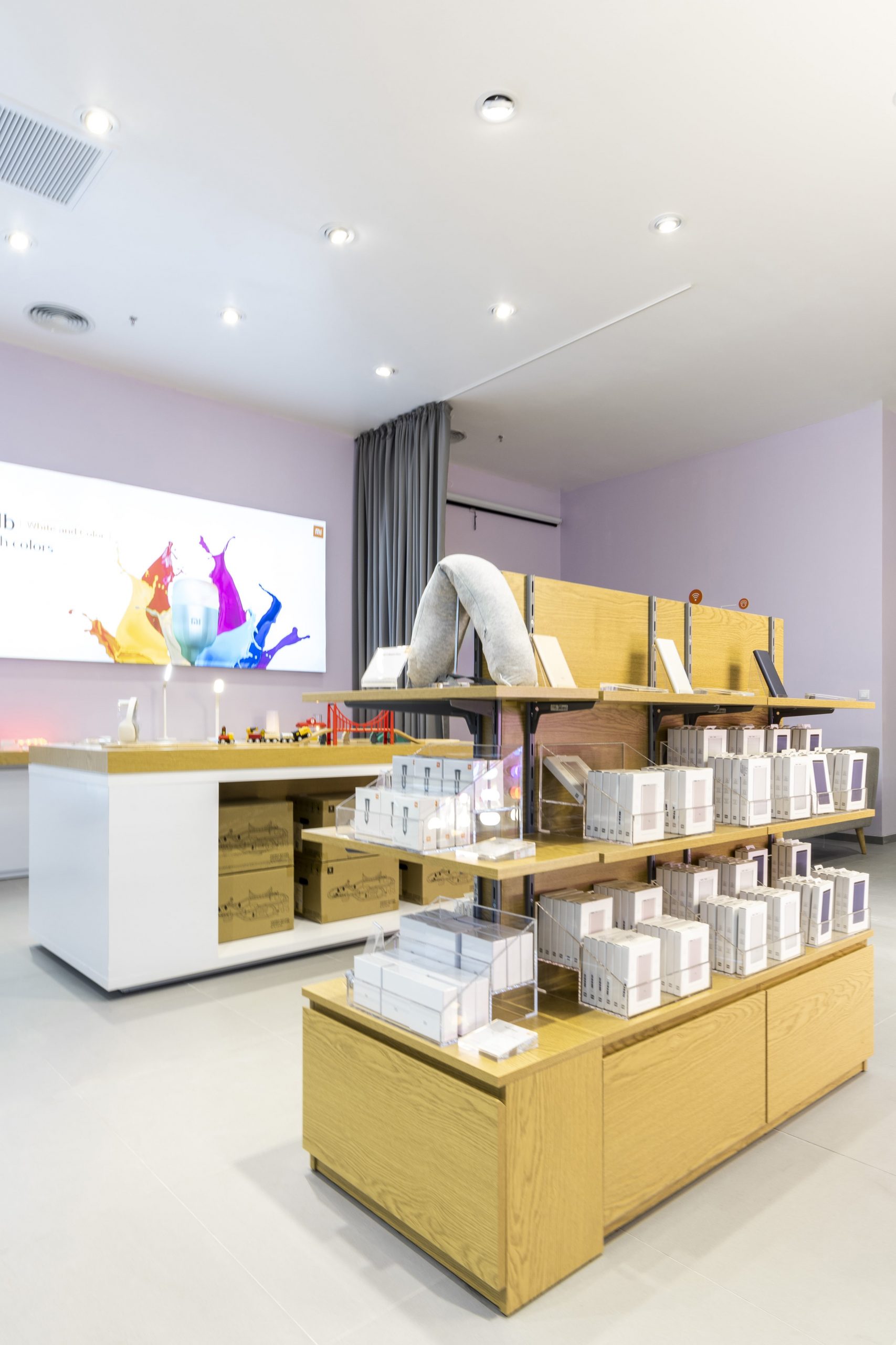
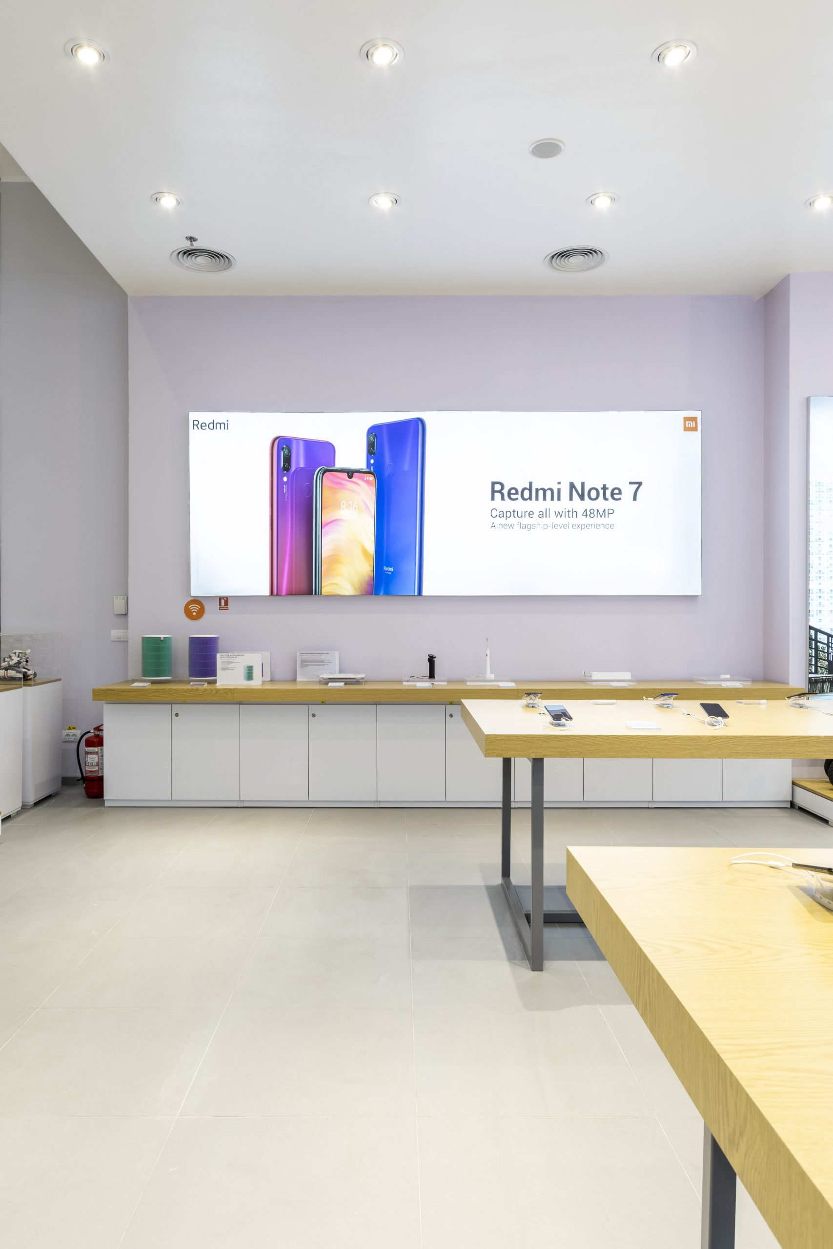
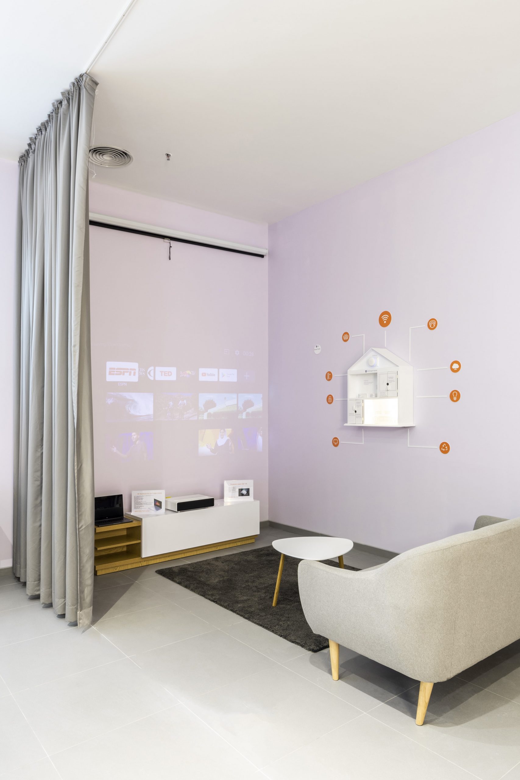
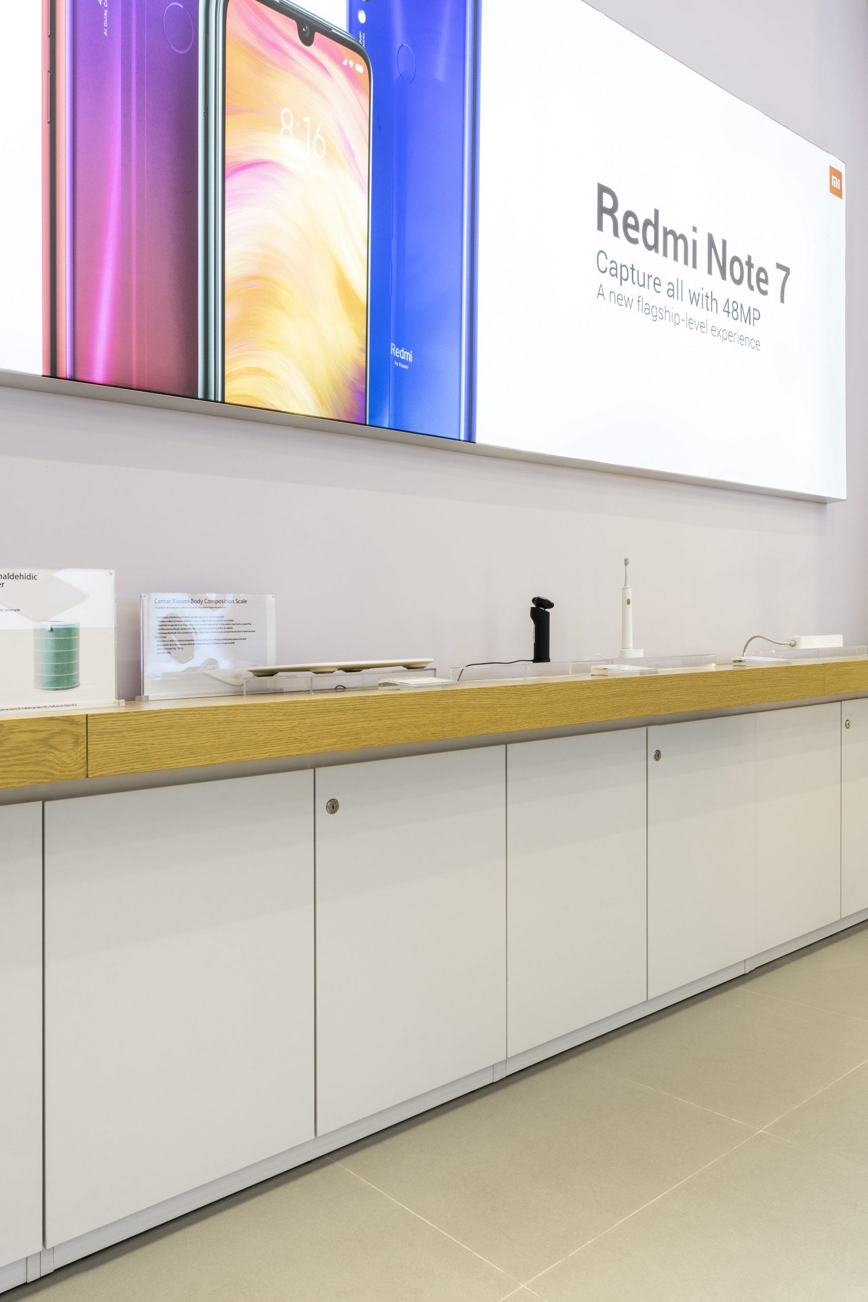
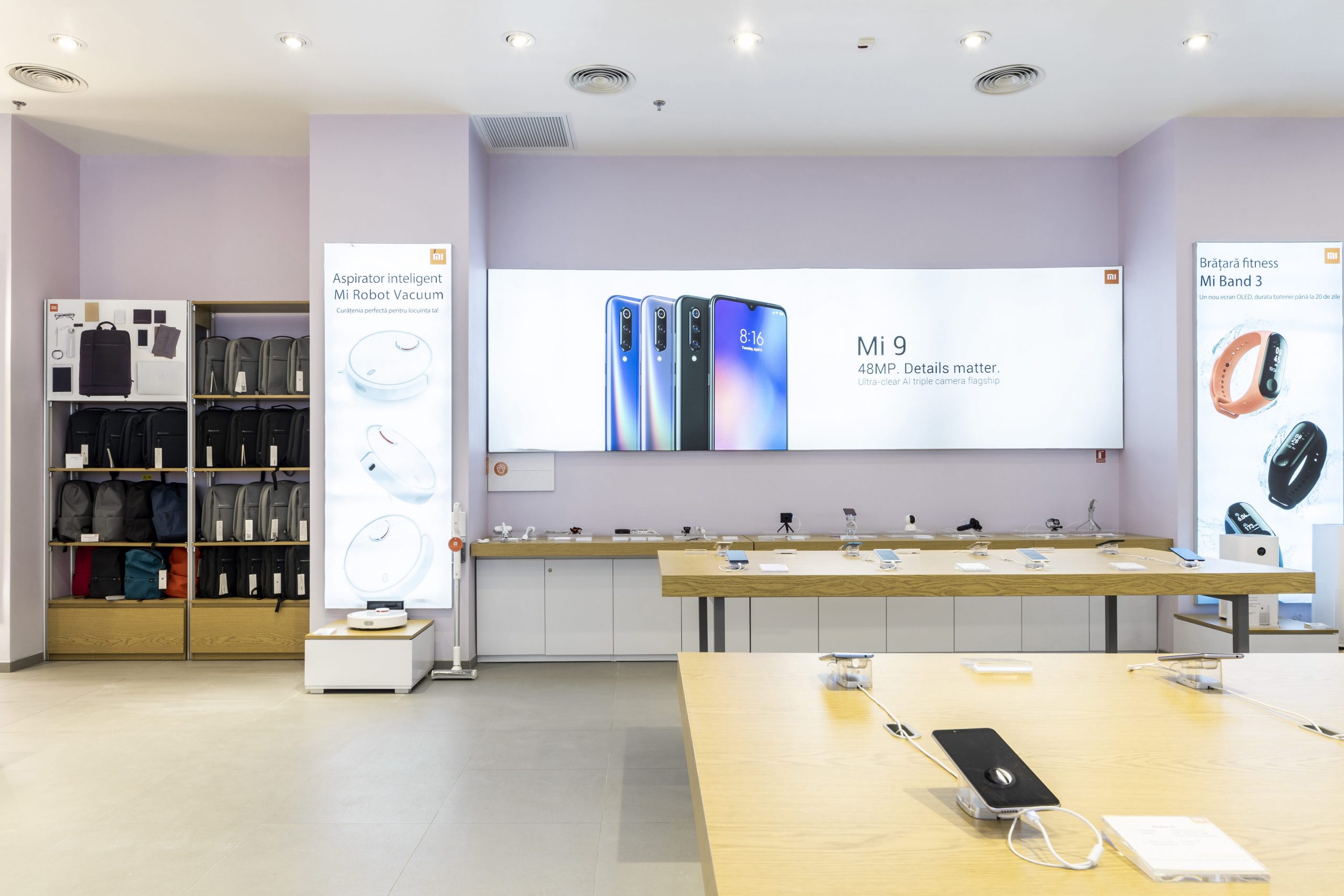
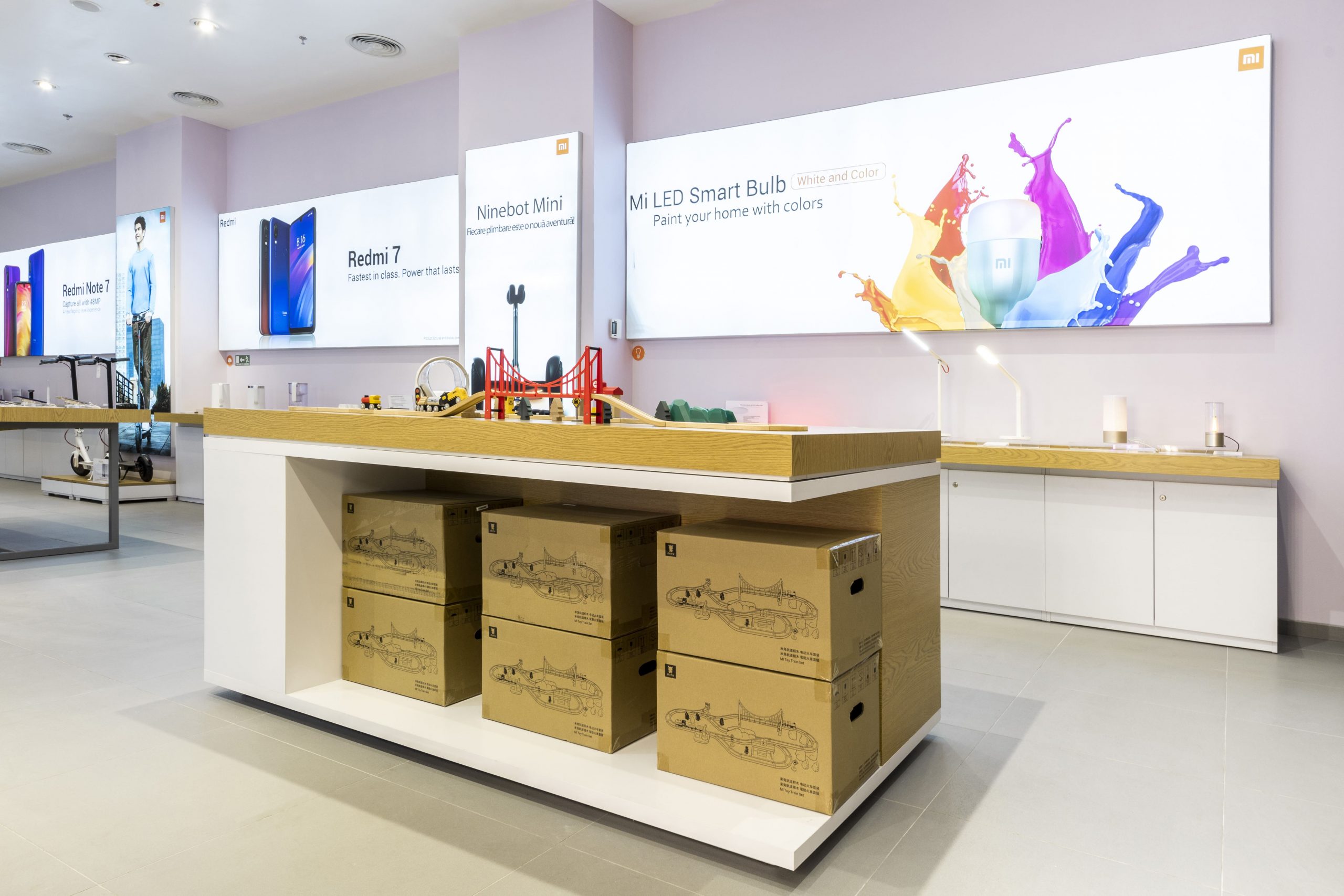
Colour solutions have been chosen in line with the rigours we had, so we have obtained a light-filled premise using light and neutral hues. As there were no windows in the premises we introduced warm light spots in the shop design project to compensate for the lack of natural light. Taking into account the specificity of the premise that we had to arrange and the necessity to exhibit not only the products themselves, but also information about them, a series of light boxes has become a part of the project. They have a double purpose: to provide lighting and also advertising support.
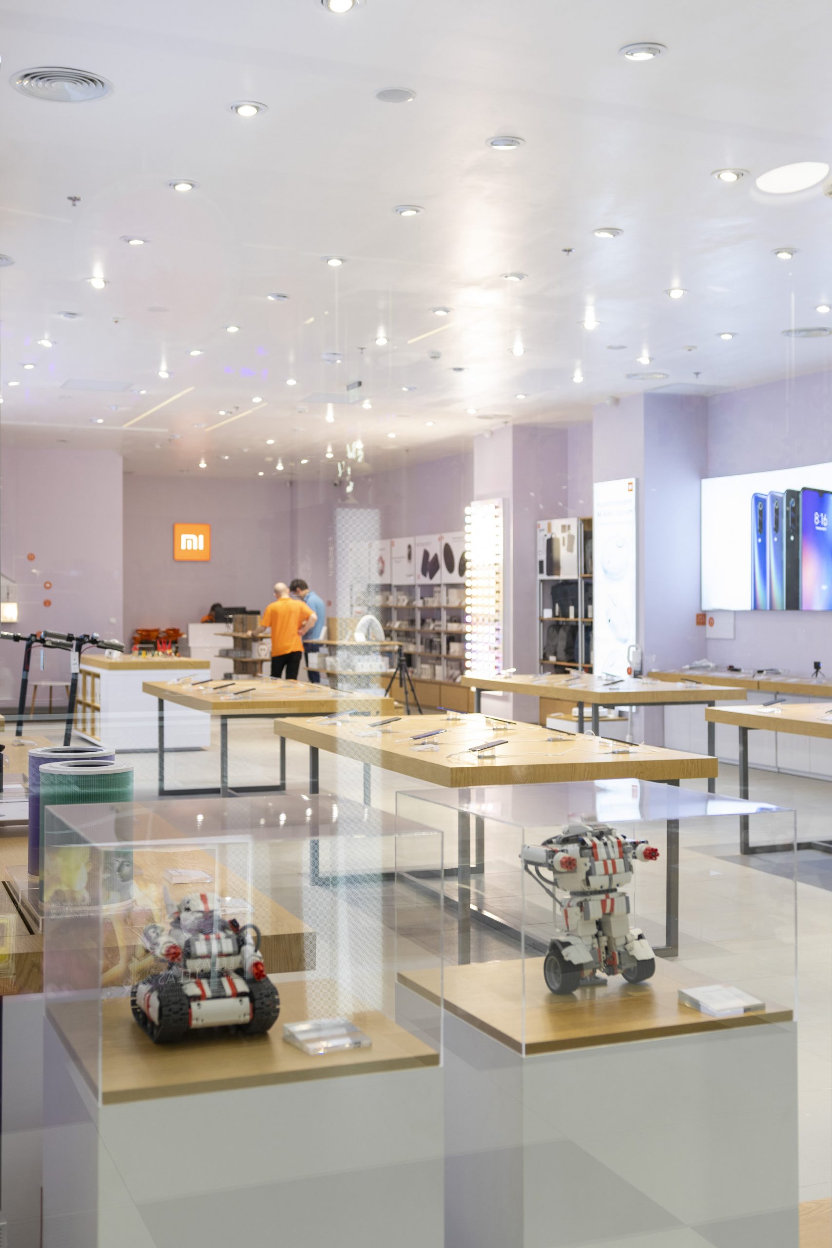
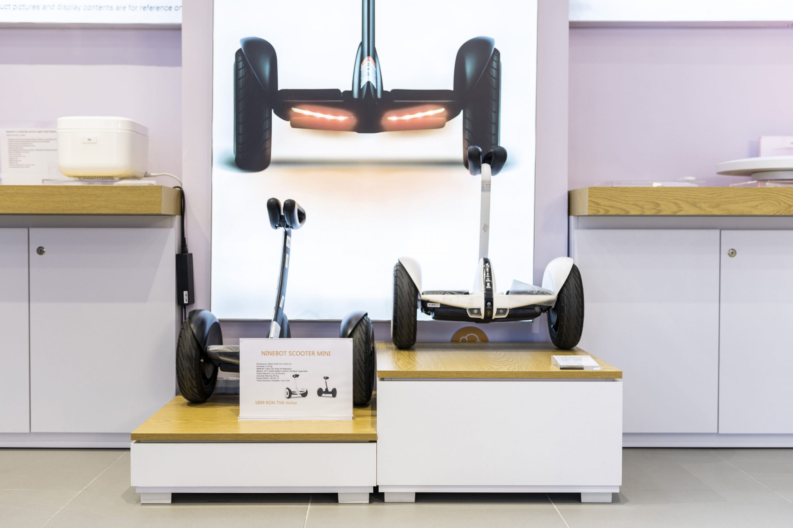
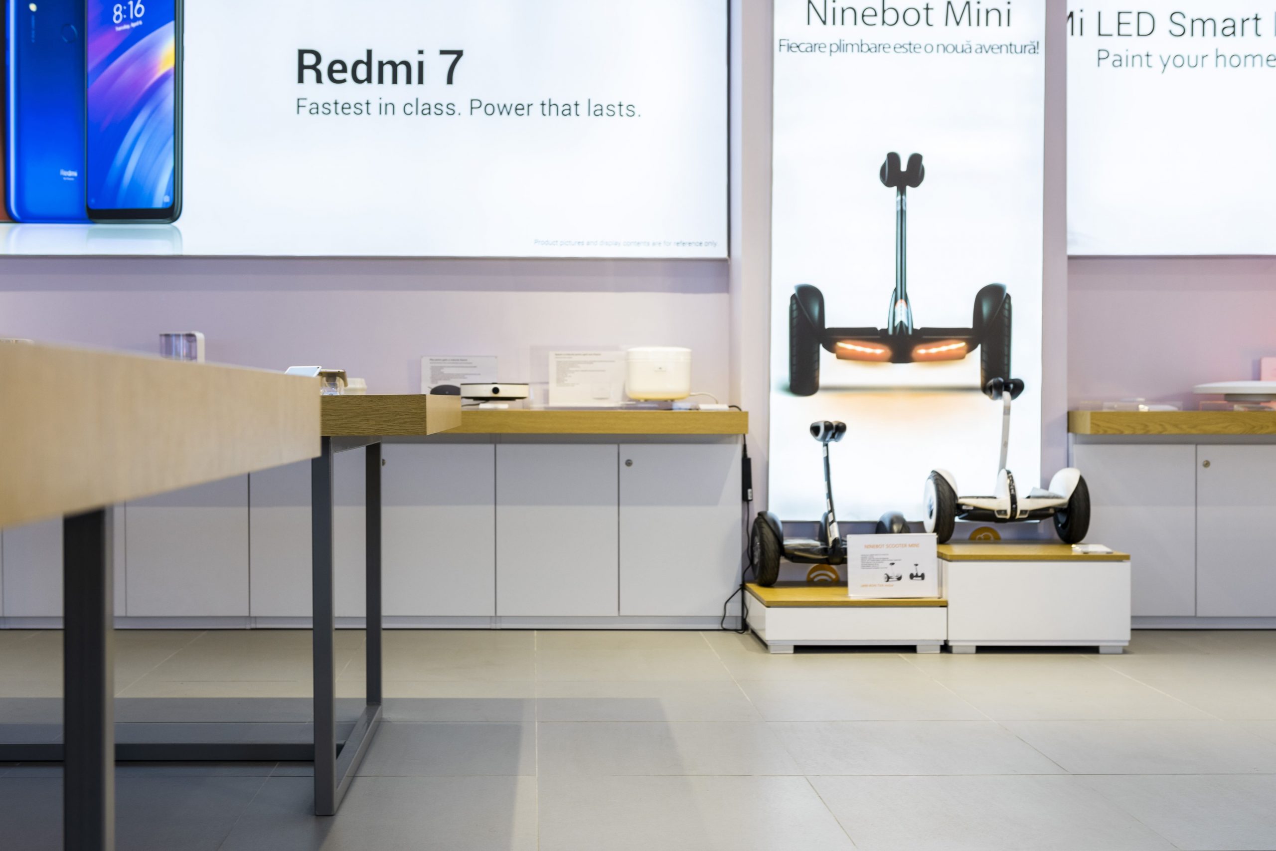
Special attention was paid to the furniture. As required by the general trend, it has simple lines, without décor details, is made of wood of a warm hue and grey metallic frame. Due to the big variety of products the brand has, it was required to have different furniture: from racks for accessories to platforms for bicycles and scooters. We opted for the lateral arrangement of the furniture, creating islands for product exhibition in the middle so as to guarantee a better flow and easy access to products for buyers. As a new element, we have created for the project boxes made from wood and glass for products presentation, following the same straight shapes.
Xiaomi project is more about functionality and rules, where we tried to introduce some new elements to implement the customer’s wishes, but also express our vision that brings originality to the rules and constrains.

