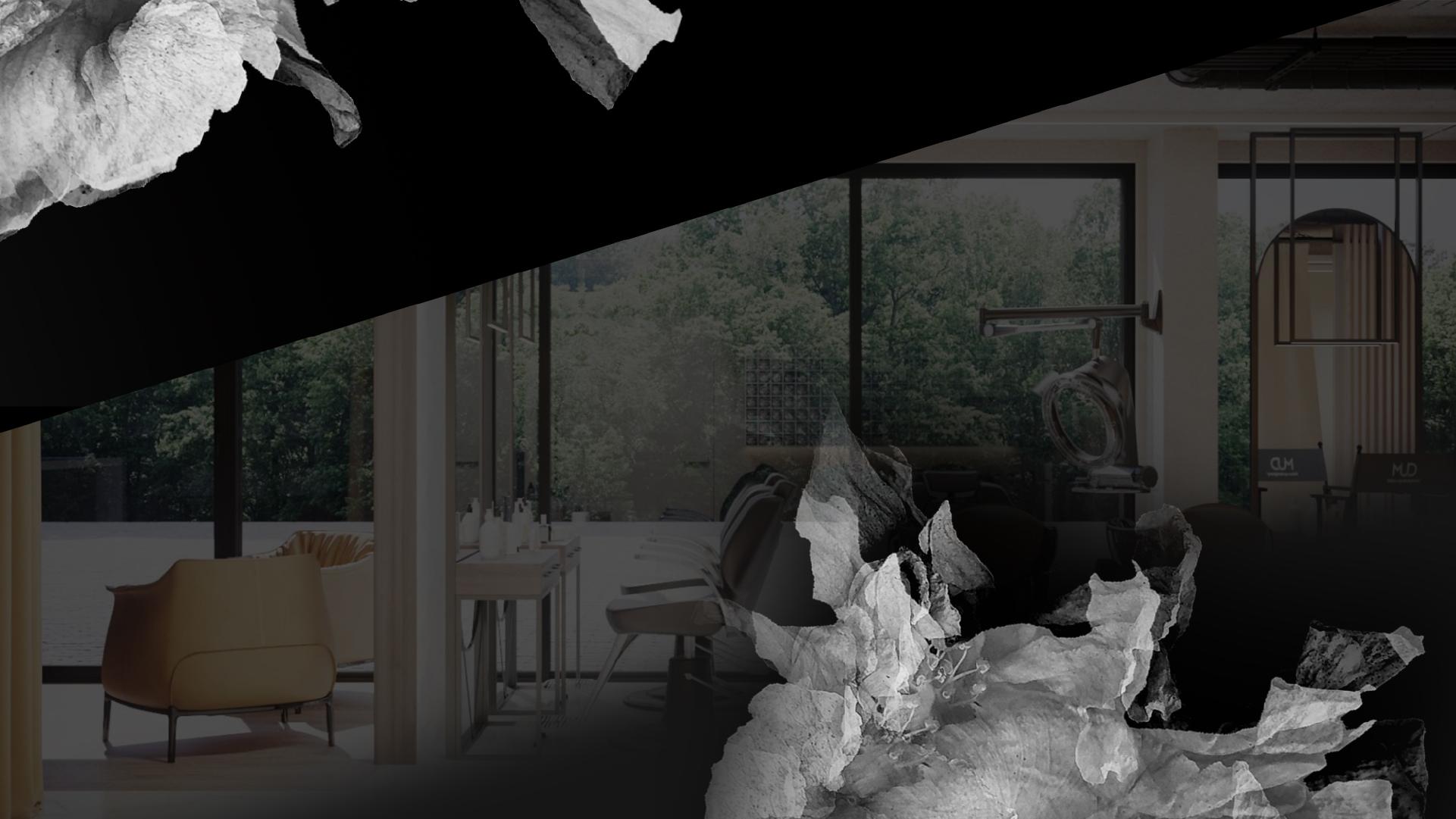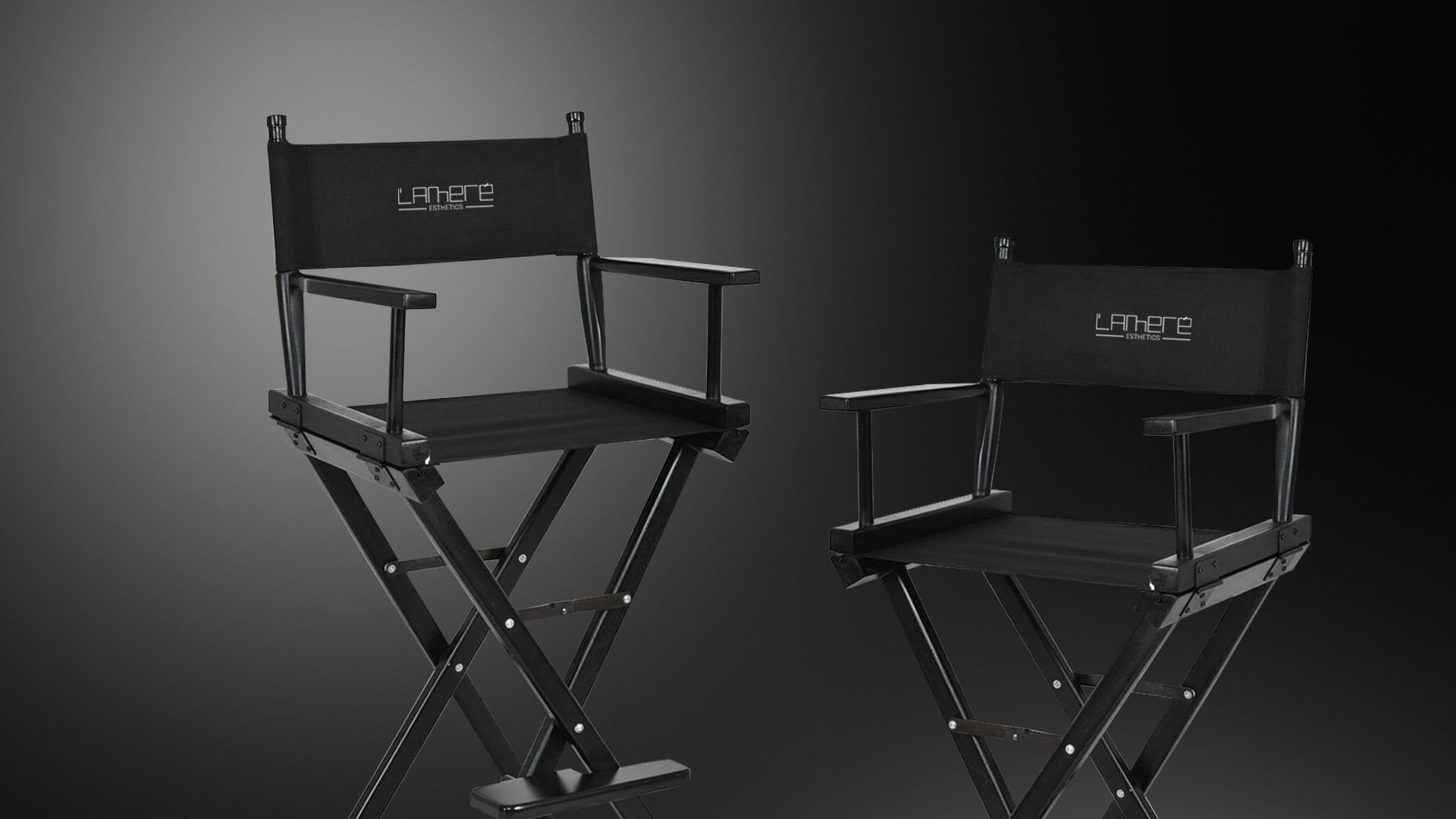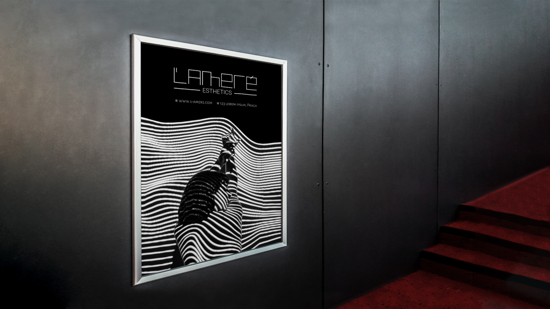
A business embeds in the public’s mind because of the messages, atmosphere and image it creates. Success depends on a number of factors, but it is important that, from the very beginning, we create a clear vision of what awaits the customers. In the case of L’AMERE, we dressed the entire business in a simple and elegant image, which speaks from the very beginning about the quality of the services to be provided. The complexity of the project was caused by two different business directions that were united by the same name: a beauty salon and a shop.
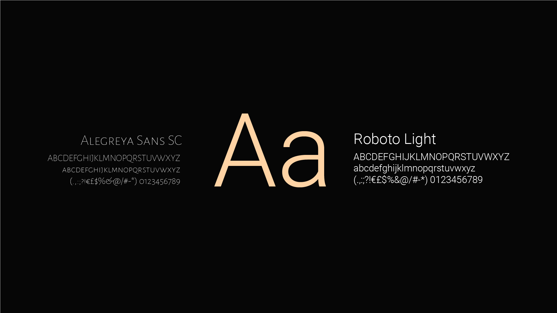
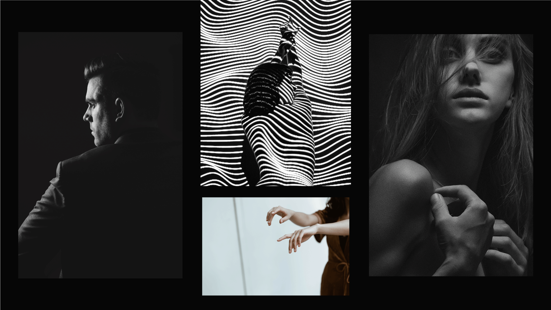
The visual identity was discreetly directed by the interior design, also created by AB + Partners. Thus, to harmonize the whole concept, we resorted to laconic lines, which followed elements of the interior. Taking into account the client profile – already fulfilled, stylish ladies, who prefer quality services, we opted for a quiet and concise colour range.
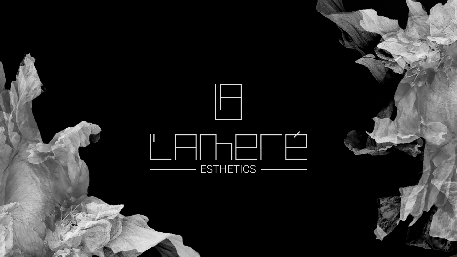
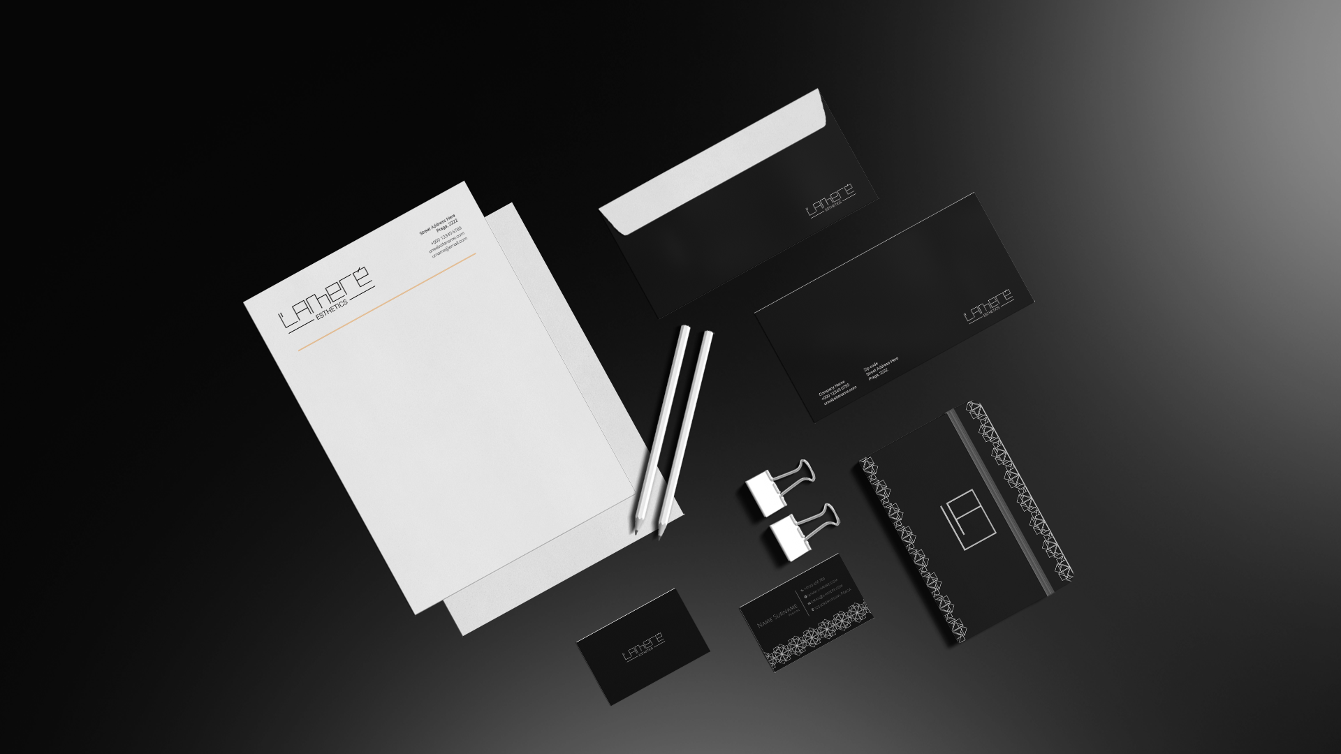
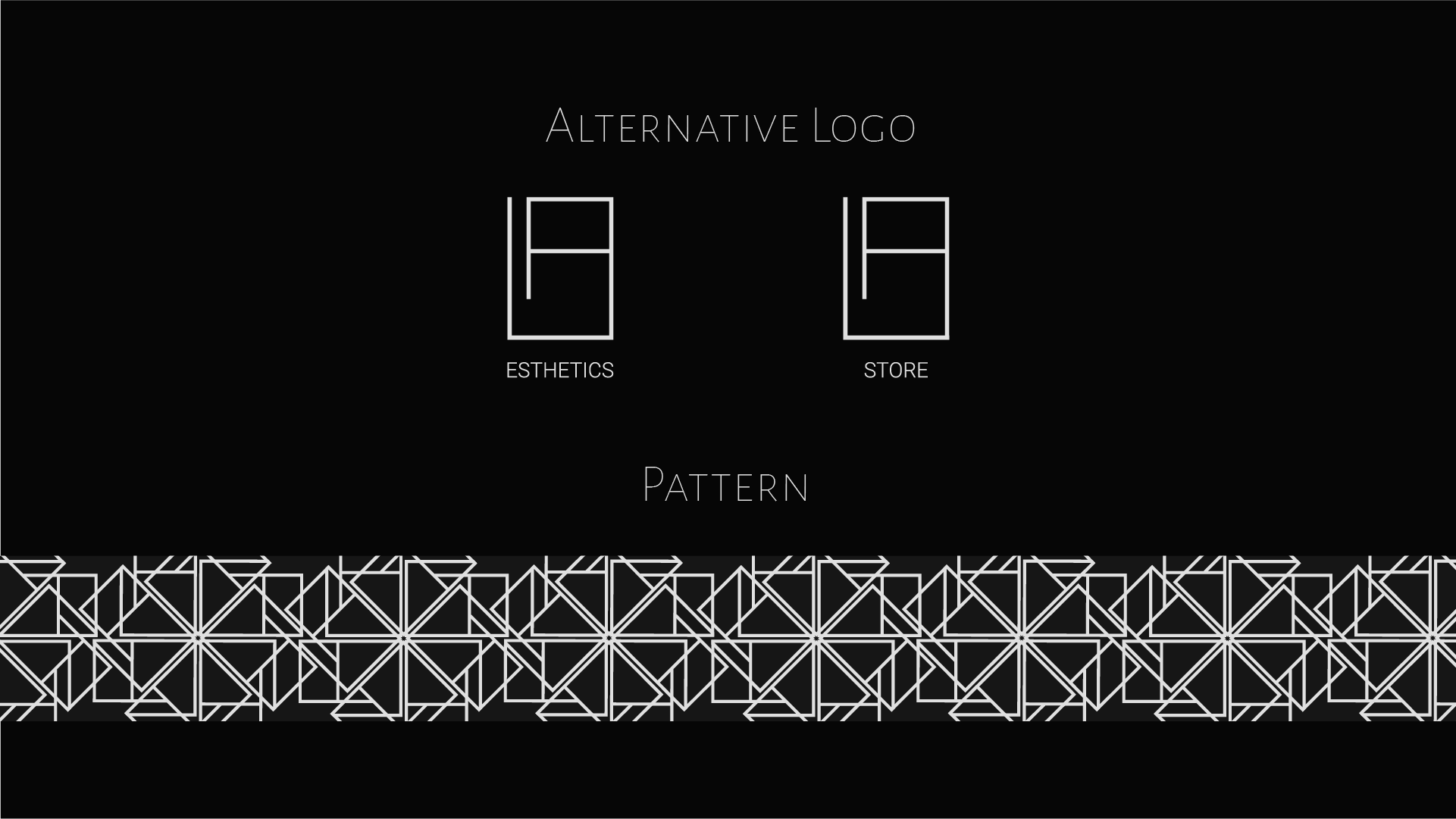
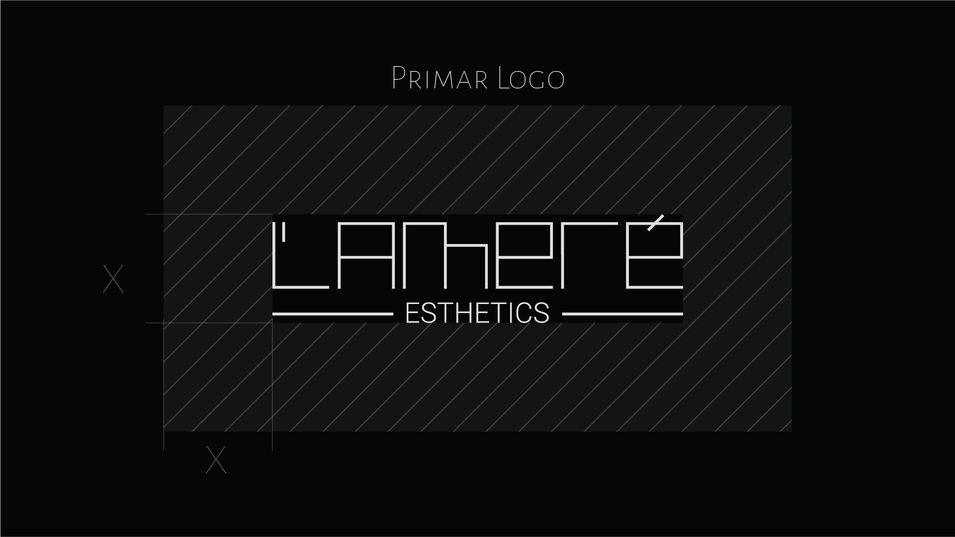
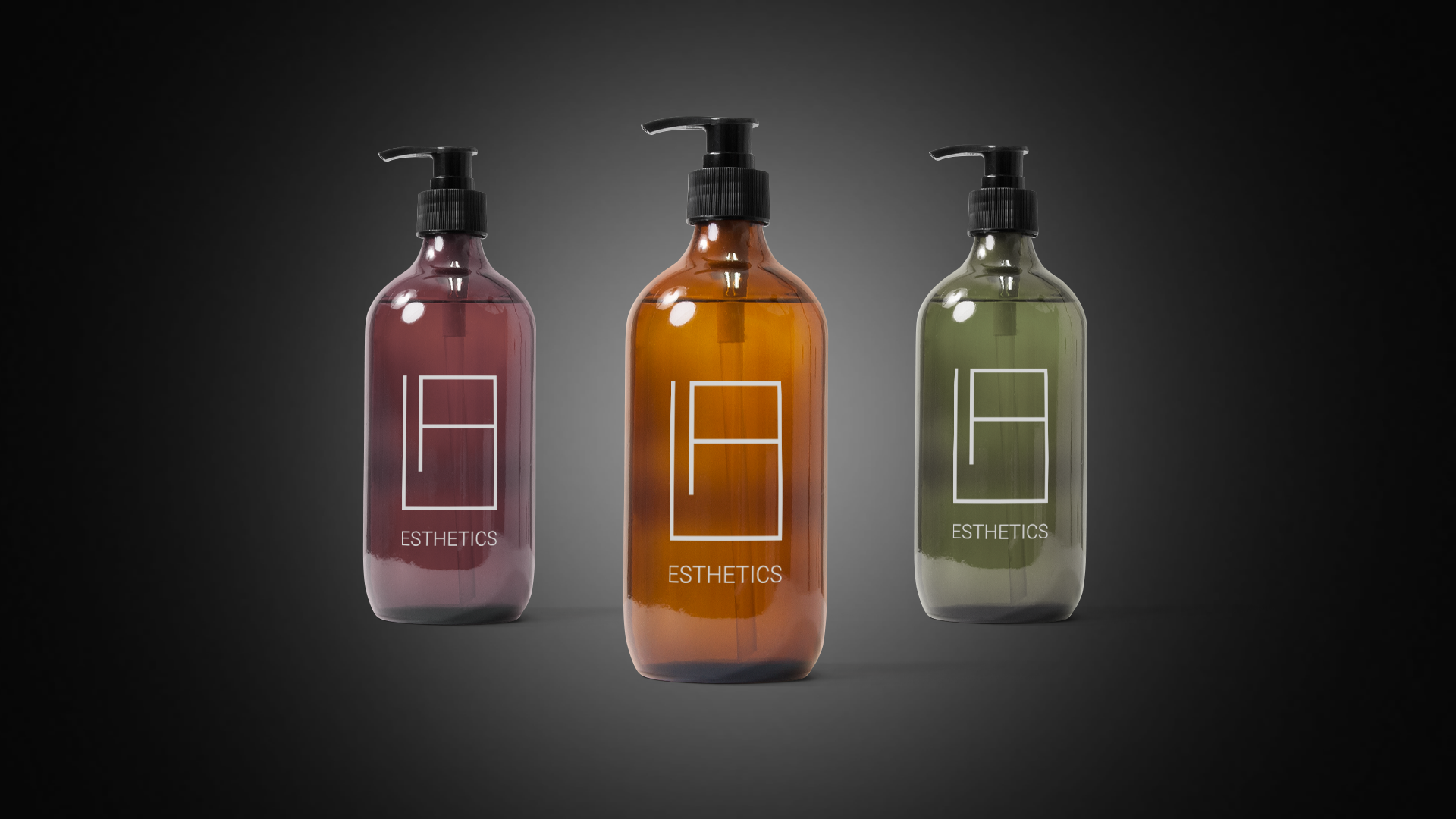
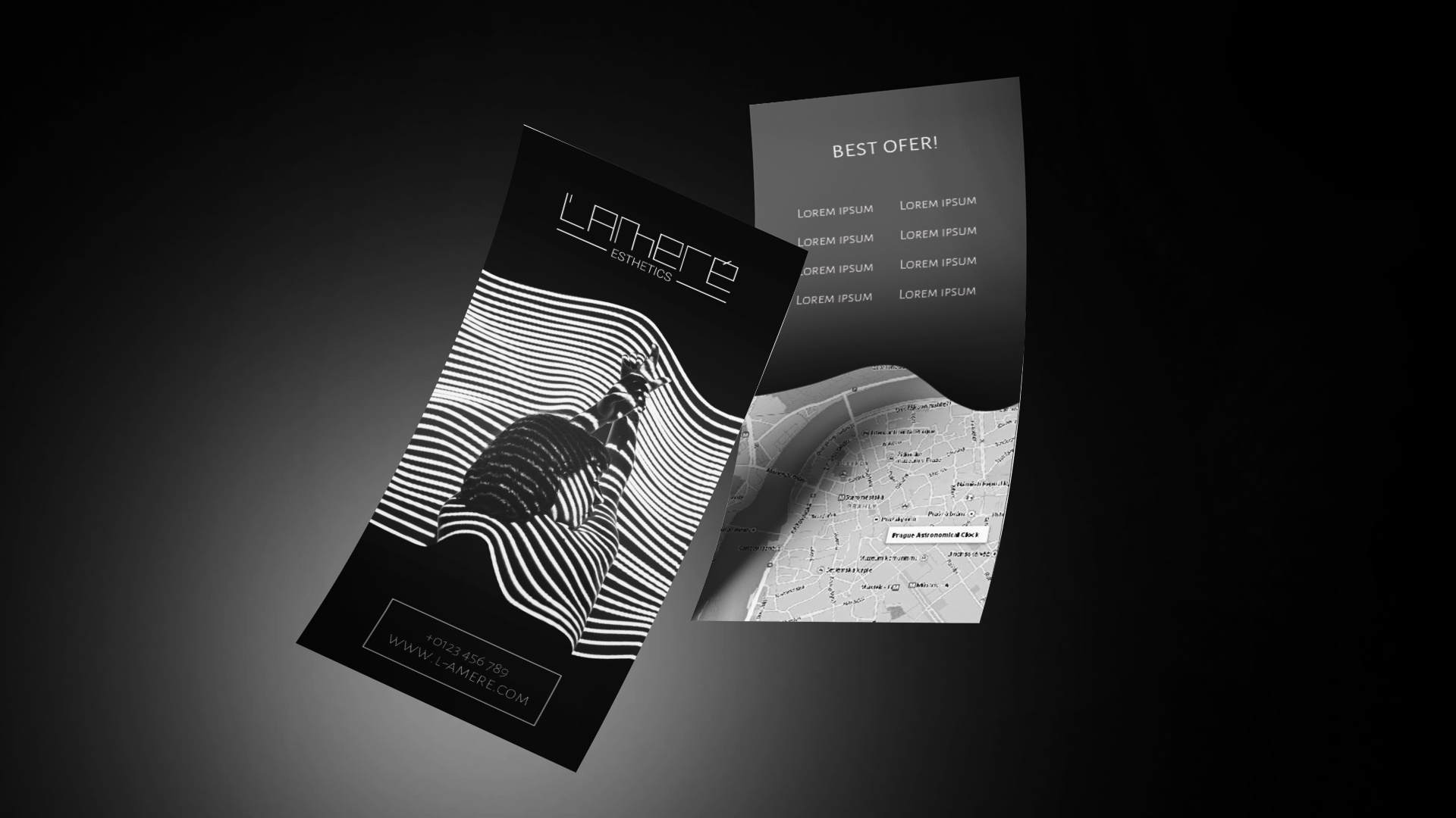
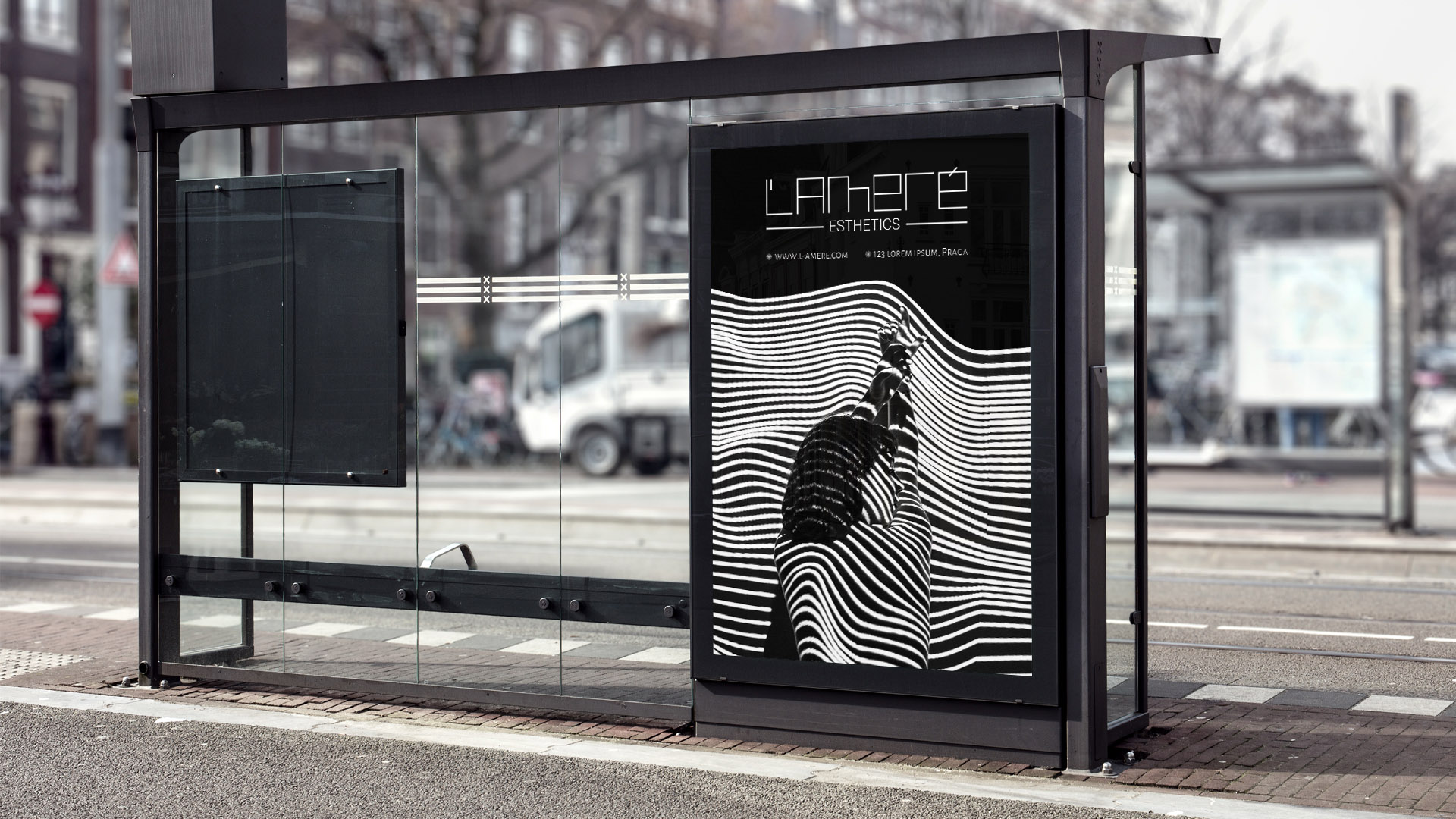
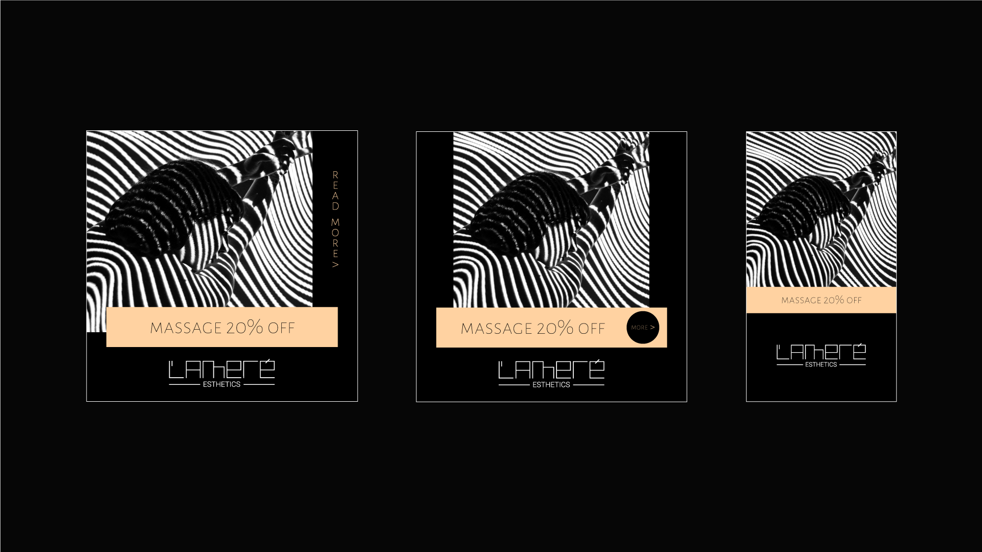
The name, being a combination of the initial letters of the owners, was created to be brief and memorable. The logo, as the main element, represents a customized font, specially created by our graphic designers to indicate the niche of the future clients. The simplicity and subtlety of lines continue from the logo to the secondary patterns and logos, and all this gives the business a unique sense of sophistication.