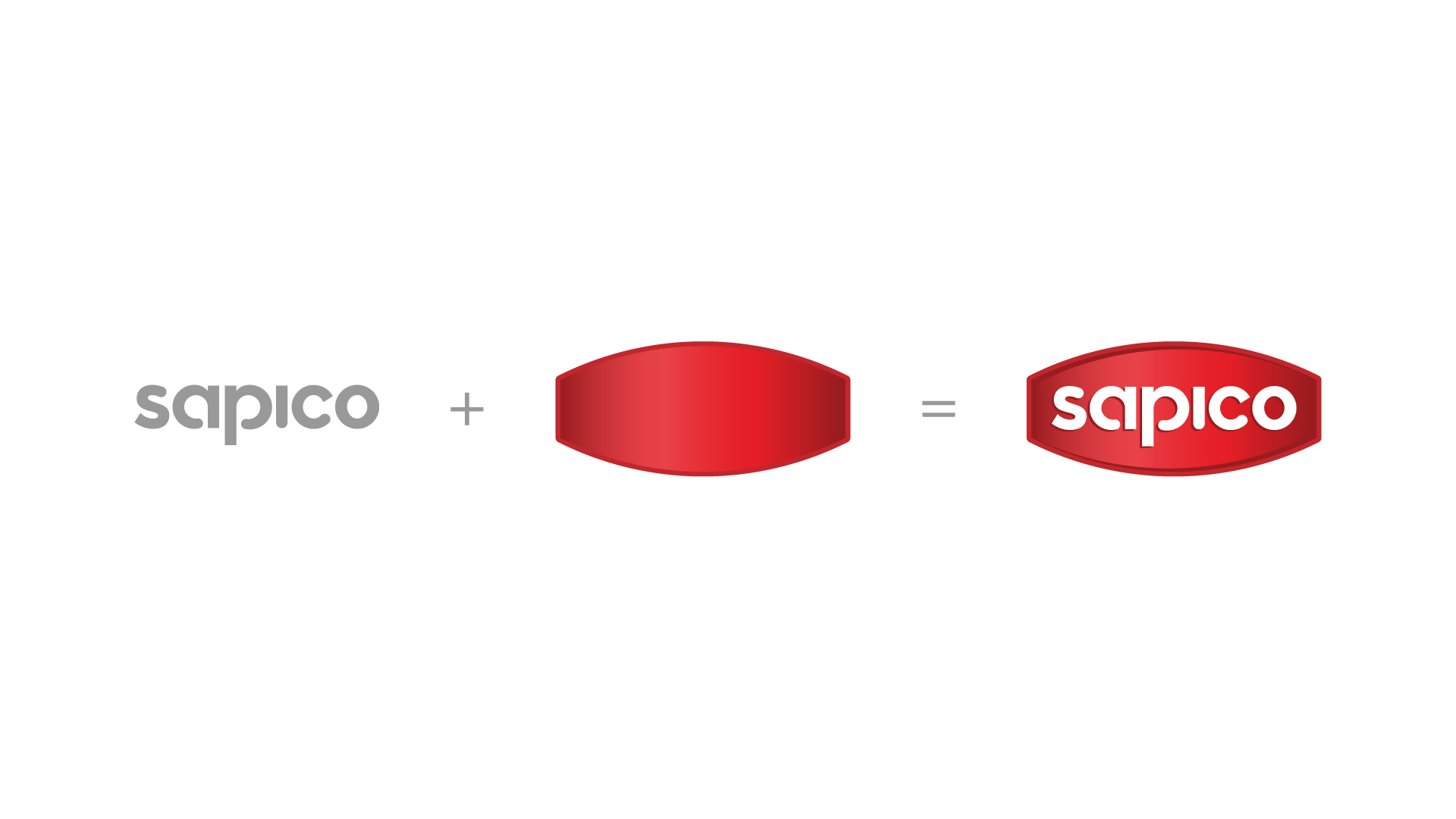
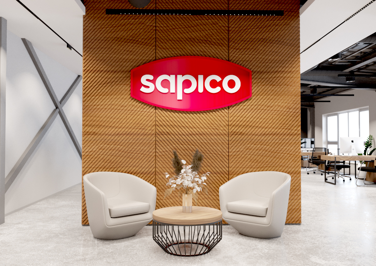
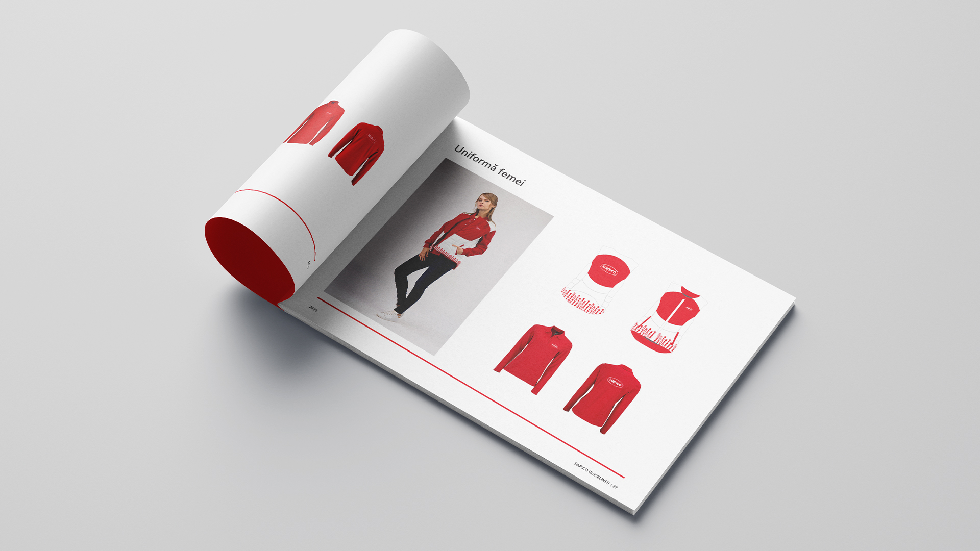
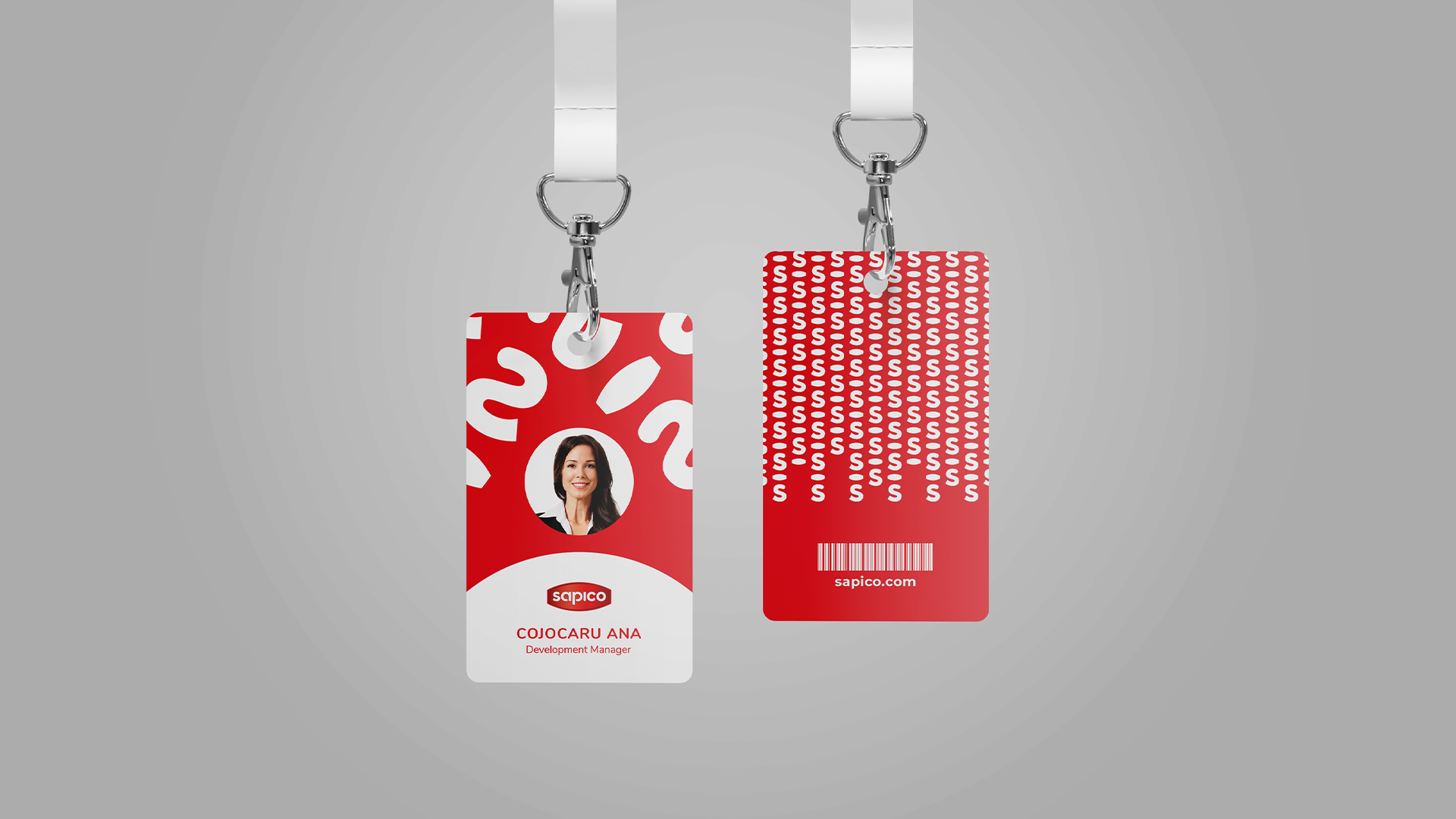
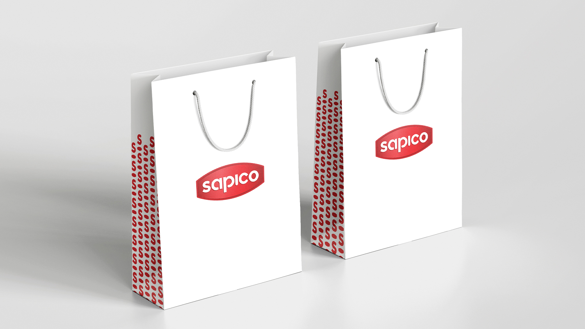
Focusing on the idea of creating a memorable and effective identity, we have created the identity of Sapico brand using simple colours and lines. As the company is a manufacturer and distributor of a wide variety of food products, its logo could not take a shape that would imitate a specific object or colour. For this reason, we have chosen a generalised variant, but individualized according to our case. Thus, we used two colours: white – which offers neutrality and the possibility of interpretation, and red – a colour that, according to the rules, is recommended for companies active in the food segment, such as Sapico. At the same time, the concise shapes of the logo speak about the mature level of the concept. Following the rules, we have created an image that corresponds to the audience to which it is addressed, which is highlighted by a little colour and a lot of meaning.
Sapico – branding and identity with individual features
Year: 2020
Location: Chisinau, Republic of Moldova
Team: Alexandrin Buraga, Stanislav Graur, Marina Mărgărint
Concept: AB + Partners