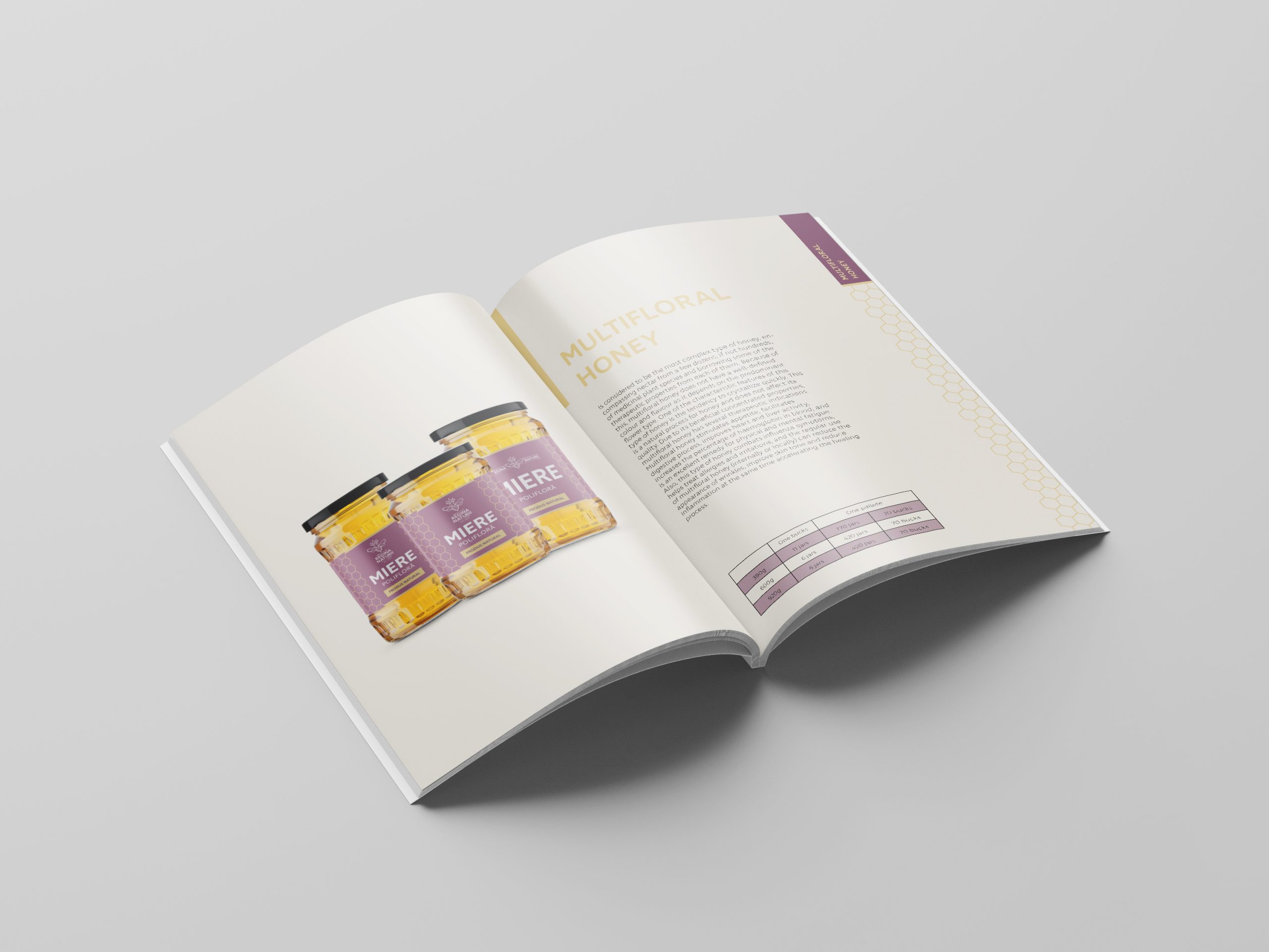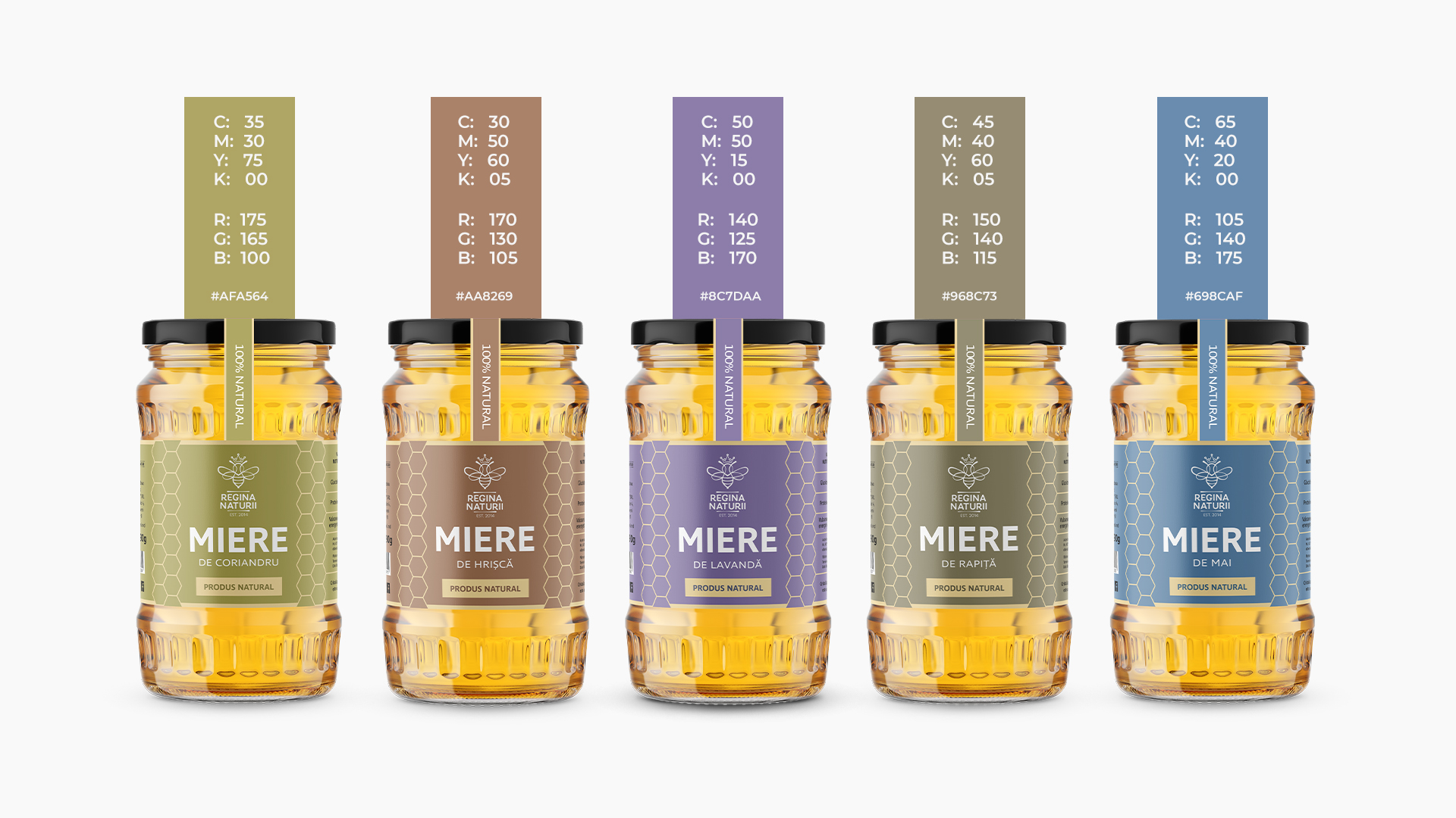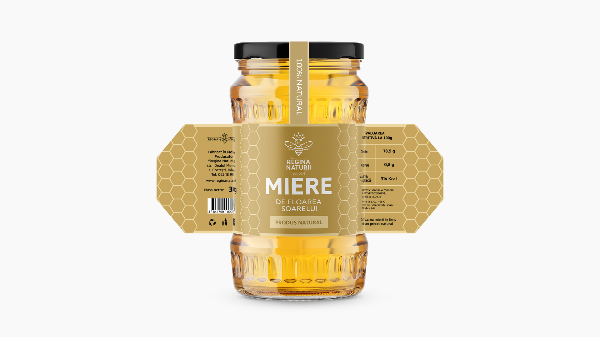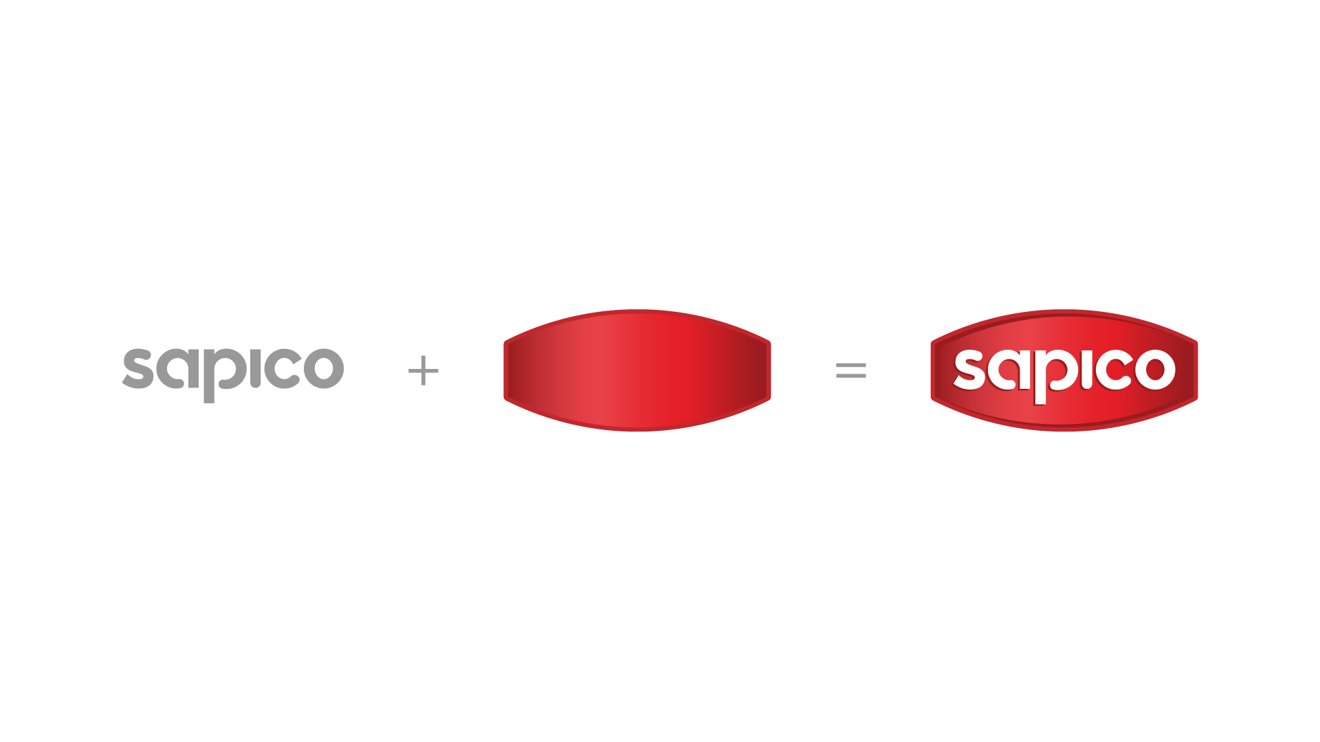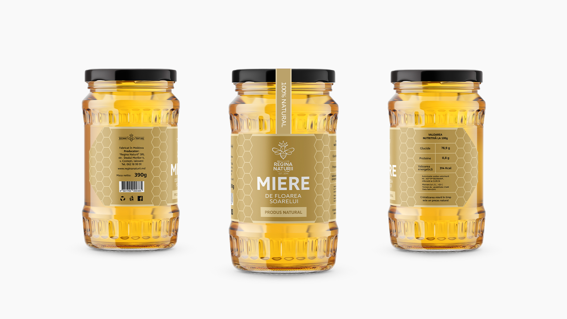
The Queen of Nature is one of the projects we have refreshed. Based on the existing logo, we reconsidered the elements derived from it, creating a new image for a bee-keeping business. You will be able to see some of the created elements integrated in the interior, but others will catch your eye in the shop window. We created a new stylistic line for labels. It seems simple, but with an assortment of 10 types of honey, the task becomes more complicated. Our goal was to create a label that would capture the attention at the local market, but also at the international one. At the same time we wanted to avoid banality.
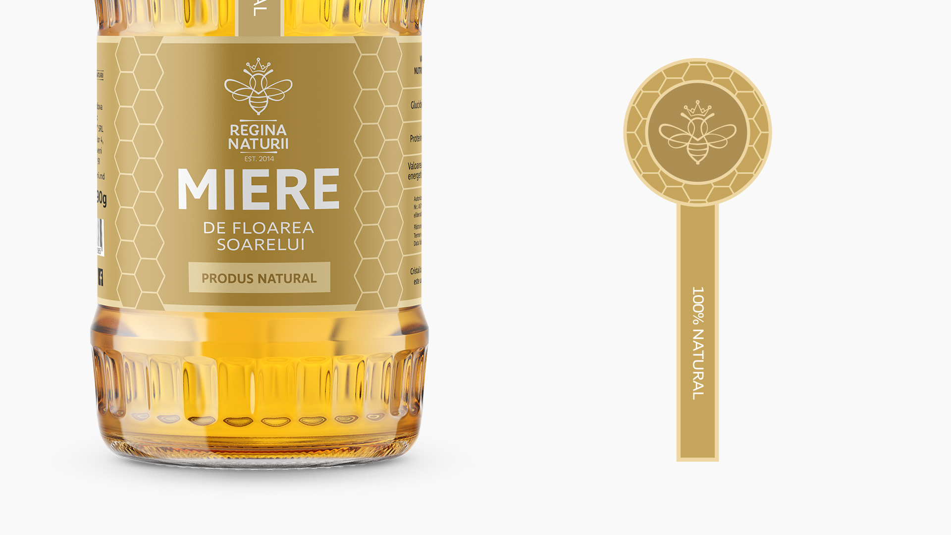
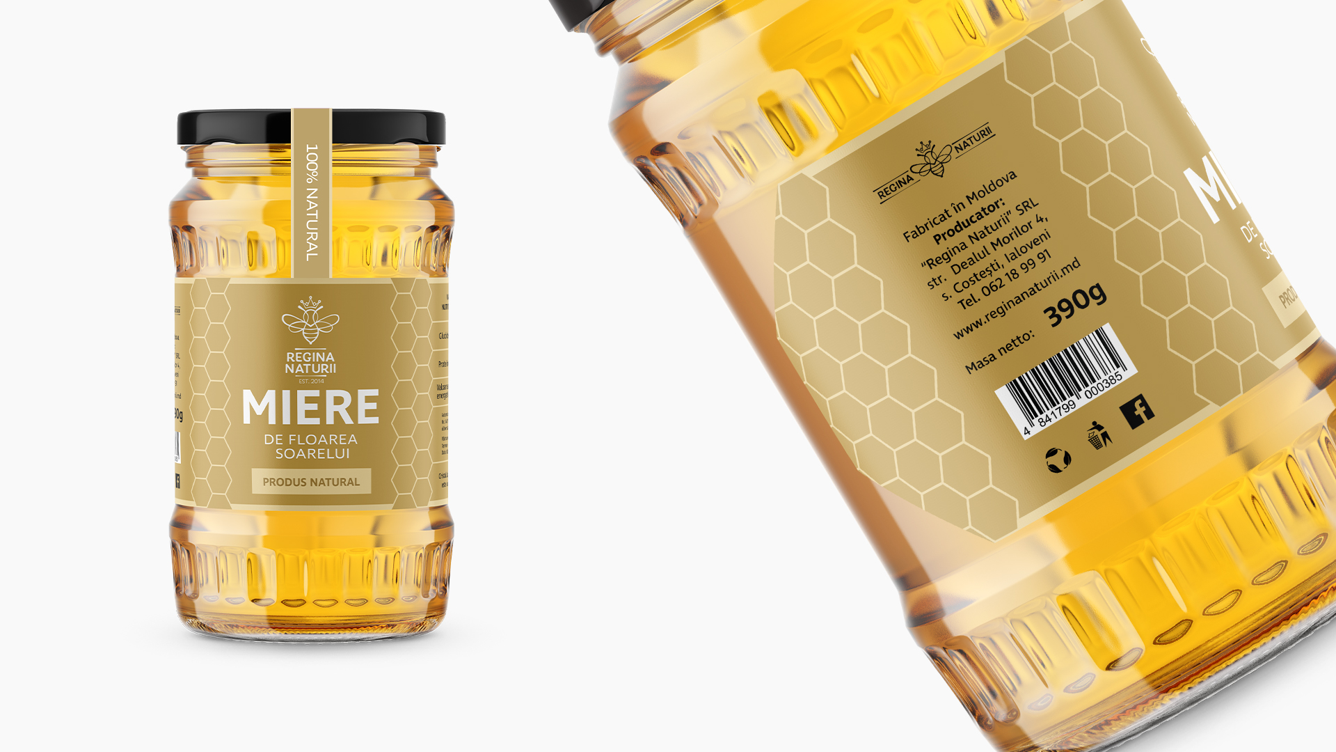
Thus, we assigned to the labels of each type of honey an individual colour, derived from the shade of honey or the type of flower from which it was extracted – in this way we obtained an easy differentiation of products, which allows buyers to identify them easily. One of the essential pieces of information we had to focus on was that the honey is organic. This information is found both in the centre of the label and on the sticker that joins the jar and the lid. We kept the “Queen of Nature” logo on the label and divided the information into geometric patterns inspired by the hexagonal shape of the honeycombs as graphic elements specific to the business.
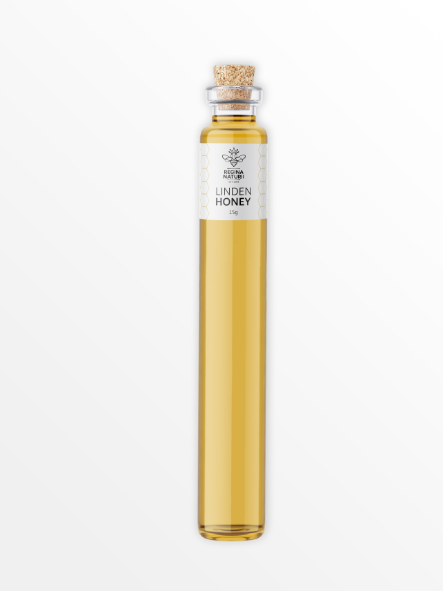
In addition to the label, we thought of the design of honey samples, meant to become small gifts. We gave up the banal idea of offering honey in small capacity jars and resorted to vials. These honey samples with a minimalist labels preserve the general motifs of the visual image.
We created a well-defined, expressive image with shades of simplicity.