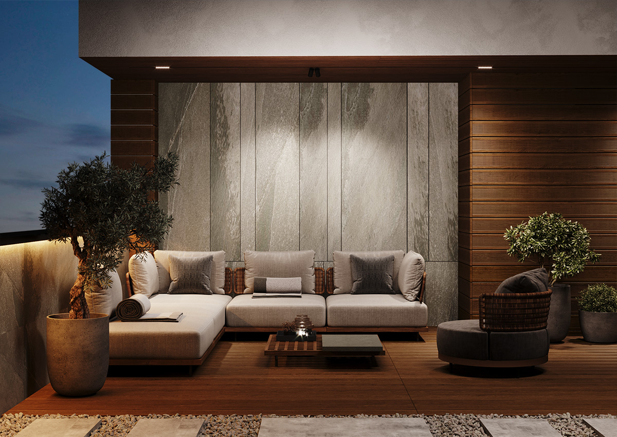
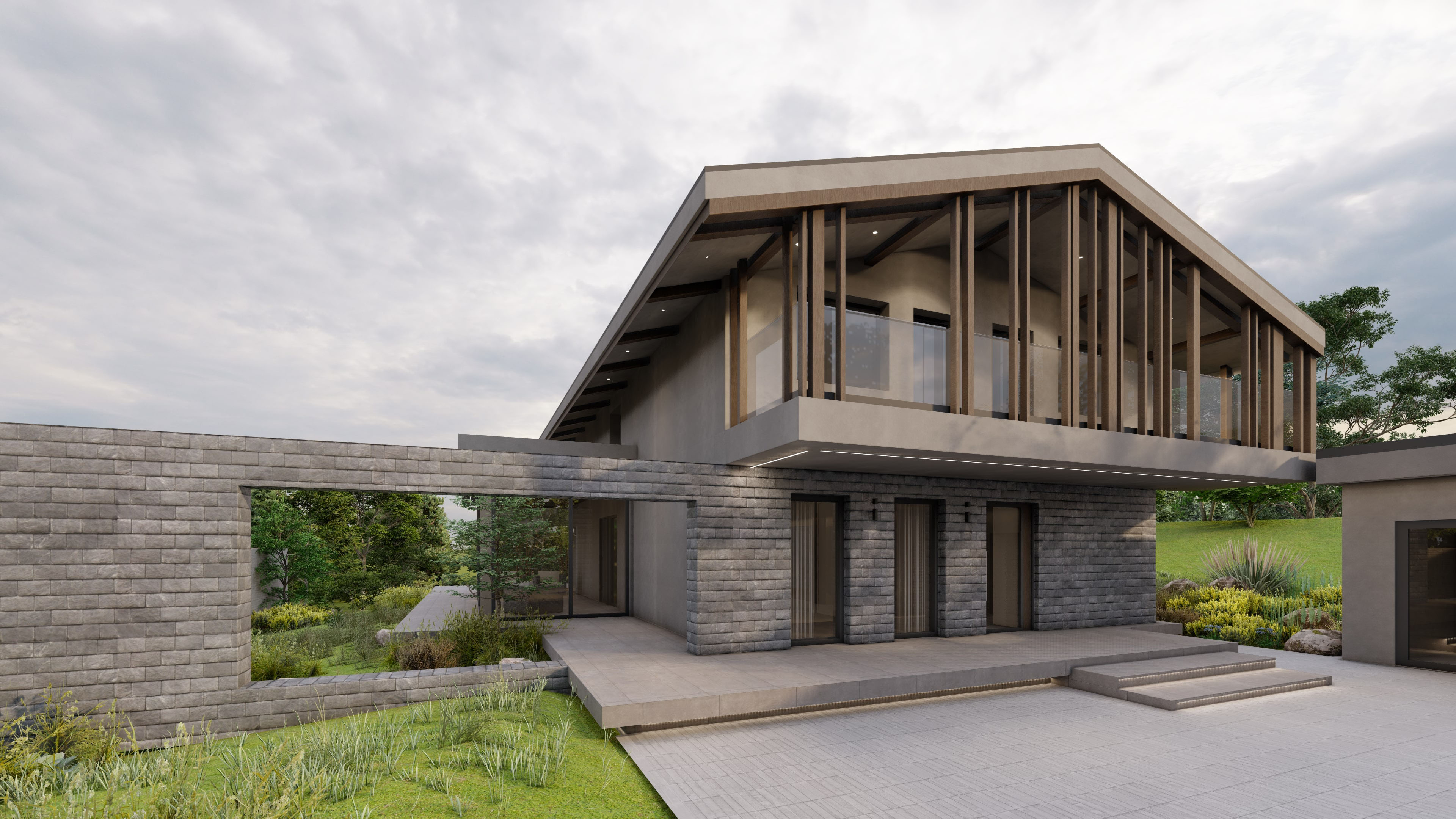
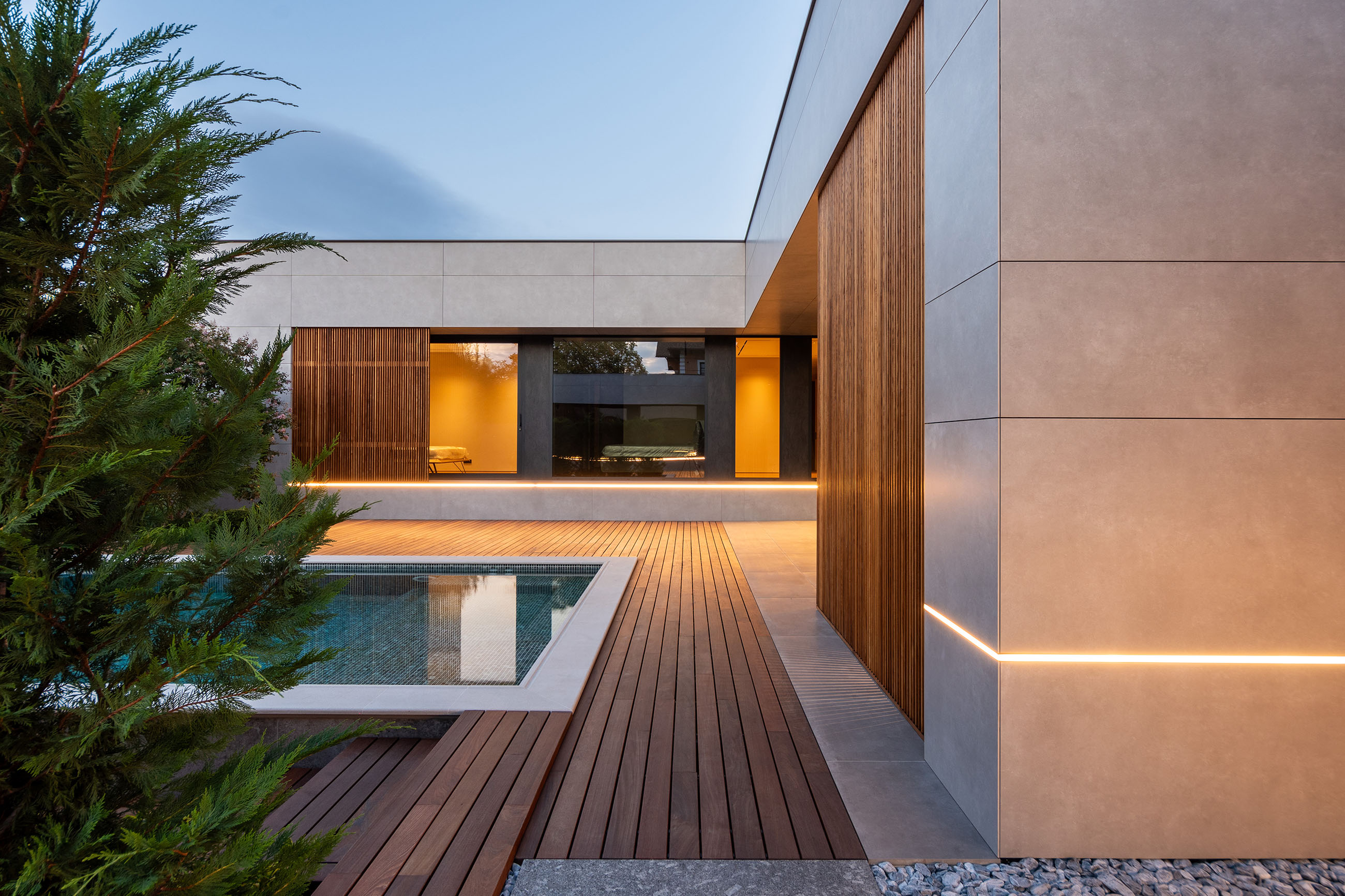
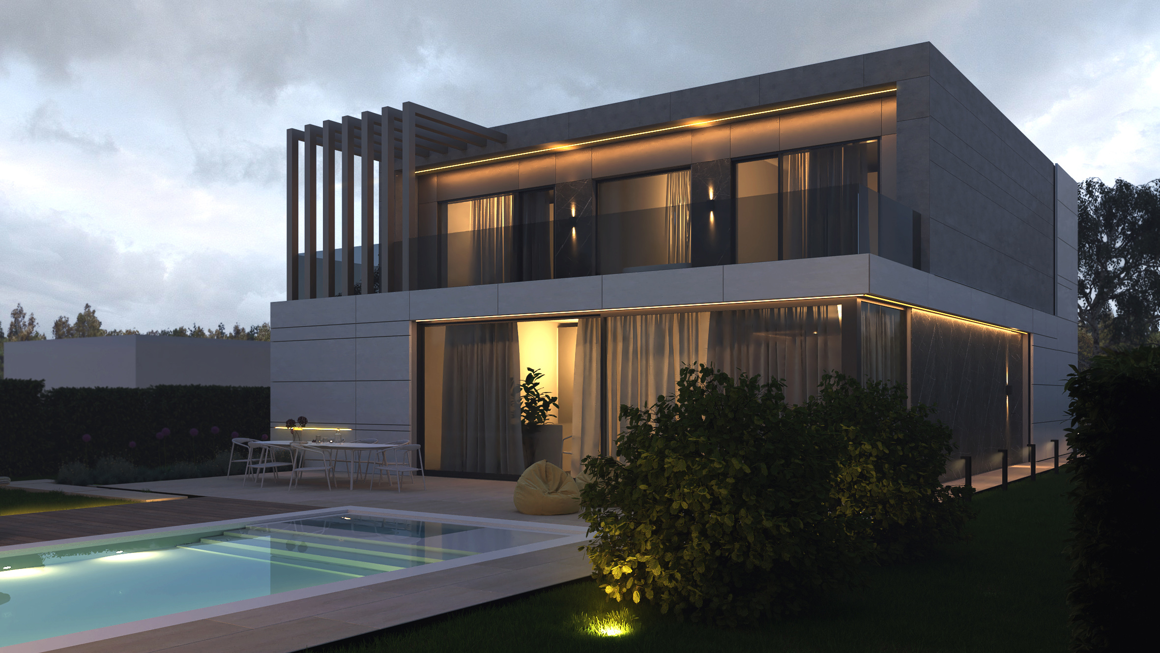
Simple lines have become indispensable for contemporary architecture. Their sobriety, however, does not contradict the creation of a comprehensive image. Thus, we tend to combine them in expressive geometric shapes and volumes. This is exactly what we did in the case of this project, which was given an appearance of complete accuracy.
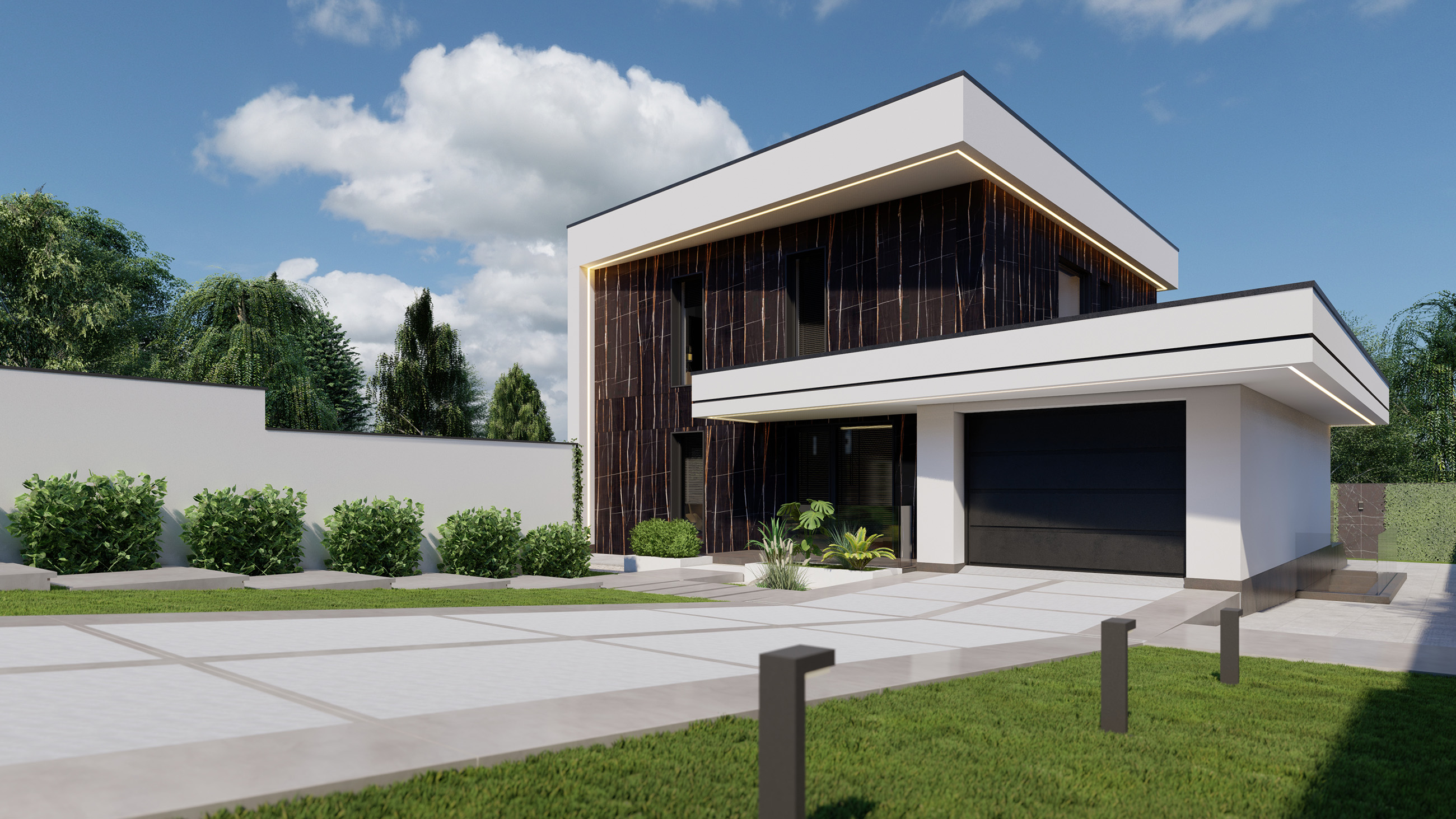
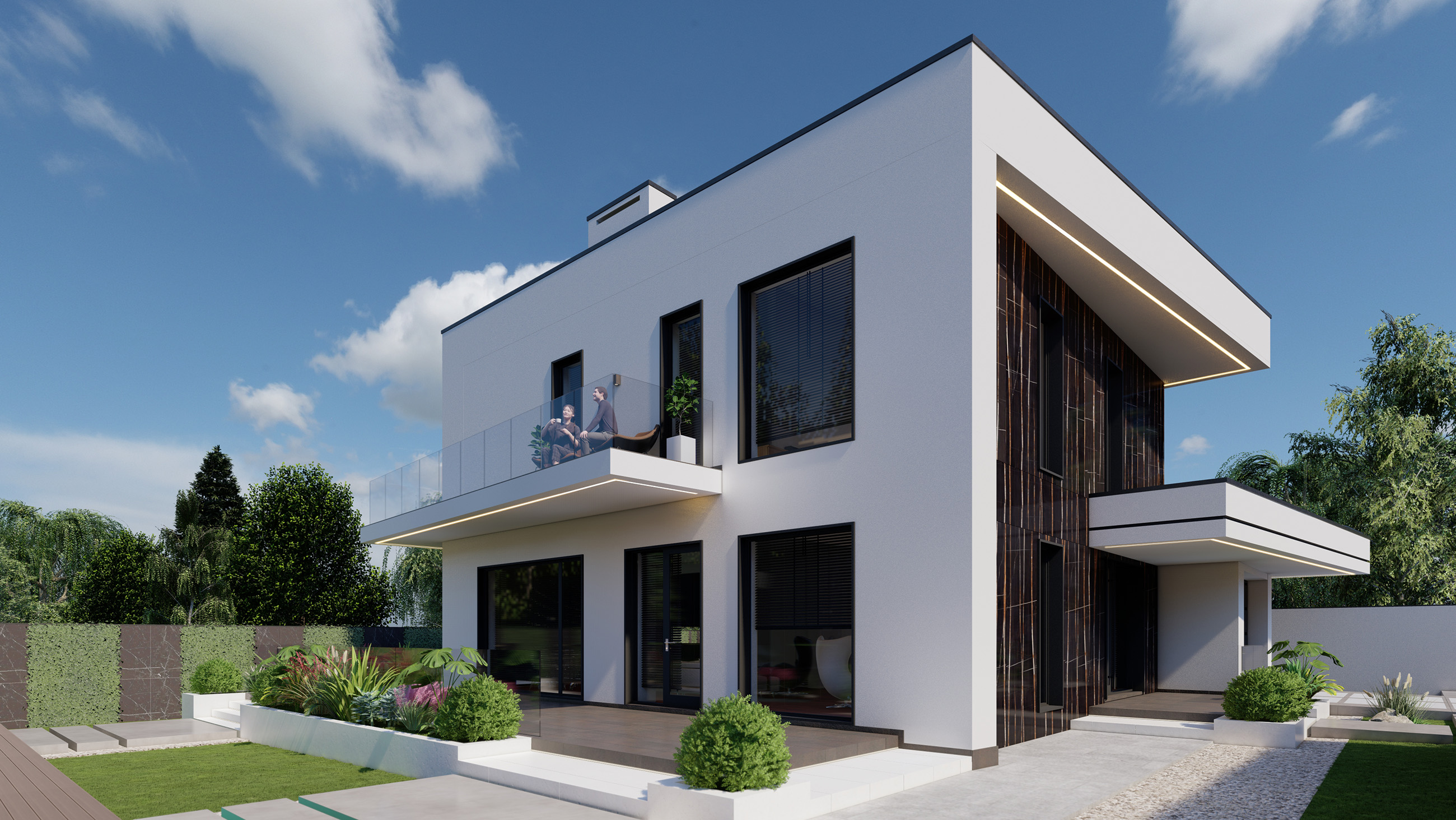
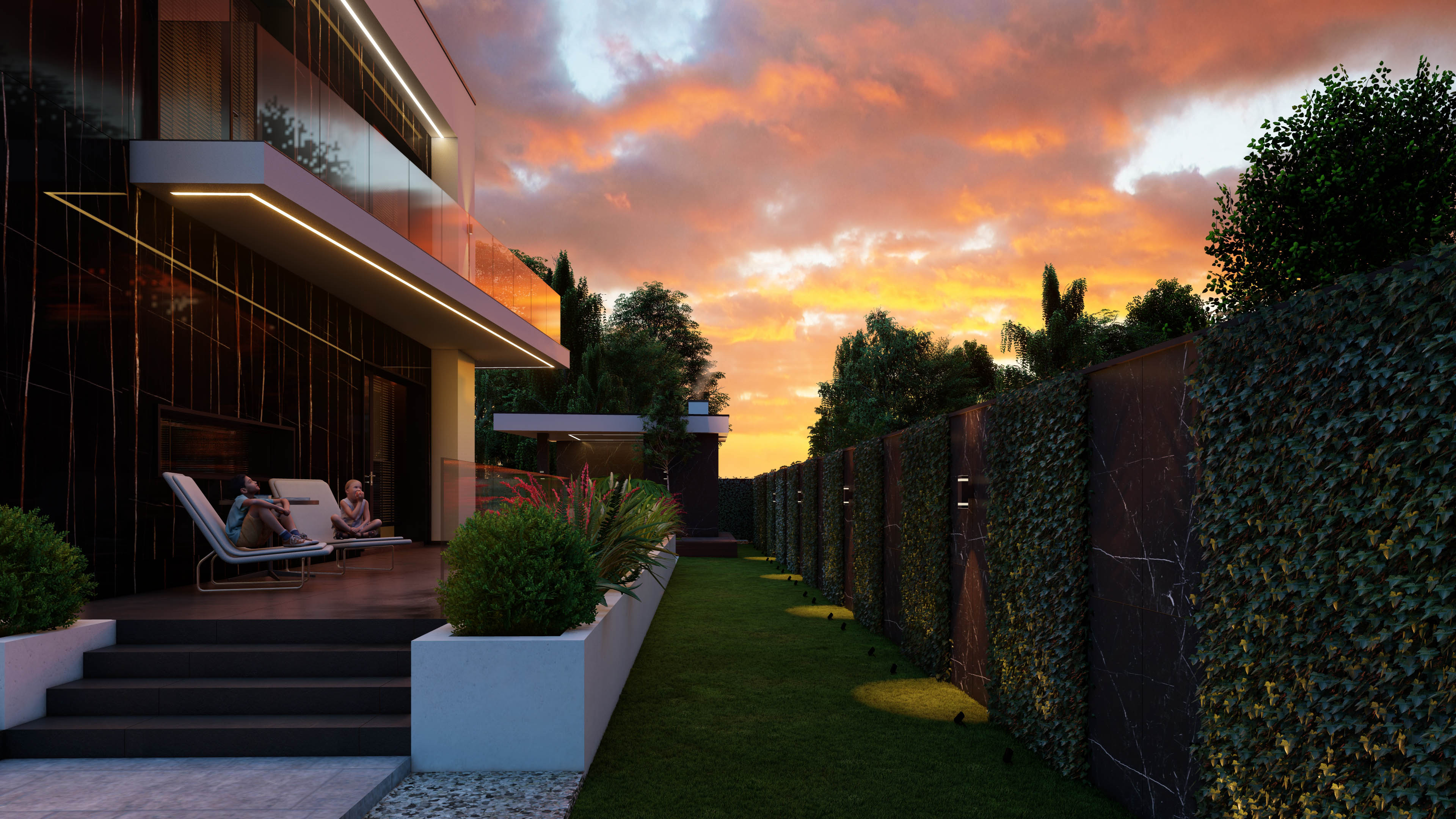
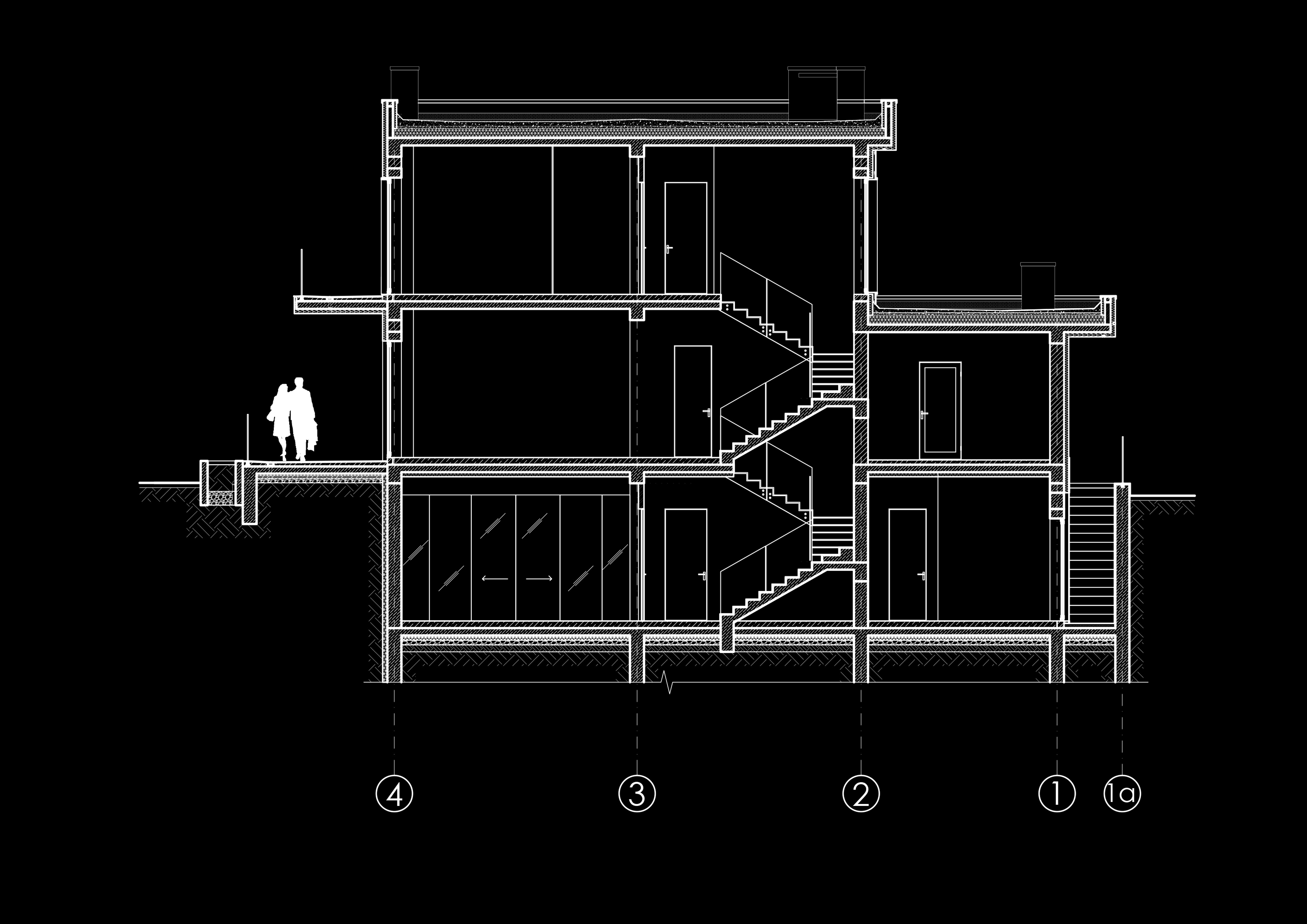
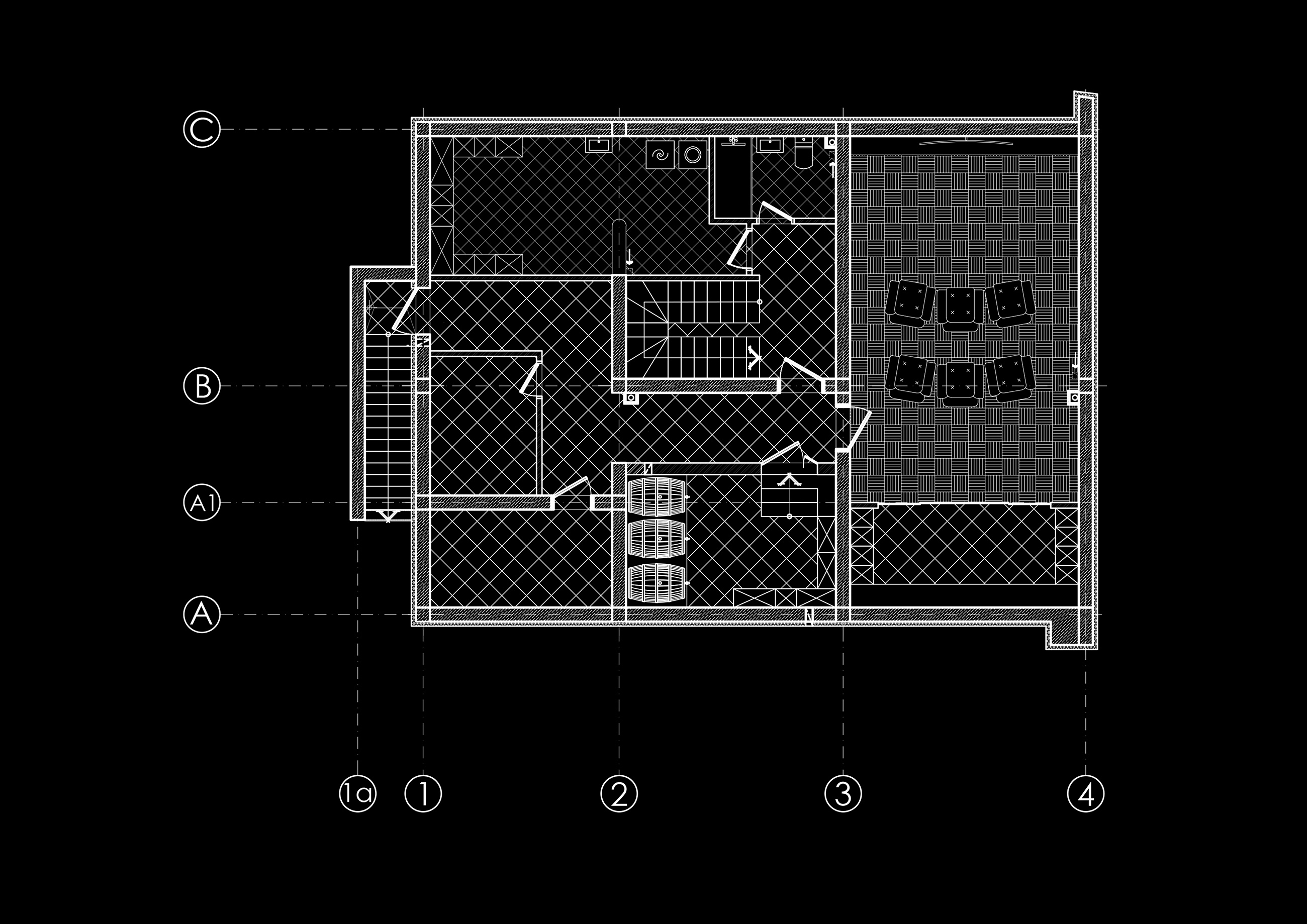
By dividing the functions into three levels: basement, first and second floors, we took care to use the advantages of the building from an aesthetic point of view as well. Although we have given up symmetry, the construction has a regular geometric shape. Two main volumes resulted from the complexity of the project: the house and the garage. With the view of offering them congruence and coherence we united these two elements by means of a horizontal detail. Its material and shape were borrowed for the lateral balconies. Alongside with the play of geometric shapes we used a play of textures and materials for to create aesthetic harmony. Thus, the façade is a combination of decorative plaster and tiles from ceramic granite of the ventilated façade. The latter gives the house a touch of nobility due to its appearance, which resembles natural stone tiles. Being in chromatic contrast, the two materials allowed us to highlight the architectural lines. LED lighting, framing the building along the perimeter, maintains geometric rigour.
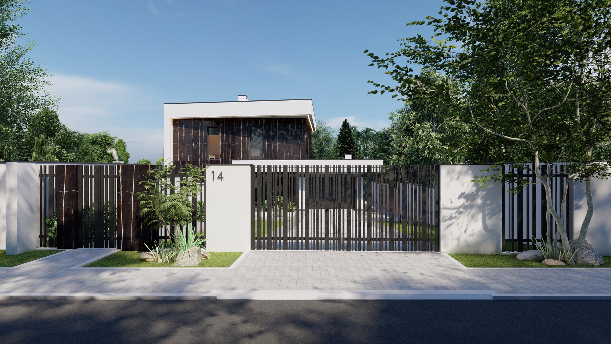
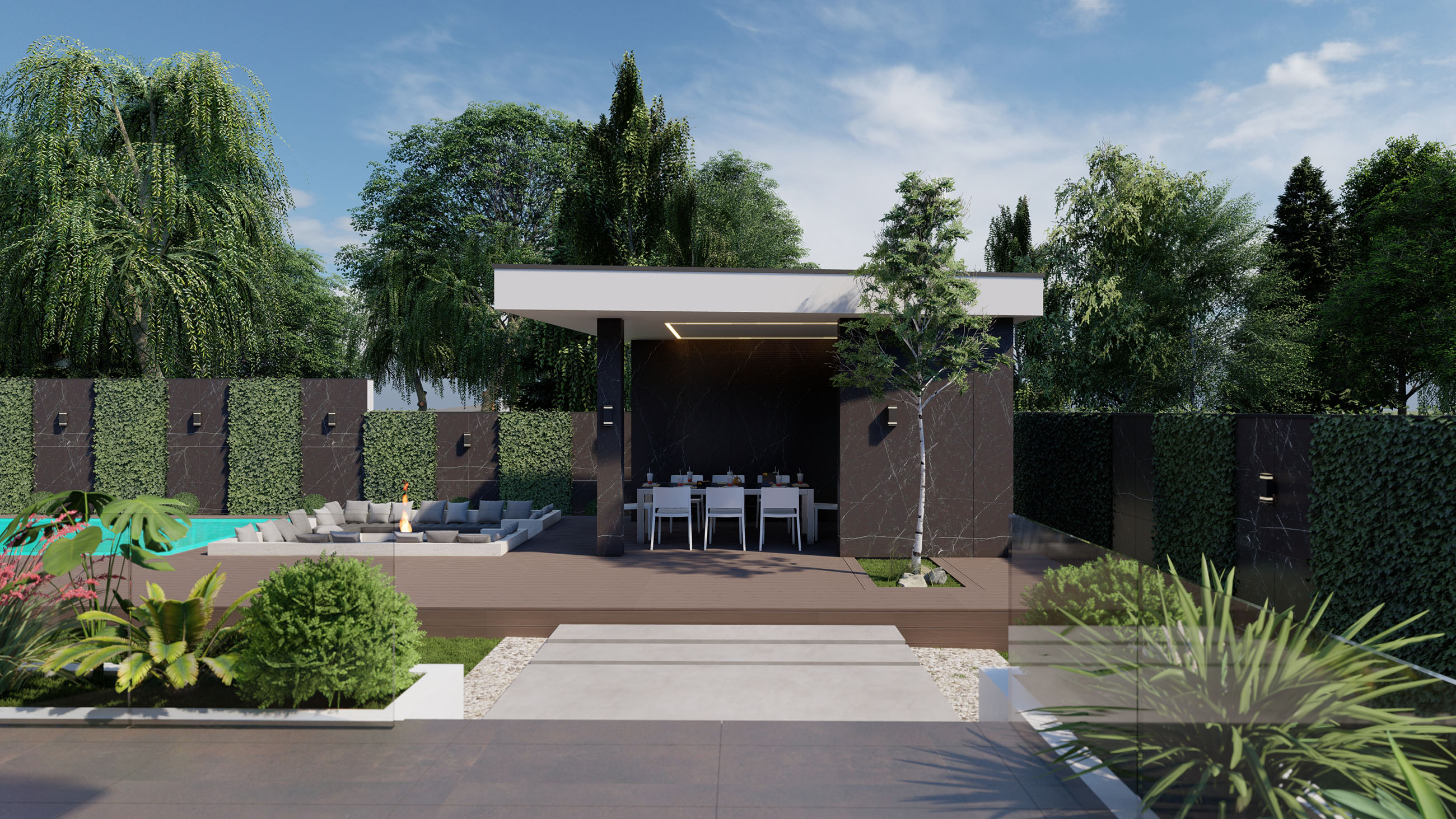
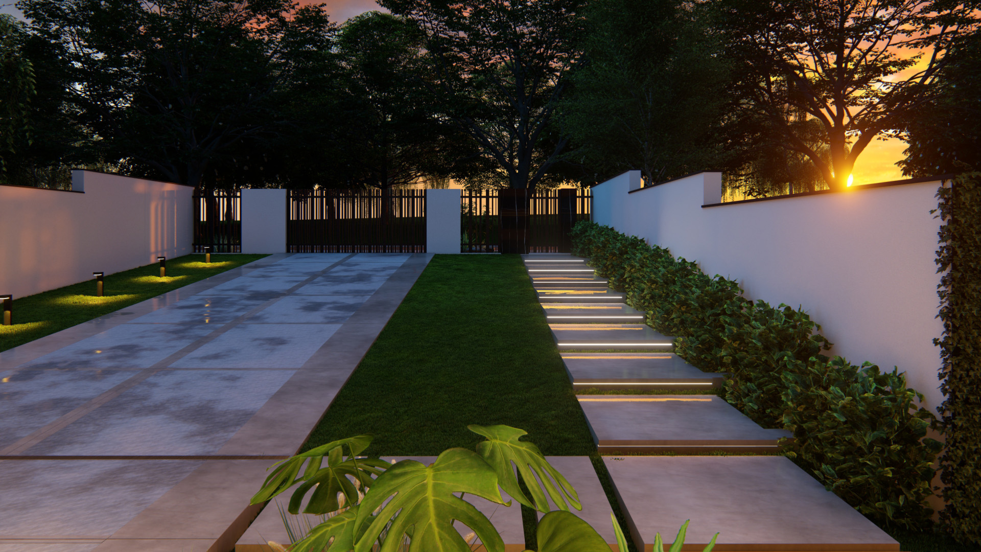
The ideal combination of yard and house arrangement was achieved through common details. We borrowed the texture and colour range of the ceramic granite tiles both for the gazebo and for the fence posts. The gate and the fence were designed from rectangular metal slats, which give verticality to the project.
