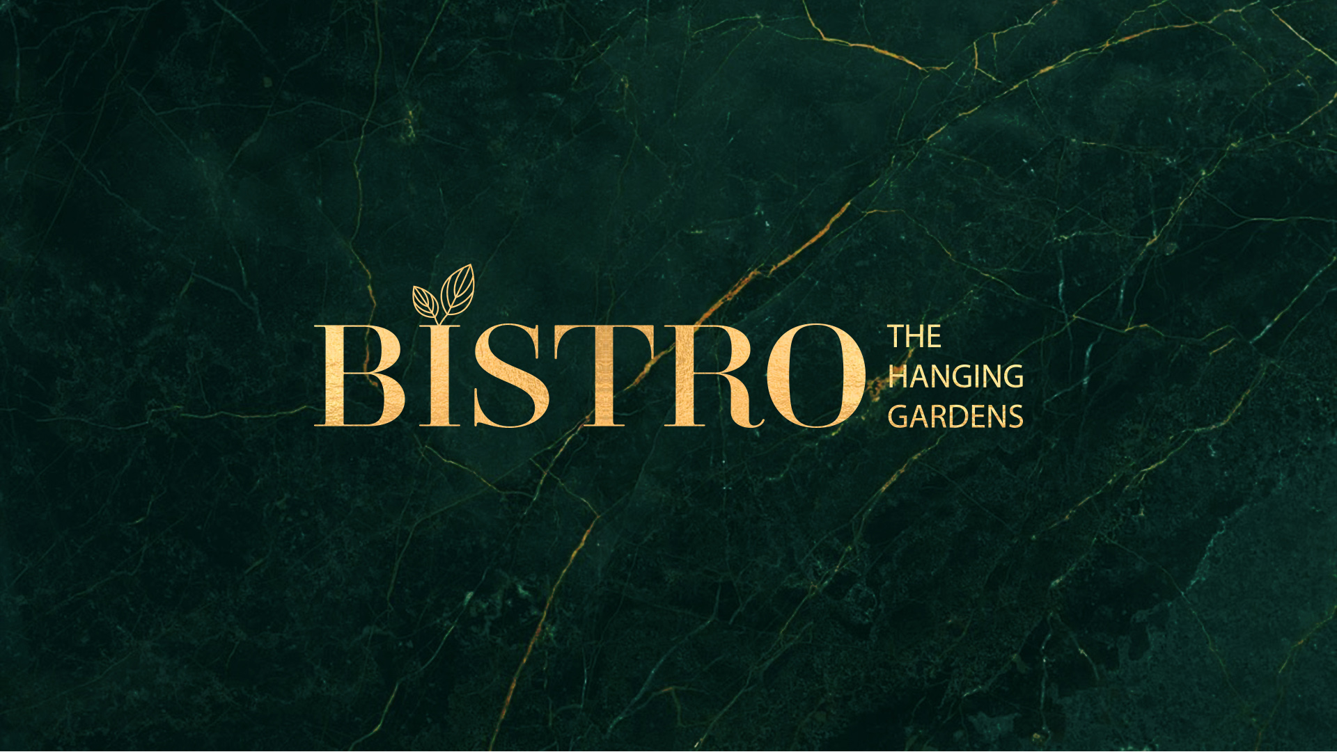
We love to abandon the familiar and amaze and consider that any business, even a simple bistro, deserves to be elegant. That’s why we have created a chic identity for it. We were inspired by nature. Thus, the identity of the venue borrowed its characteristic colours and symbols: noble green and leaves.
We detached ourselves from the cliché of red and orange colours that are considered to stimulate the appetite and we opted for the colour of freshness and naturalness. We developed the concept in a calm direction, without flashy shades, and even the golden colour that inspired us combines luxury and modesty. The font was chosen in the same way - simple but not oversimplified, with a touch of modest elegance.
The colour balance is supported by the logo itself, the edges of which are elegantly framed in clear boundaries, and the two leaves have become an aesthetic accent that illustrates the symbol of the name of the venue.
At the same time, we created two alternative logo variants, so that the branding process is easy when individualizing certain products, regardless of their characteristics. In the personalization process, it is also supported by a pattern that echoes the leaf symbol in the same minimalist style with a touch of elegance.
