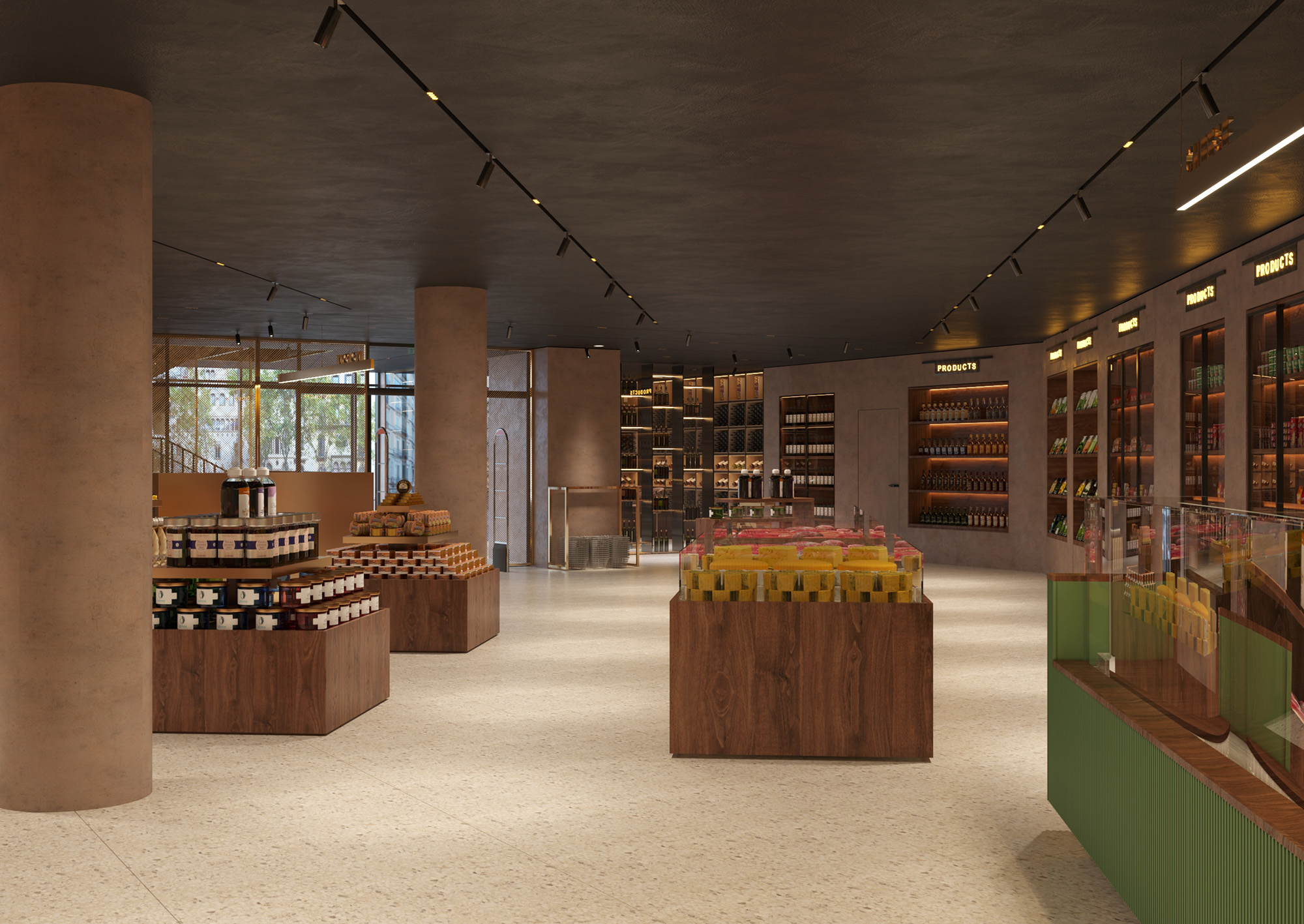
Bliss store project was a challenge of reinventing. It is an ideal interior design project in terms of sustainability. The project was based on elements from the old location, and we had to introduce them in a new space so as to keep the existing stylistic line, dictated by the brand book created by an Italian company, but also to give it a new breath.
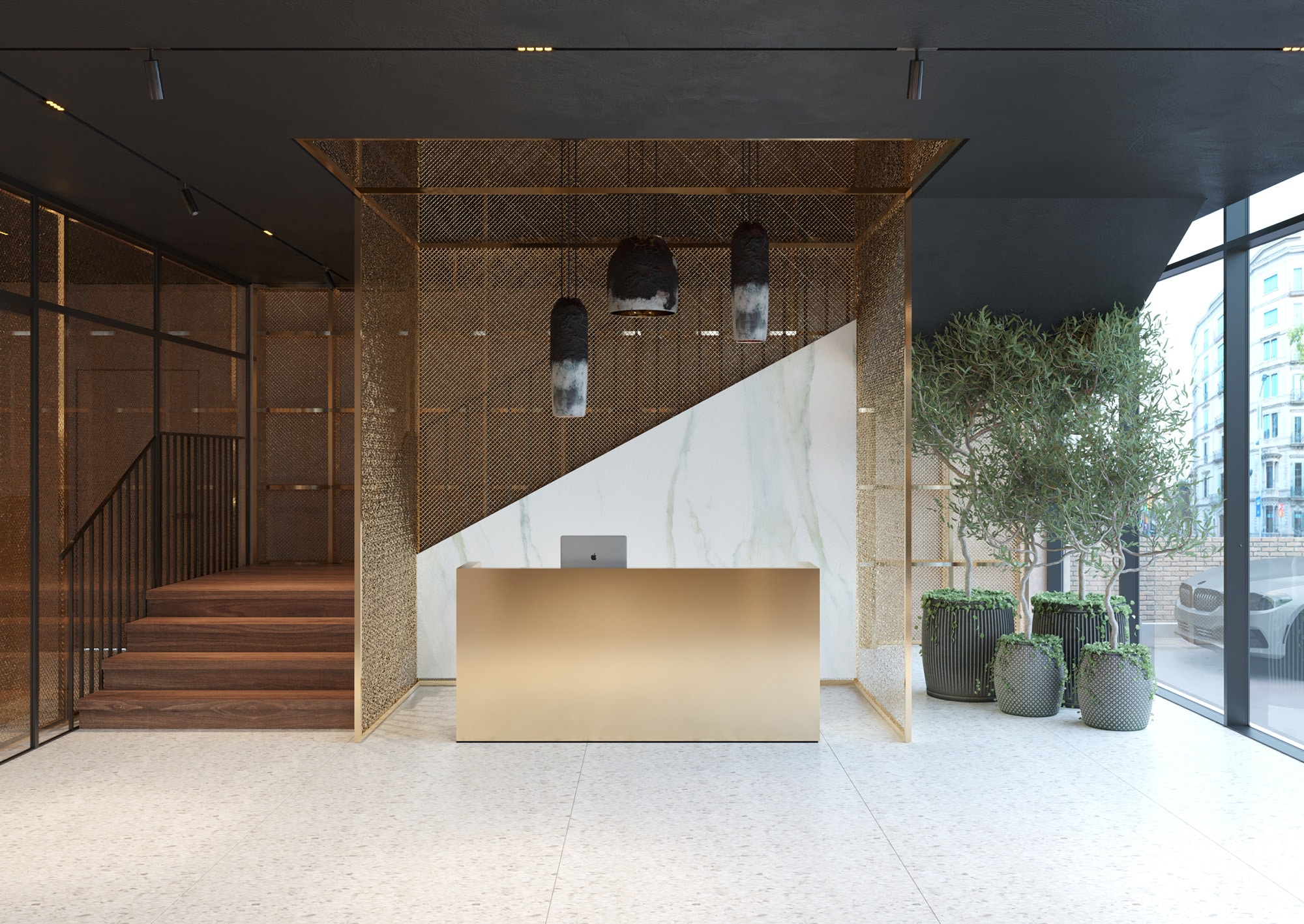
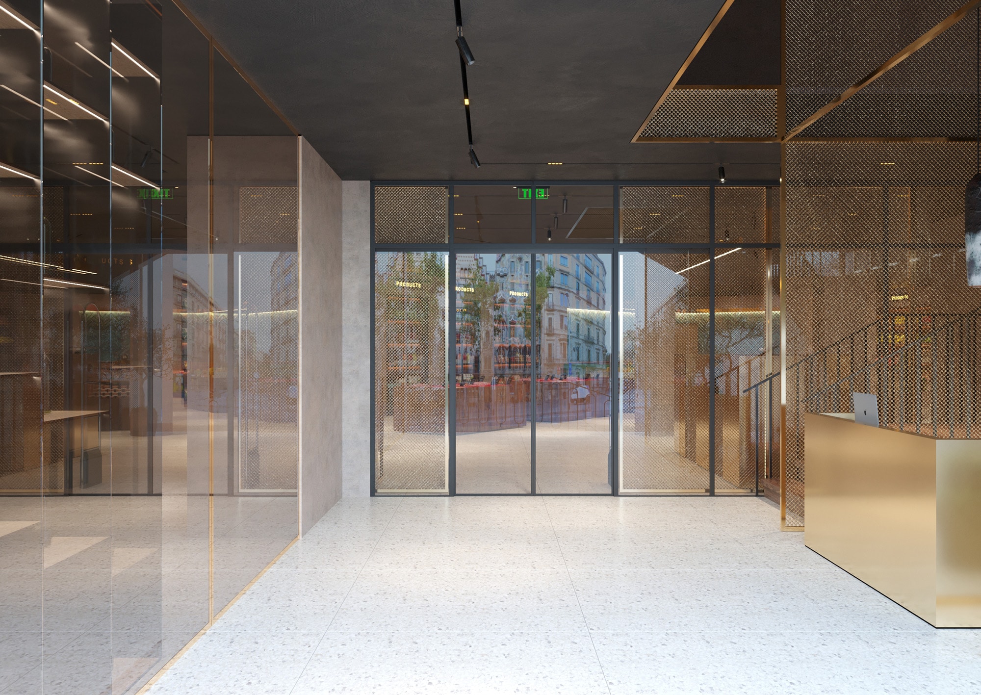
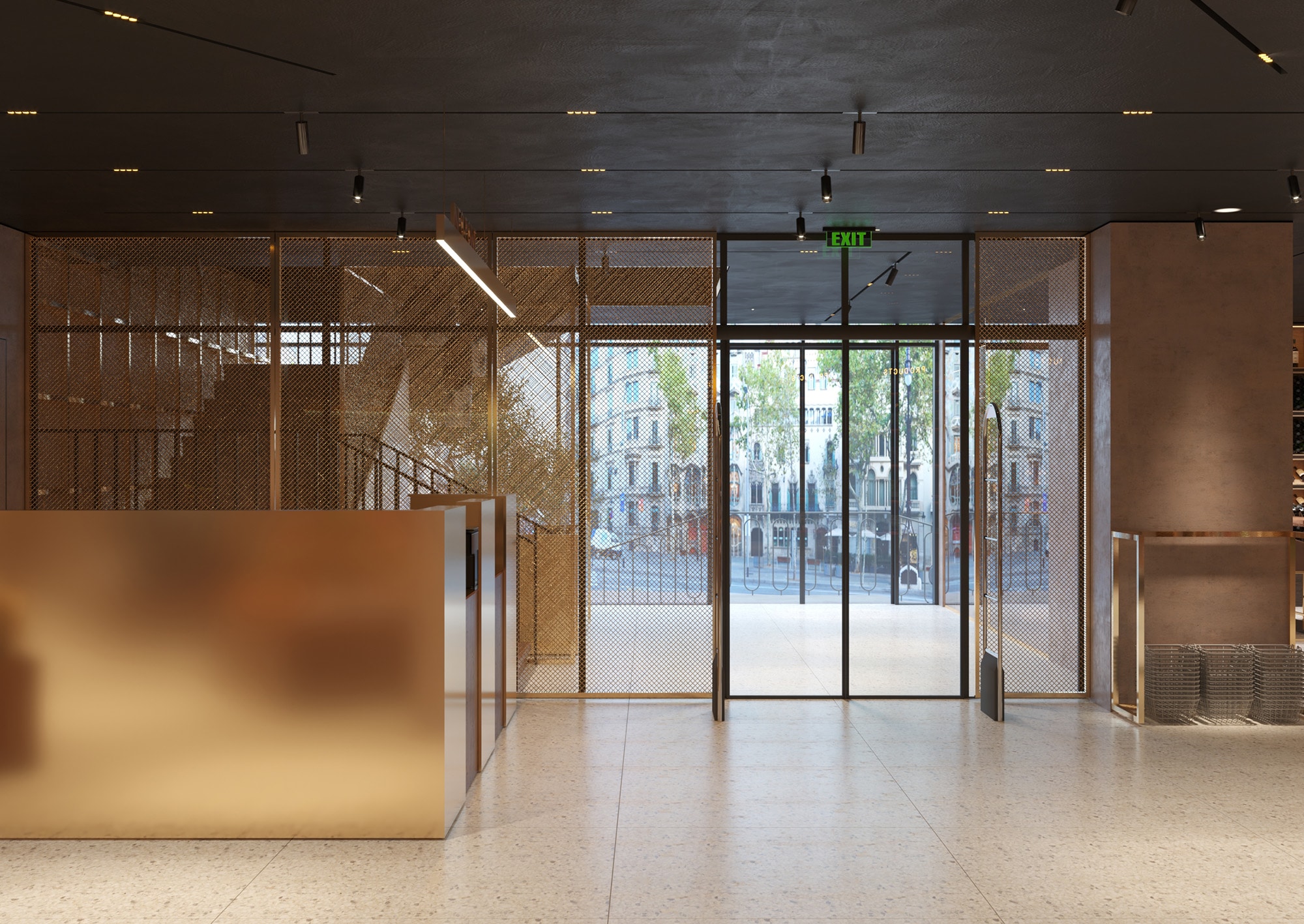
In the new location visitors will meet the usual aesthetics with new hues and accents. The reception area, kept in the same shape with golden hues, was installed in an area separated from the store, so as to create an area for directing the flow of visitors. Here as stylistic accents we have lighting fixtures whose brutality becomes the sober accent of the premise.
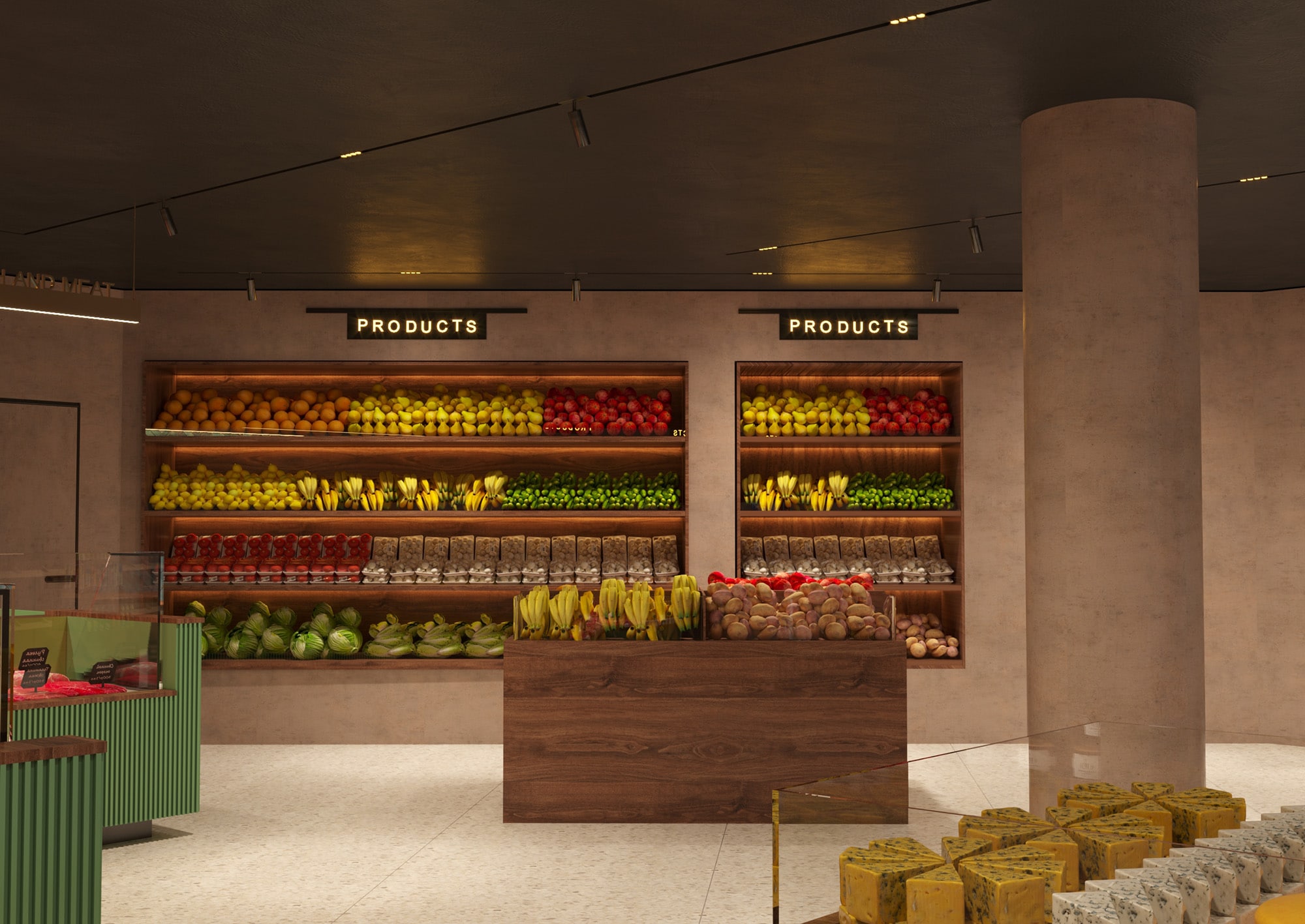
The interior of the shop follows an eco-line. Natural materials dominate here; the floor being tiled and the showcases being made mostly of wood.
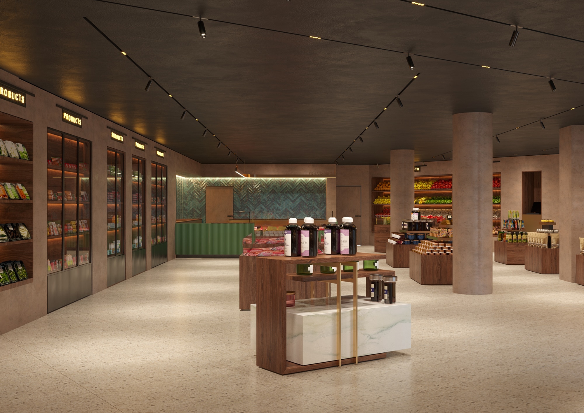
Again, smart zoning has contributed to the creation of a multifunctional and aesthetic space. As a chromatic accent, we have designed the counter for fish, sausages and cheeses. Even in these conditions, it was designed in a consistent green, with the back wall covered with ceramics whose turquoise colour reminds of sea waves.
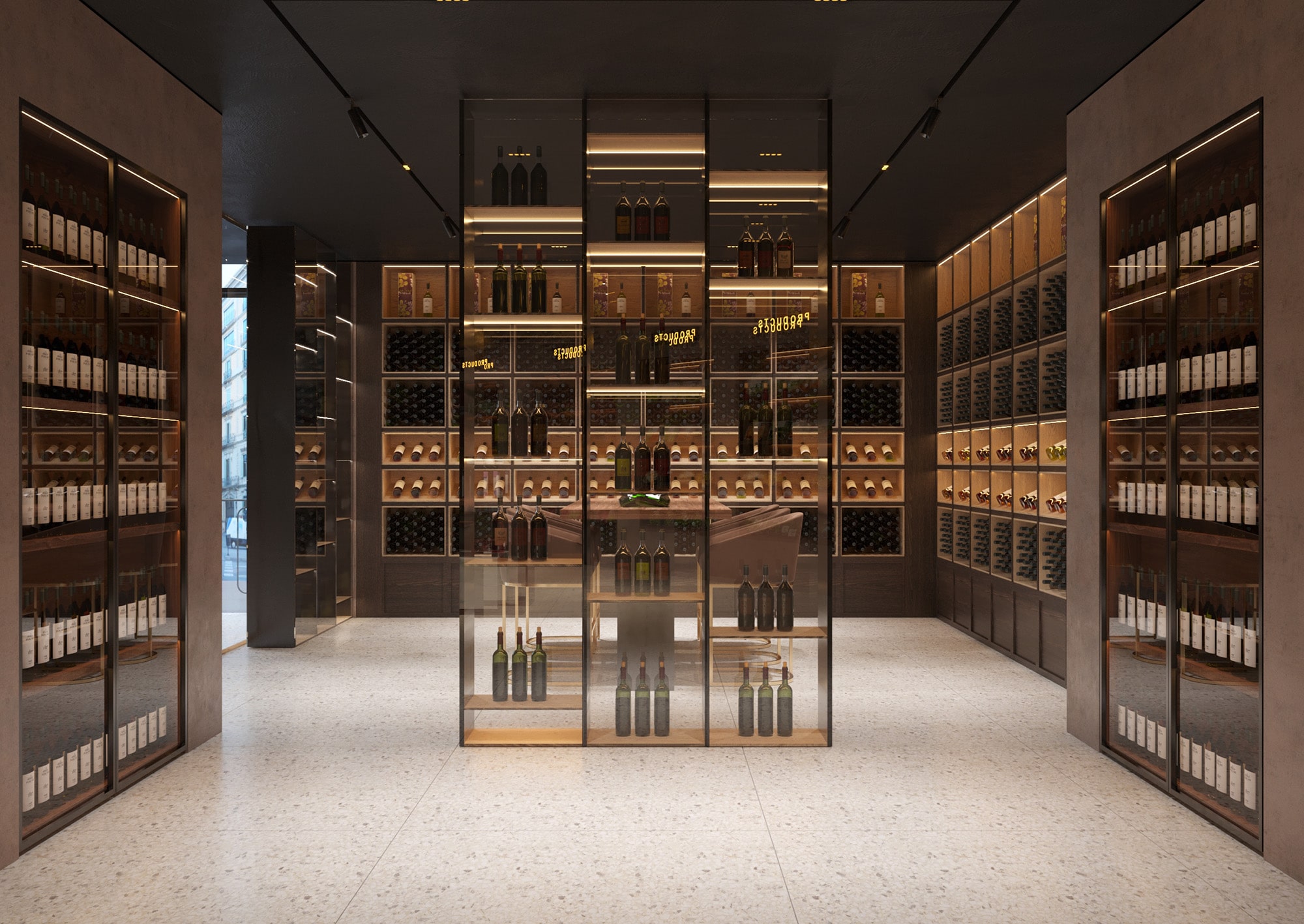
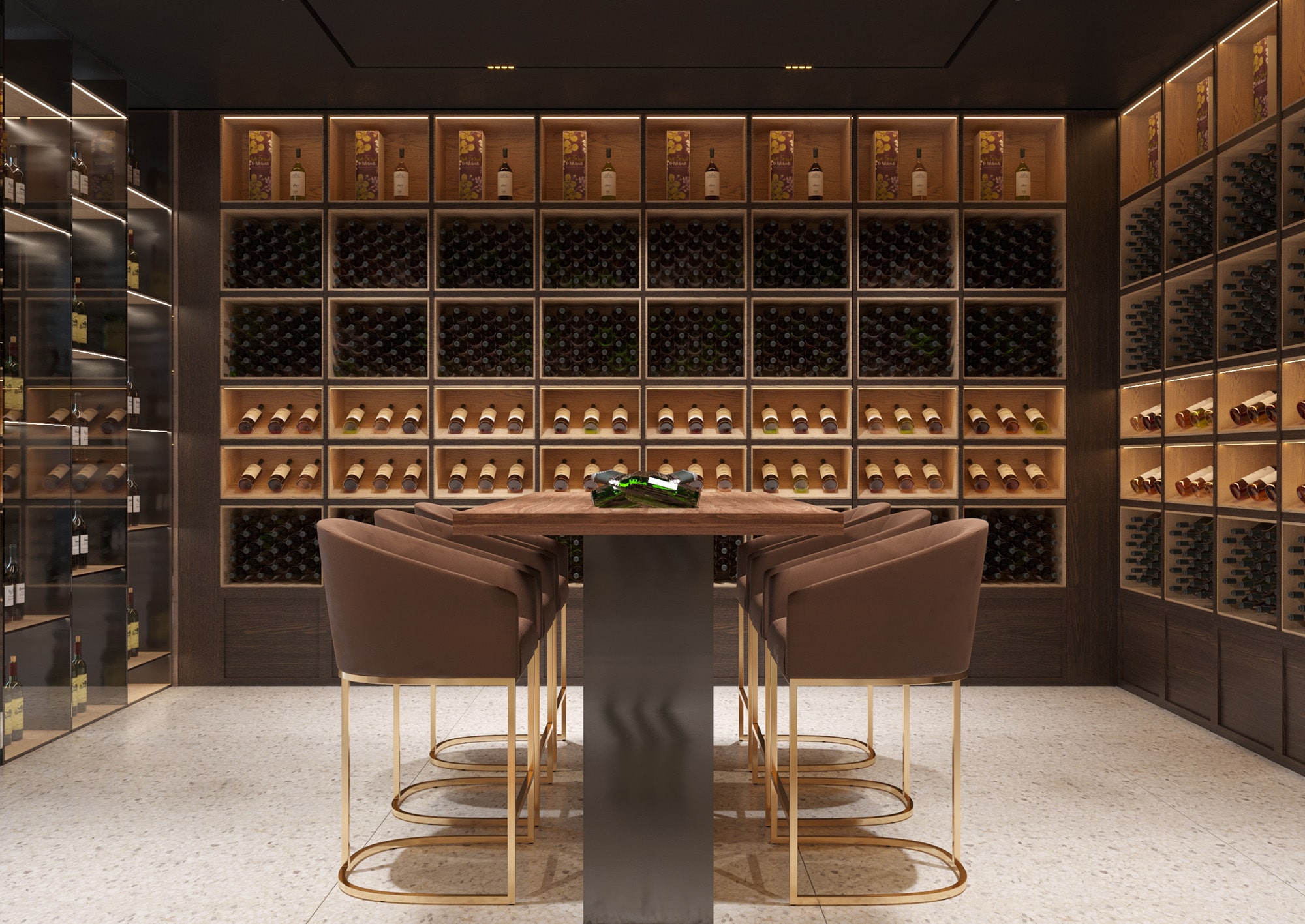
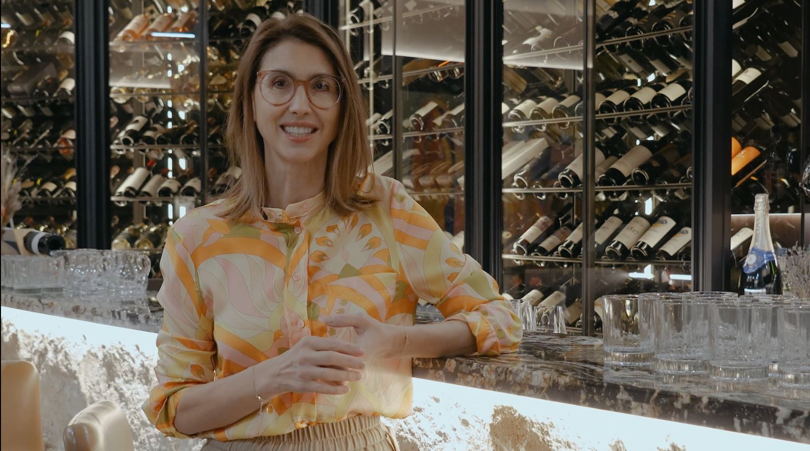
We paid special attention to the wine shop. Again, we preserved the stylistics, generously giving ephemerality to the space. We avoided the suspended lighting fixtures and created a scenographic play of lights with the help of spotlights and showcase lighting. Here, we offered an accent of nobility through upholstered chairs with golden elements, but also an accent of ephemerality due to the glass showcase.
The entire interior is dominated by simple lines and calm colours, all talking about the naturalness and high quality of a sustainable store.
