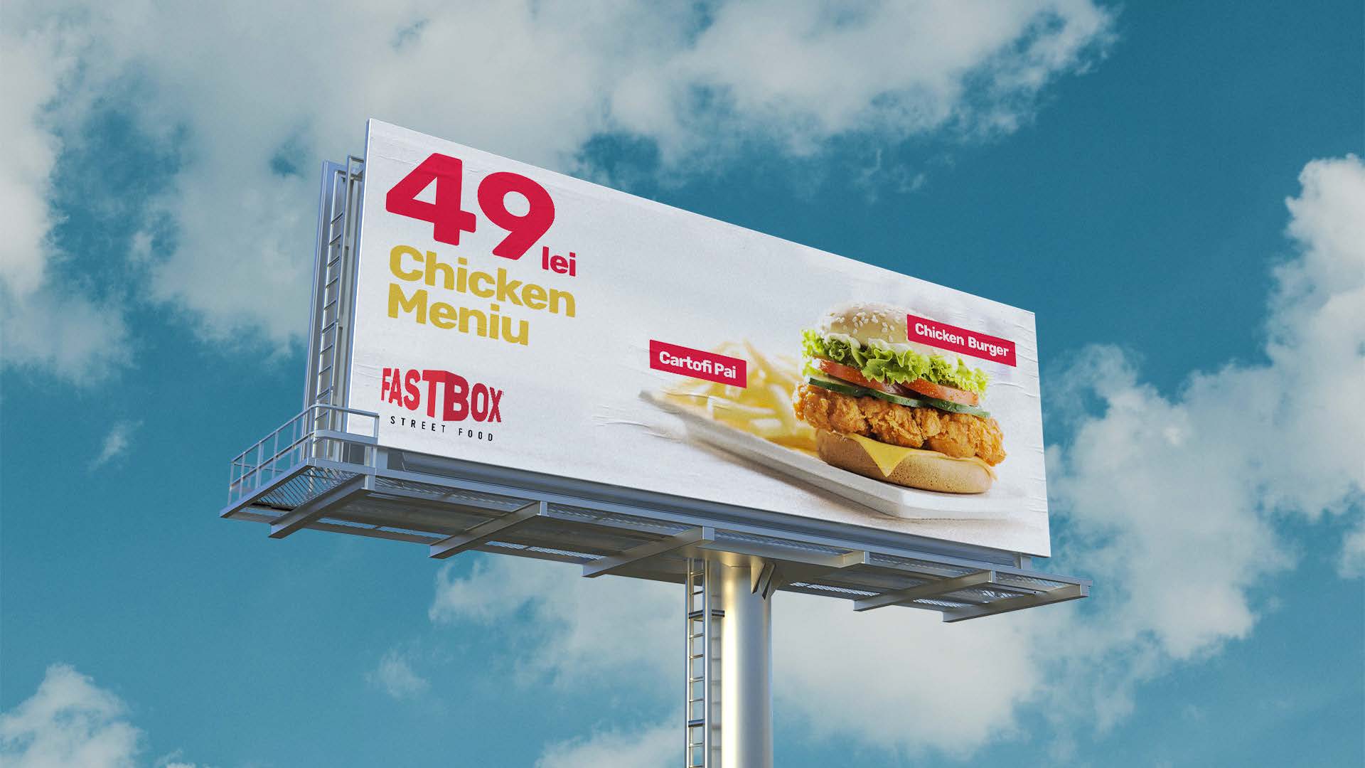
The development of a visual identity starts from the research. Taking into account the client’s requests, we study the existing businesses of the same niche, offering a variant that brings together the functional elements of the already known brands. At the same time, we focus on the point that the image we create should emphasize individuality.
The FastBox project started by identifying the name for a fast food restaurant and we used a play on words, borrowing “fast” from the specifics of the dishes and adding “box”, which is meant to associate the specificity of the restaurant with the box-packed food, easy and fast to obtain.
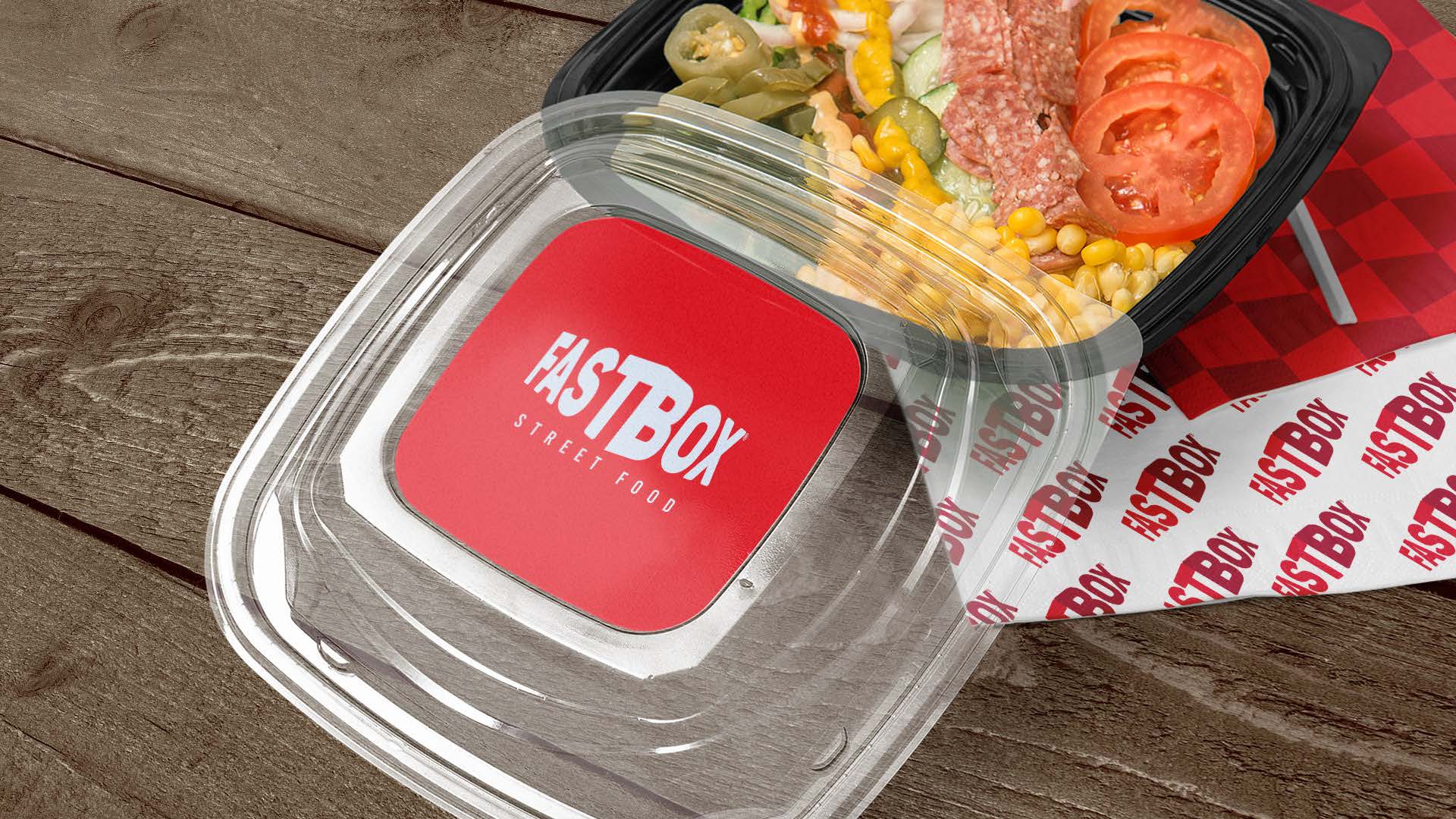
Most fast food restaurants use the red colour in their visual identity because it stimulates the appetite. We borrowed it too. At the same time, we have framed the business name in a geometric shape that looks like a box to suggest the idea of the dishes you take with you in the package. We introduced the image of the logo on the packaging of the products, but we avoided using it excessively in the interior.
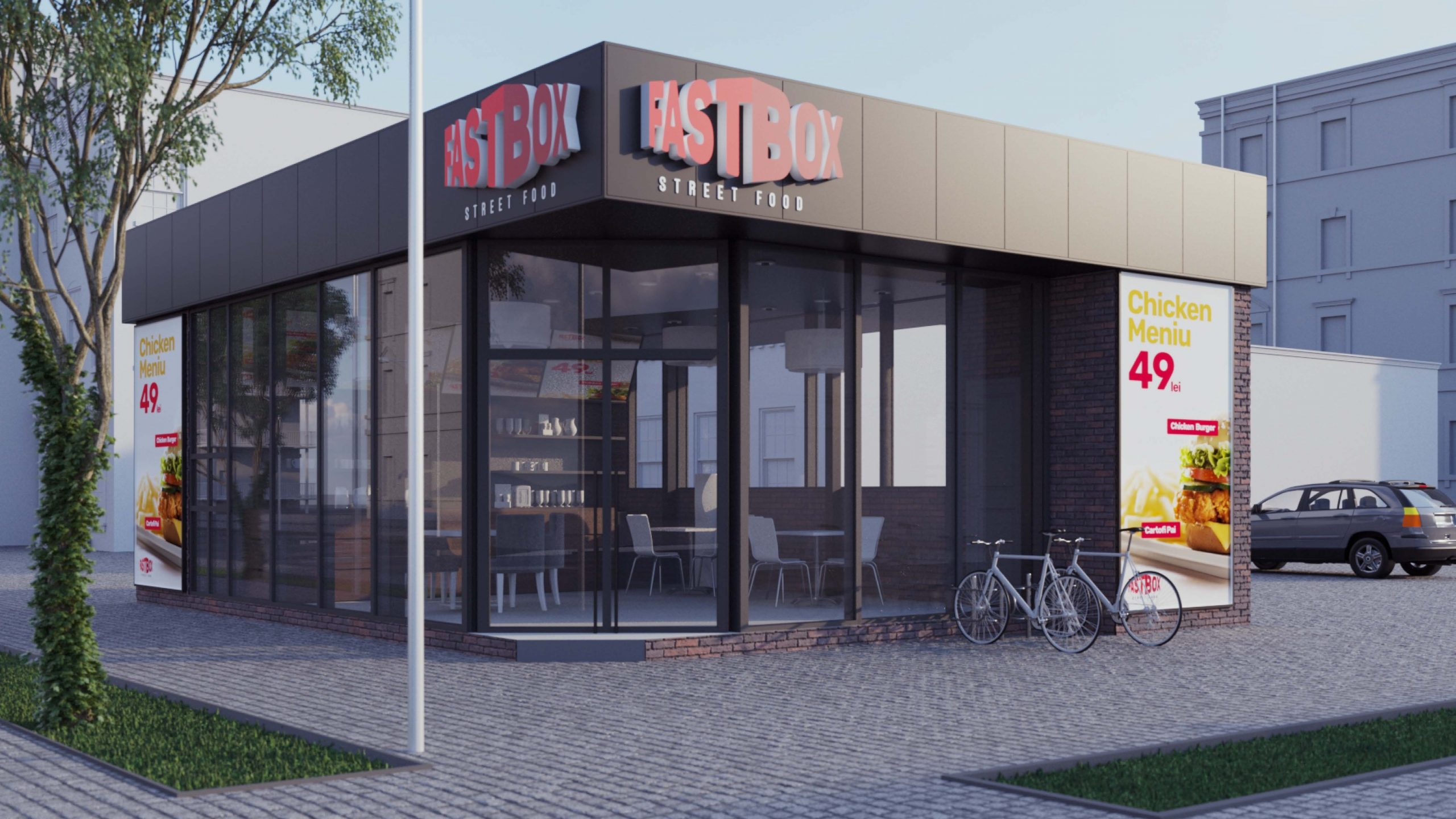
We also decided to integrate it subtly on the façade of the building. The rough-looking materials of the building contrast with the logo, giving a balanced stylistic appearance and thus avoiding the kitsch look and demonstrating that a fast food restaurant can also be elegant.
